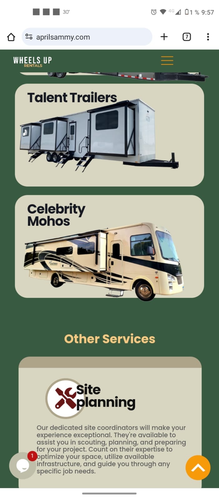
problem with responsive to mobile, looks different in several mobiles
This is how it should be viewed on all mobile devices
Device #1
Device #2
Device #3
Please look how all forms, shapes, text, images, even the menu are in different positions, also on the Device #3 there are some shapes that look with opacity at the top, while on other devices they don't look like that, why is this happening?


Comments
Hi,
Please always attach a link to your website so we can check it out. If the page is offline(localhost), then our help will be limited. You will have to contact us when the page is online. Also, please make sure that the page is not under maintenance before you provide us with the link.
Thanks
https://aprilsammy.com/
The header displays wrongly because you set it up like this. I suggest you check the following video tutorial to see how mobile headers should be created:
https://support.muffingroup.com/video-tutorials/building-mobile-headers/
Also, you have a lot of misconfiguration on your website like these:
And there are many more. I assume you used these for positioning elements to desired places, but it is a completely wrong approach.
At your place, I would remove these sections and start again.
I also highly recommend checking our video tutorials to understand BeBuilder better.
Here you can find a complex video showing pre-built website creation:
https://support.muffingroup.com/video-tutorials/how-to-build-wordpress-website-from-scratch-in-2-hours/
Here you can find all of our video tutorials:
https://support.muffingroup.com/video-tutorials/
What is more, you can do is to install Betheme on a staging domain, install some pre-built websites, and see how it was built.
https://support.muffingroup.com/how-to/how-to-set-up-betheme-staging-site/
Best regards
Hi, ok I understand, so what I see is not how it will looks at the end? I did not know that, so you recommend me start again all version? even desktop? or are you talking only about the mobile version?
Ok I start again with the mobile version Header and I have a problem, It looks good...
But once I scroll the background header stays at the top and does not go down with the logo and the burger menu
https://aprilsammy.com/
That is because you have a transparent header. You must edit the mobile section in the header template and set up its background.
Best regards
Hi, ok I understand, so you recommend me start again all version? even desktop? or are you talking only about the mobile version?
If you set up the Desktop version in the same way, I suggest doing that because some settings are taken from the desktop version to smaller widths.
Best regards