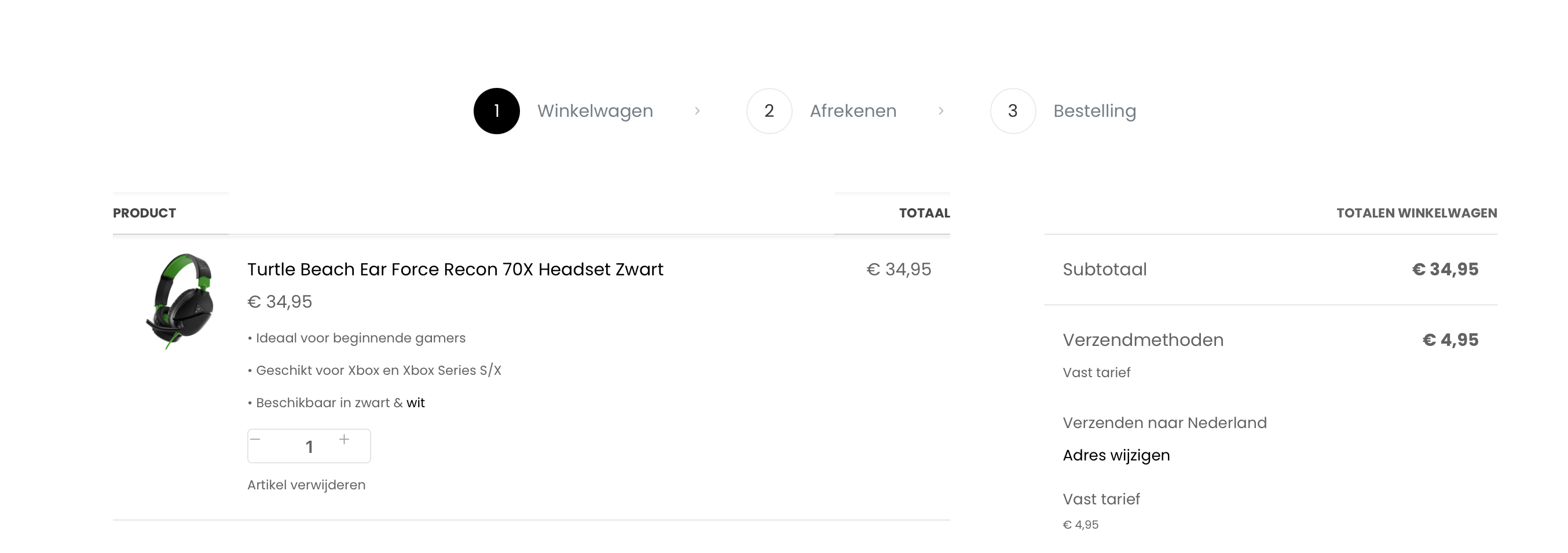
Cart layout
Hello there, as you can see in the picture below a few elements have some shade. Is it possible to remove this? Also, the plus and minus symbols are out of proportion. Is it possible to fix this (if necessary with CSS)?
My site: https://gamersvault.nl/

Comments
Hi,
1) Please go to Betheme -> Theme options -> Global -> Advanced, uncheck the Shadows option, and see if the problem persists.
2) We will correct that in the upcoming update. Before that, please use the following CSS code:
.woocommerce-cart .wc-block-components-quantity-selector__button{
 align-items: center;
 justify-content: center;
}
Put it in Betheme -> Theme options -> Custom CSS & JS -> CSS.
Best regards
Hi,
Thank you for the answer. Both worked.