Text wrap mobile
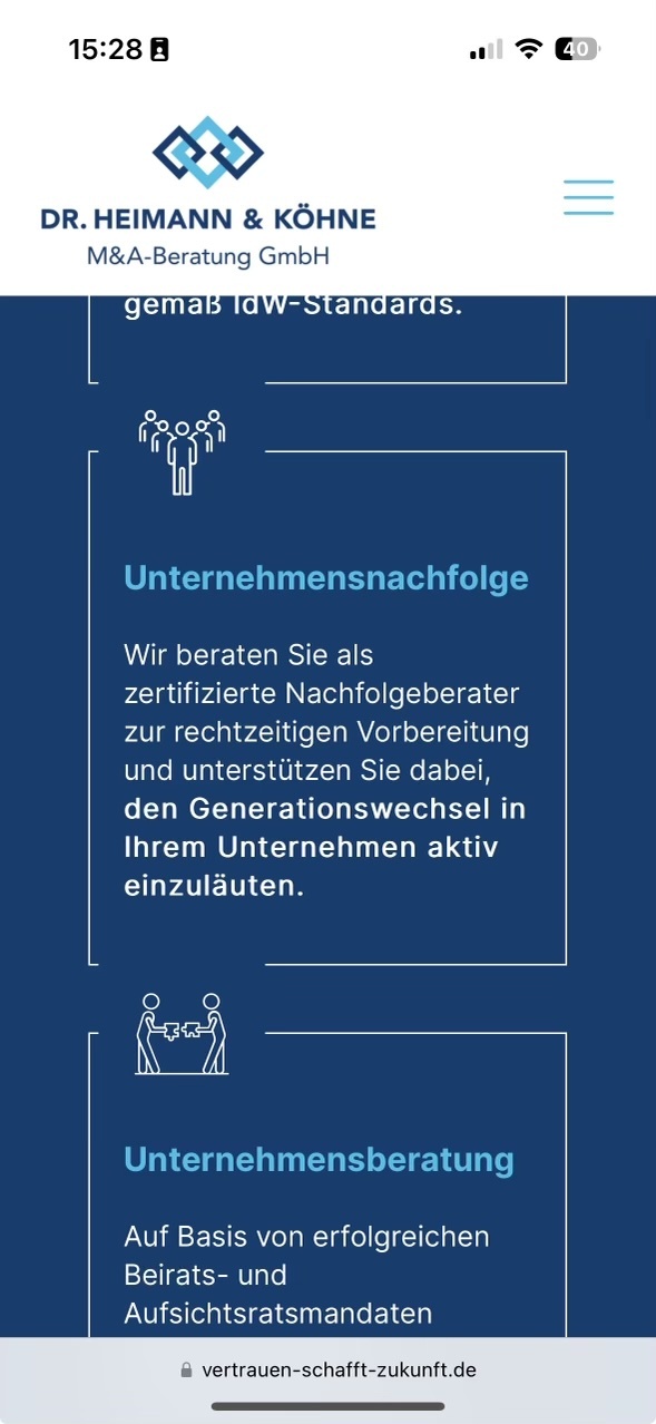
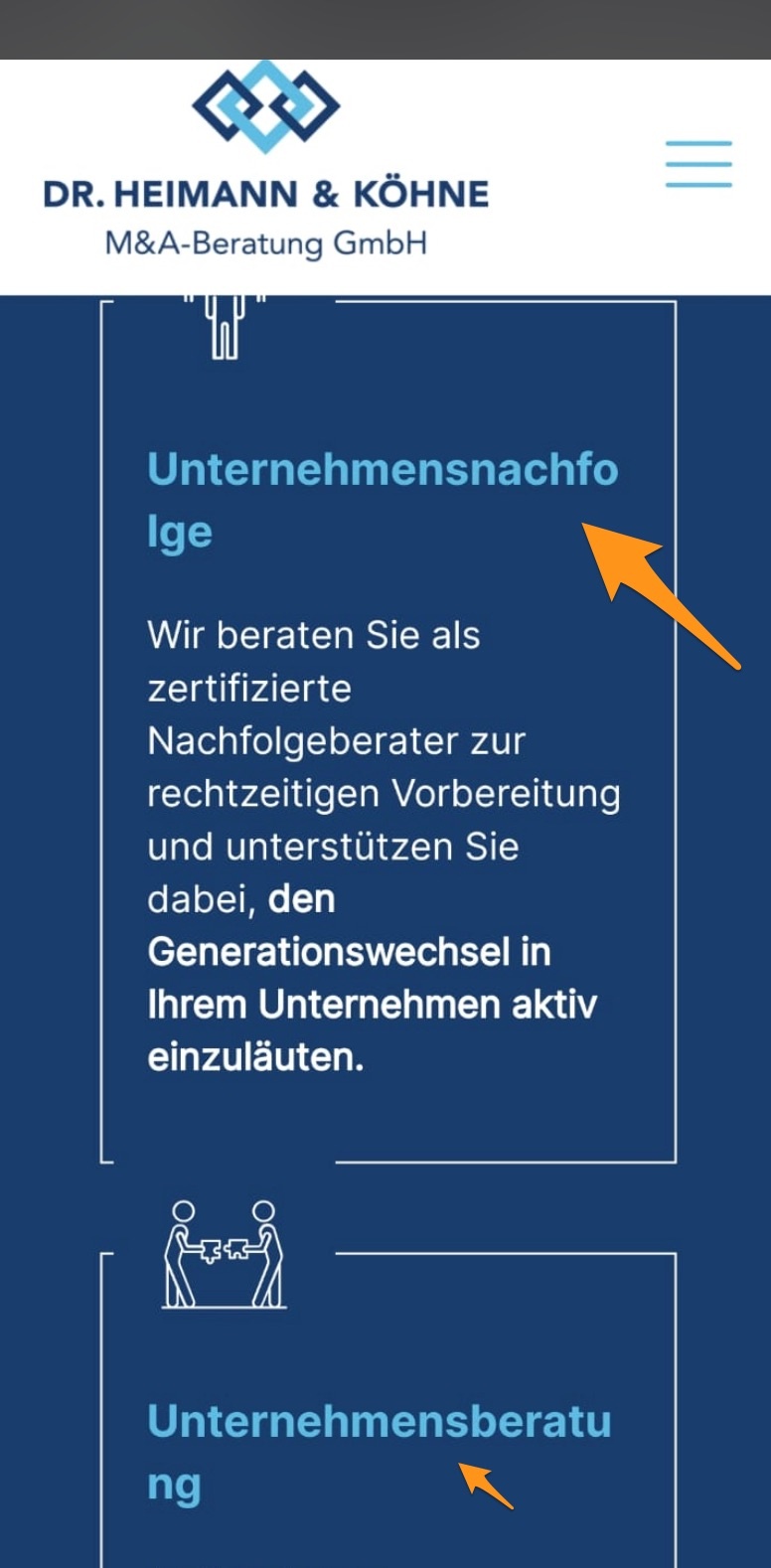
Hello, I have the following problem with mobile views:
1. iPhone everything is fine
2. Android: text breaks in different places
Example: https://www.vertrauen-schafft-zukunft.de/
I have already played with the setting: Betheme -> Options -> Responsive -> Mobile site padding. But no improvement. The text does not wrap well (see screenshot).


Comments
Hi,
That is because the phone with Android have a smaller screen width, and as this word is too long it breaks to another line.
Try to use the following option from the Responsive settings:
Best regards
Is activated. The problem remains.
Otherwise I have to duplicate the fields and adjust the font for small displays. This is time-consuming for many fields (like here). Any other ideas?
Hey,
Please send us the WordPress dashboard and FTP access privately through the contact form, which is on the right side at http://themeforest.net/user/muffingroup#contact, and we will check it out.
Notice!
Please attach a link to this forum discussion.
Sending incorrect or incomplete data will result in a longer response time.
Therefore, please ensure that the data you send are complete and correct.
Thanks
Information is on the way
You did not have this option enabled:
I have enabled it:
Best regards