Broken when "Expand on Click"
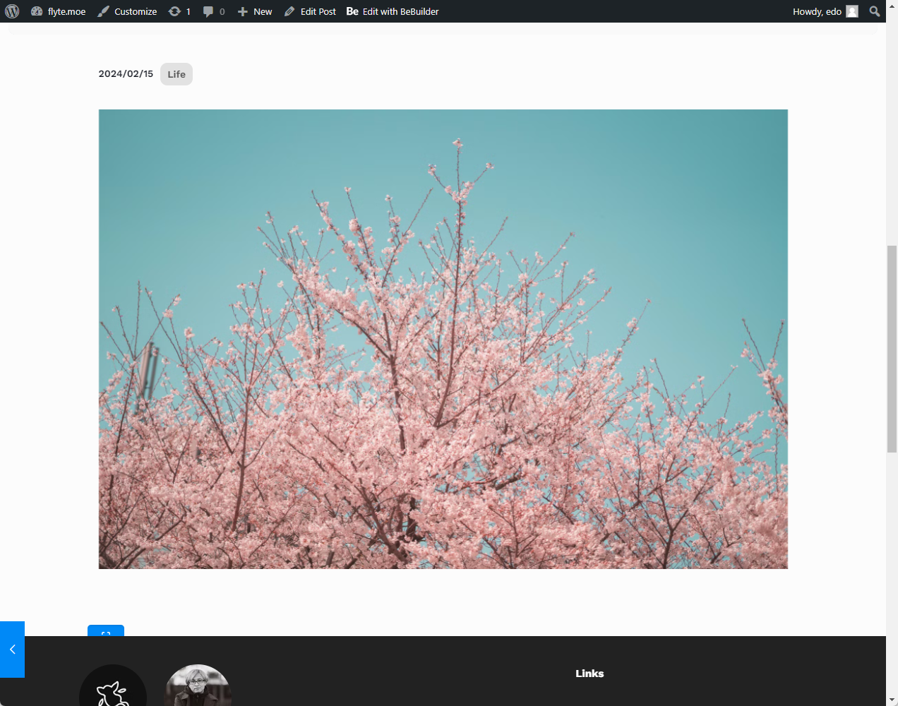
The website is broken whenever "Expand on Click" is enabled to any pictures. Attached is the sample.
Here's a sample image in a blog post:
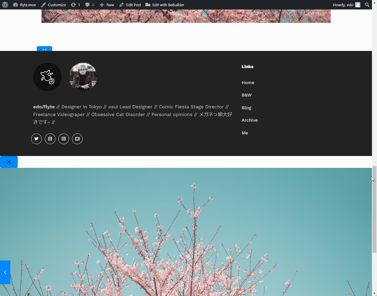
Here's for some weird reason the broken part of the website
The expanded (larger) version of the image appears below the footer, along with some blue icon that I'm not familiar with. This is how the page load as is, without any interaction. If I click any of the images, the browser just simply freezes, and I had to force close the tab.
I've deactivated any other plugins just in case, but nothing happens.


Comments
Also, at the same time, Gallery (in WP editor) doesn't seem work. Everything was just displayed in a single column instead of multiple columns as shown in preview.
For blog content, I try as to use the WP editor as much as possible instead of the BeEditor (which I only use for custom pages).
Hey,
Please send us the WordPress dashboard access privately through the contact form, which is on the right side at http://themeforest.net/user/muffingroup#contact, and we will check what might be the reason.
Notice!
Please attach a link to this forum discussion.
Sending incorrect or incomplete data will result in a longer response time.
Therefore, please ensure that the data you send are complete and correct.
Thanks
I'm still waiting for a response. Sent the access few days ago.
Yes, but you sent your message during the weekend, so I could not answer you.
These problems occurred because you disabled the Block library in the Theme options performance tab.
I have activated it, and the display is correct.
Best regards
Forgive me, I lost track of days. Thanks, it solved the two problems.
However, the padding between image blocks seems to be missing now. Maybe all the padding between all the wp blocks are missing too.
No problem.
Can you attach a screenshot showing which padding you refer to, please?
Thanks
In the editor, it appears as intended (above). However, in the actual site, all the paddings are missing (below).
On which page/post do you have it?
I checked the one you mentioned in the private message and a couple of others, and I could not find the one from your screenshot.
Best regards
All the blog pages. Check the images and it has no gaps.
The sample that I screenshotted was taken from 'Instameet: Sakura". This includes the sample that you screenshotted above. There's no padding between the picture block and the gallery block.
You can add a spacer element between the image and other elements.
Best regards
Hmm, I have to add the spacers manually for each blocks? I was hoping that there would be a gap by default, but I guess this is okay too.
Thanks for all the help!