messy view in some devices
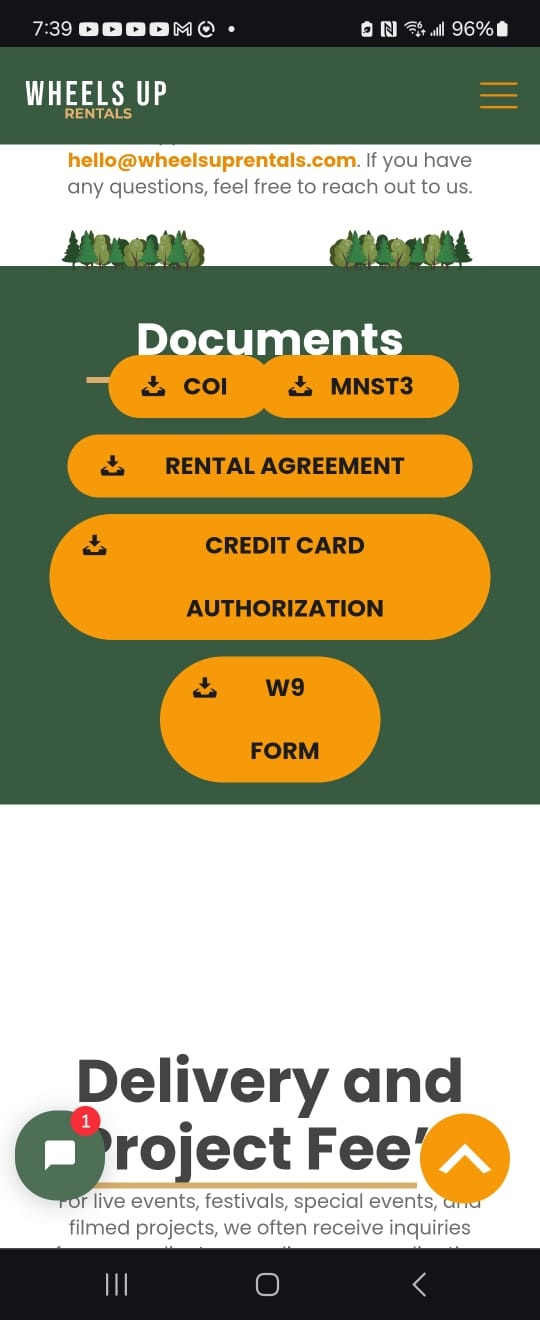
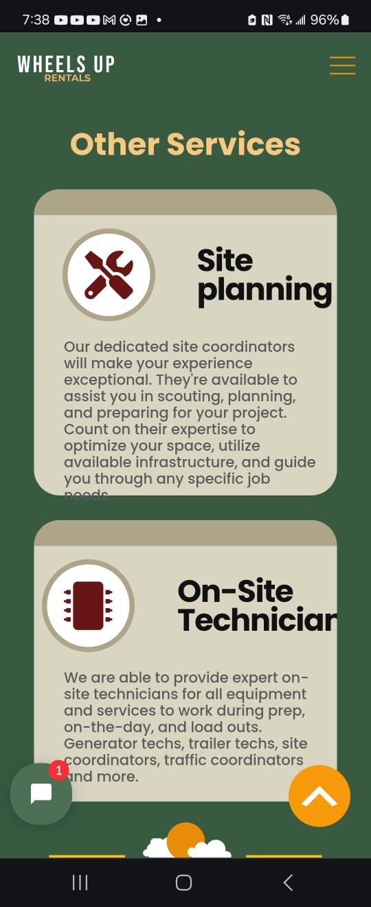
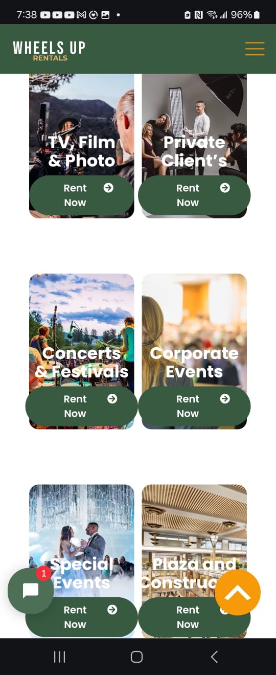
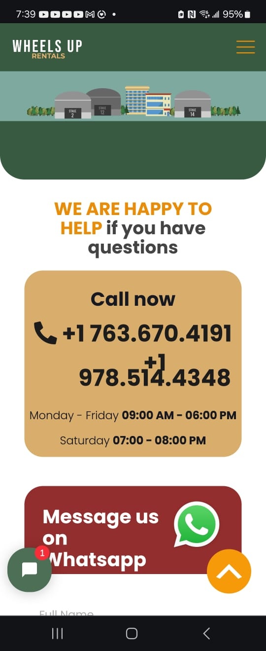
Hello, I have a device with these characteristics 6.7 inches OLED, (~87.4% screen-to-body ratio) Dimensions 86.4 x 72.2 x 15.9mm to 7.1 mm (folded); 72.2 x 166.0 x 6.9mm (unfolded) Resolution 1080 x 2640 pixels, (~425 ppi density) Aspect ratio 229. and the website looks like thi
WHY?






Comments
Hi,
You have set up your layout wrongly.
Negative margins, large margins, custom heights, and other stuff break it all.
I suggest you carefully watch these two video tutorials:
https://support.muffingroup.com/video-tutorials/responsive-editing-in-bebuilder/
https://support.muffingroup.com/video-tutorials/how-to-build-wordpress-website-from-scratch-in-2-hours/
Best regards
Hi, I am sending you this pictures as examples to show you how I see the website when I am building it, it looks good and I can see it like that on some mobiles but on devices with small sizes of screen it looks like the pictures that I send you before, and I dont know how could I fix it if I can not see that there is something wrong when I build it
https://wheelsuprentals.com/
The display in the BeBuilder is different in width from the device you are testing your website with, and that is why it differs.
To fix it, get rid of setting static values (for heights or widths) and negative margins, or adjust them for mobile display as shown in the video tutorials I have sent you.
Best regards