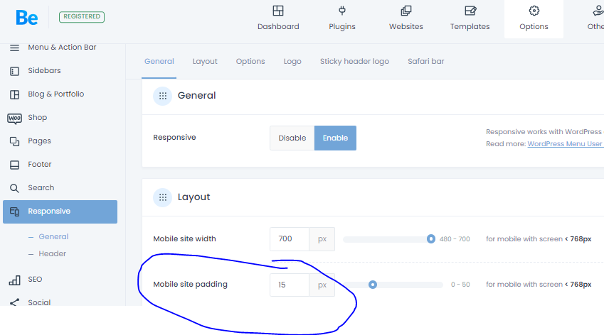
setting padding of text for mobiles
Hello there,
its me again, I hope you all had nice weekend :)
Im looking for some general setting where I can setup the text left and right padding so on mobile it looks good and from edge of display to opposite edge.
Im doing it now hard way thats where I edit every wrap I do and select padding on mobiles / in advanced settings for 10px left and 10px right and it looks just fine.
Im looking for some easier way to prop up some general rule so it works automaticaly.
I tried the options provided in BeTheme / responsive / layout, but after changing the padding values, I see no difference on mobile previews.
Is it possible, that Im doing it all wrong ?
Thanks for help

Comments
Hi,
Please always attach a link to your website so we can check it out. If the page is offline(localhost), then our help will be limited. You will have to contact us when the page is online. Also, please make sure that the page is not under maintenance before you provide us with the link.
Thanks
https://www.crazyfamilyontheroad.com/kefalonia-plazovy-raj/
Hey,
Please send us the WordPress dashboard access privately through the contact form, which is on the right side at https://themeforest.net/user/muffingroup#contact and we will check what might be the reason.
Notice!
Please attach a link to this forum discussion.
Sending incorrect or incomplete data will result in a longer response time.
Therefore, please ensure that the data you send are complete and correct.
Thanks
Ok, I had sent you the access
I tried to enter your WP admin, but I get this page:
Can you unlock access for us, please?
We are located in Poland.
Thanks
Yeah sure, I forgot this. Now you can get in :)
You had this option enabled in Betheme -> Theme options -> Responsive -> General:
I have set it to default, and paddings are visible correctly:
Best regards
thank you very much :)