
Header responsiveness on desktop and tablet

Hi, I need help with setting up the header for both the desktop and the tablet. The menu contains several menu items that are well visible on the desktop. But when I open the site on the tablet, the items are not aligned. Also, there is a second logo on the right side of the header that is completely moved to the right on the tablet. I have created a mobile header for mobiles that works well, but again, not on tablets. Any ideas on how to adjust it? Thanks a lot.
Comments
Hi,
Responsive editing in the Header Builder works just like on a regular page, so I suggest seeing the following video tutorial:
https://support.muffingroup.com/video-tutorials/responsive-editing-in-bebuilder/
If something is unclear or you will struggle with adjusting that, please attach a link to your website, and I will help you sort it out.
Best regards
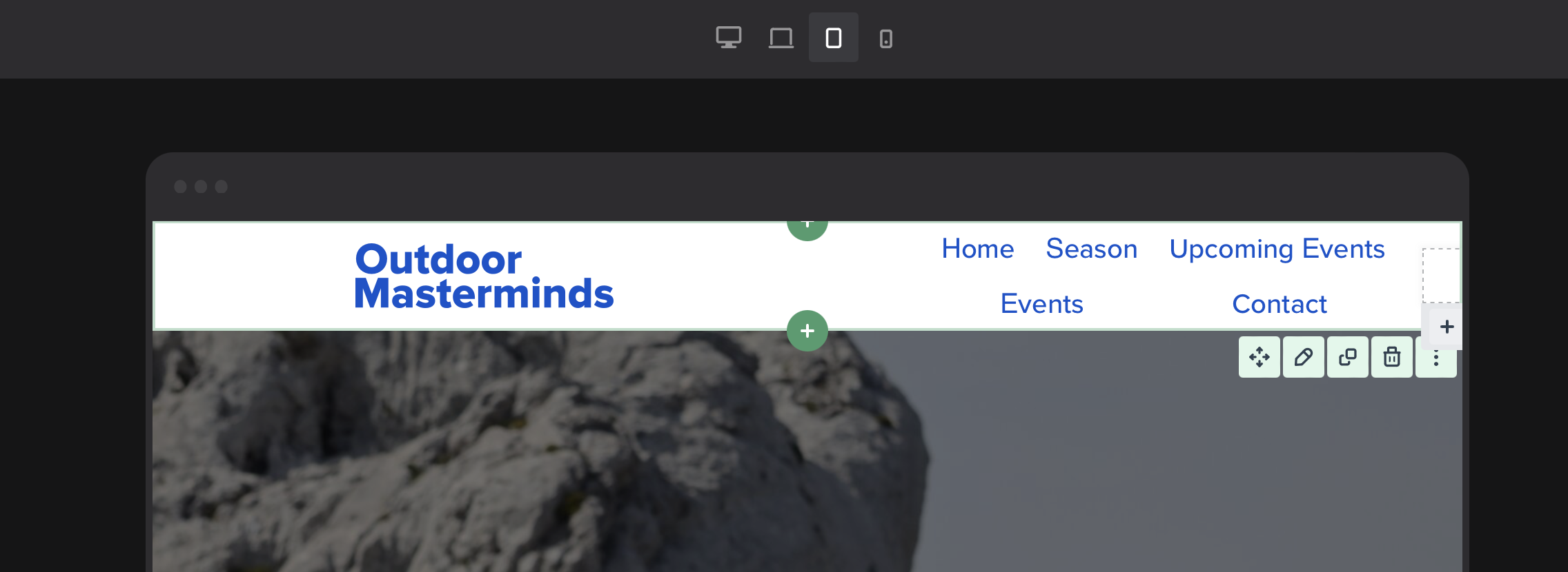
Hi, I have set everything right. But from some reason I am not able to make it work on tablet.
The logo on the right is too small, and the menu items are in two lines. :/
Also, I have set up the mobile header but it doesn't work on the tablet setup.
Can you help me out somehow? Thank you,
Jan
https://www.outdoormasterminds.com/
If you want to fit the regular menu on tablet view, I suggest decreasing menu items side paddings:
Also, font size can be decreased a little:
Moreover, the logo on the left is kind of big for a tablet display, so it can be decreased. Meanwhile, the logo on the right can be increased.
Best regards