Megamenu Dropdown Issues
Hi,
I have a few questions about the megamenu dropdown on my website. You can visit the site here, and my login credentials are up to date with the forum.
https://floatingptstg.wpenginepowered.com/
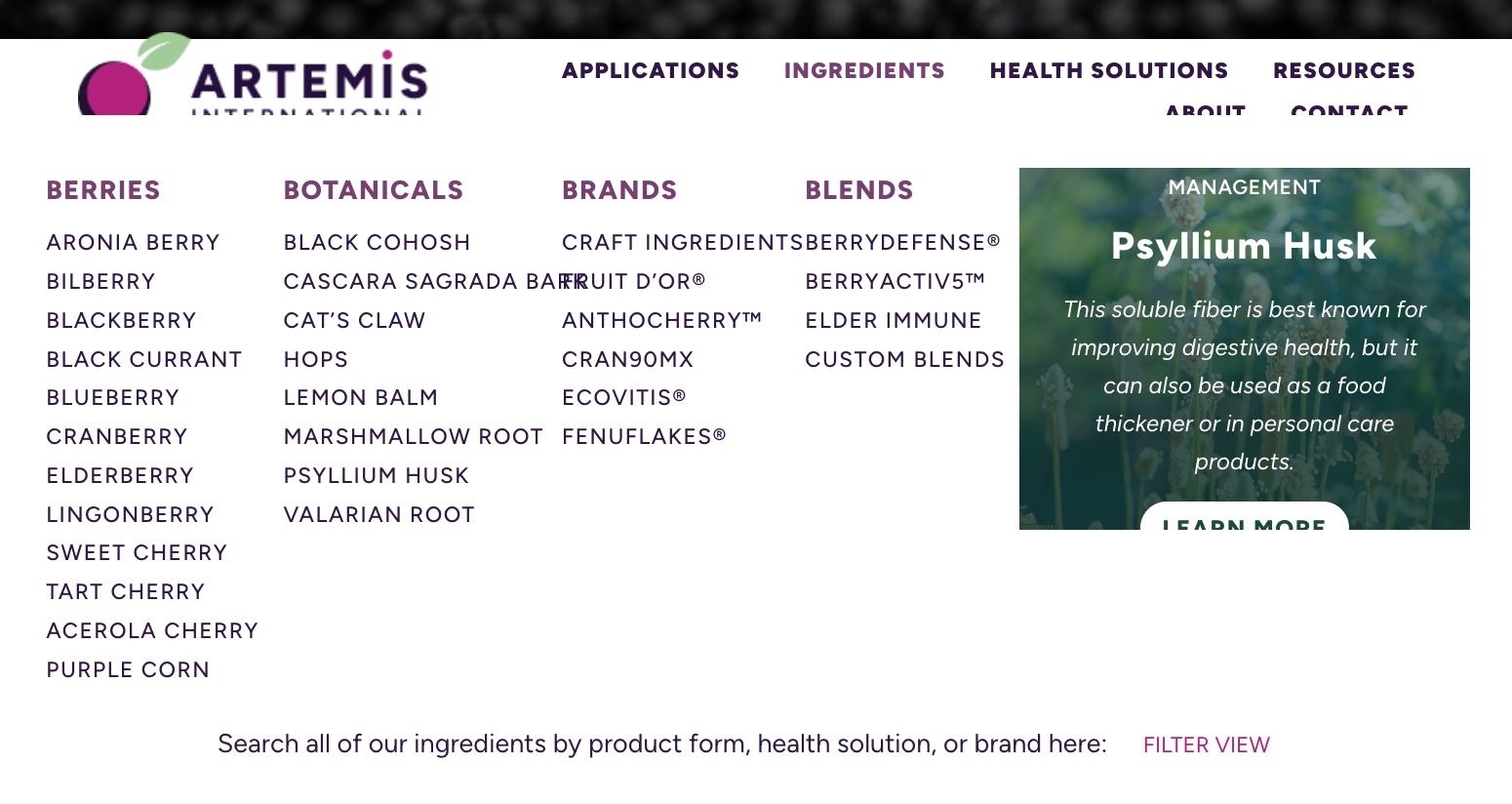
- I would like the megamenu drop-downs to be z-positioned below the header menu, so in instances (like the screenshot below) where the menu drops to 2 lines, the megamenu doesn't overlap the header and logo. I have set the z-positioning to 2 on the header menu, and 0 on the megamenu dropdown, but the dropdown still show in front of the header menu. Can you help me troubleshoot this?
- In the same image above, you see that the text on the menus overlap when the site is viewed on a narrower window. The best example is with "Cascara Sagrada Bark." Can I make the menu items wrap to 2 lines, if it doesn't fit within the column?
- In the "Resources" dropdown, the titles (Resources, Latest Research, and Upcoming Events) are all supposed to be aligned with the top of the menu. I have been unable to find a reason for the gap above "Resources." Can you help me figure this out? This gap happens even when I create a new headline, or copy over one of the headlines that is working properly. The settings on the wrap containing resources are all top aligned.
I really appreciate any help you can provide!
Thanks,
Hillary


Comments
Hi,
@media only screen and (min-width:768px) and (max-width:959px){ .mfn-menu-item-megamenu { top: 160%; } }.mfn-megamenu-menu a .menu-label { white-space: wrap; }Hi,
Thanks for your suggestions. The first and last worked, but the middle one is having a weird effect. As you can see, when the lines wrap, they create odd gaps and 'empty lines' in the menu:
Do you have any advice for how to fix this issue? I have the CSS activated on my site now, so you can see it on any page:
Thanks!
Try to add this CSS code as well:
.mfn-megamenu-menu > li{
 align-self: start;
}
Best regards