Product tabs flex and responsive padding goes crazy on multiple websites
Product tabs:
On multiple websites the flex and responsive function going crazy.
On mobile:
Images more than 400px in the product content leave the screen on the right side. The container padding just quits when the screen gets to narrow.
On the short product description everything is fine and the theme padding works.
This is new for me and I'm very sure it has to do with a theme update.
There are no issues with plugins, have php 8.1 loaded and I also did troubleshooting in the browser, this gives zero results.
This is a hard coding issue of the theme and a global one.
Please fix it and update 🙄
Kind regards Walter

Comments
Hi,
any link to page that you refer to?
Hi there,
I created a test product.
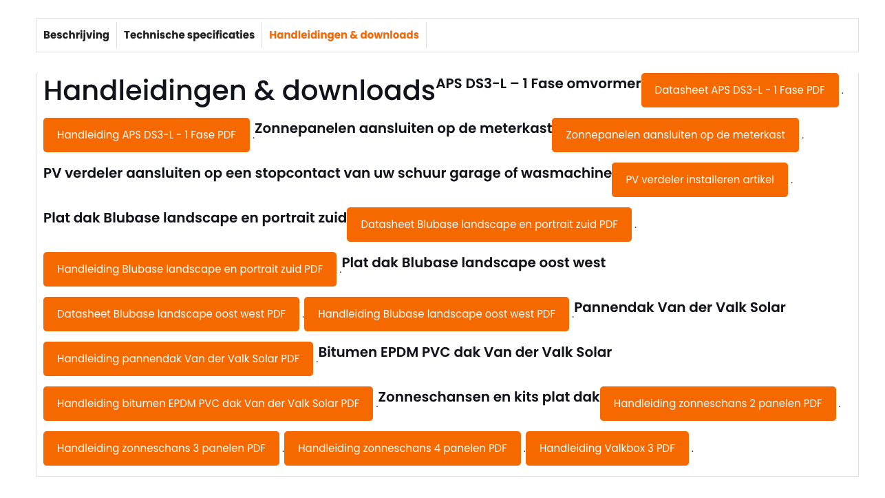
Image and text under tabs leave screen on mobile. The rest you can see yourself. I hope there is a way to solve this. This is not the only website this occurs.
https://solarkits.nl/product/testproduct/
To the element on the screenshot below an inline style is assigned for a custom width:
As you can see, after I disabled it, the display is correct.
Please edit this element and remove this style.
Best regards
Thank you. Do you have a solution for the other tabs?
Can you be more specific, please?
It would help if you attach a screenshot showing that.
Thanks
https://solarkits.nl/product/testproduct/
Hi,
The remaining tabs display correctly after removing the inline style from the div in the browser console, as I mentioned earlier. Please locate the following image on your site and remove the fixed width of 1510px from its container.
https://solarkits.nl/wp-content/uploads/Blubase-Connect-oost-west-afmetingen.jpg
<div id="attachment_3119" style="width: 1510px;" class="wp-caption alignnone">Best regards
Thank you, but I mean the second tab.
Hi,
To improve the buttons spacing, paste the following code in Theme Options > Custom CSS:
.mfn-woocommerce-tabs-content .button {
margin: -10px 10px 15px;
}
Best regards
What is this screenshot for?