
How to Prevent Elements in a Section from Overlapping the Next Section Across Devices?

Hi,
How can I ensure that all elements within a section do not overlap with the section below?
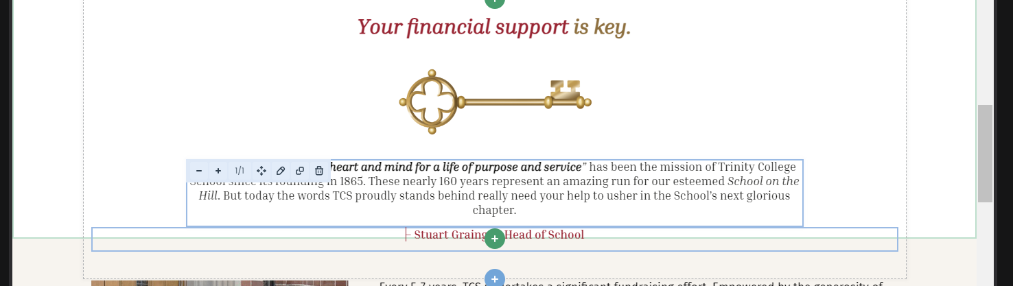
For example, in the attached image, the red text box is part of the upper section (white background) and should have extra white space underneath it. This works in desktop view, but in laptop view, it's too close to the beige section below.
In other words, is there a way to format each section's height so that all its elements (including spacers) stay within the section across all devices?
Thanks for your help!
Comments
Hi,
Please always attach a link to your website so we can check it out. If the page is offline(localhost), then our help will be limited. You will have to contact us when the page is online. Also, please make sure that the page is not under maintenance before you provide us with the link.
Thanks
Hi,
Here it is: [Links visible only for registered users]
I've been trying to play around with custom section heights but it makes it very long and painful to have to readjust each device view every time I modify elements within a section. Again, I'd like to understand how to ensure all elements of a section remain inside their corresponding section no matter what. Thanks a whole lot!
Are there any extra steps to reproduce that?
I checked your website with widths for laptop views, and it shows like this for me:
Best regards
Thanks for getting back to me.
I have been making more modifications since then but seeing your screenshots, it looks OK indeed. It didn't on mine and couldn't figure out why. Have you made any changes on your end?
No, I did not perform any actions. I only opened your website, and this is how it looked for me straight away.
I checked it with Firefox and Chrome.
Best regards