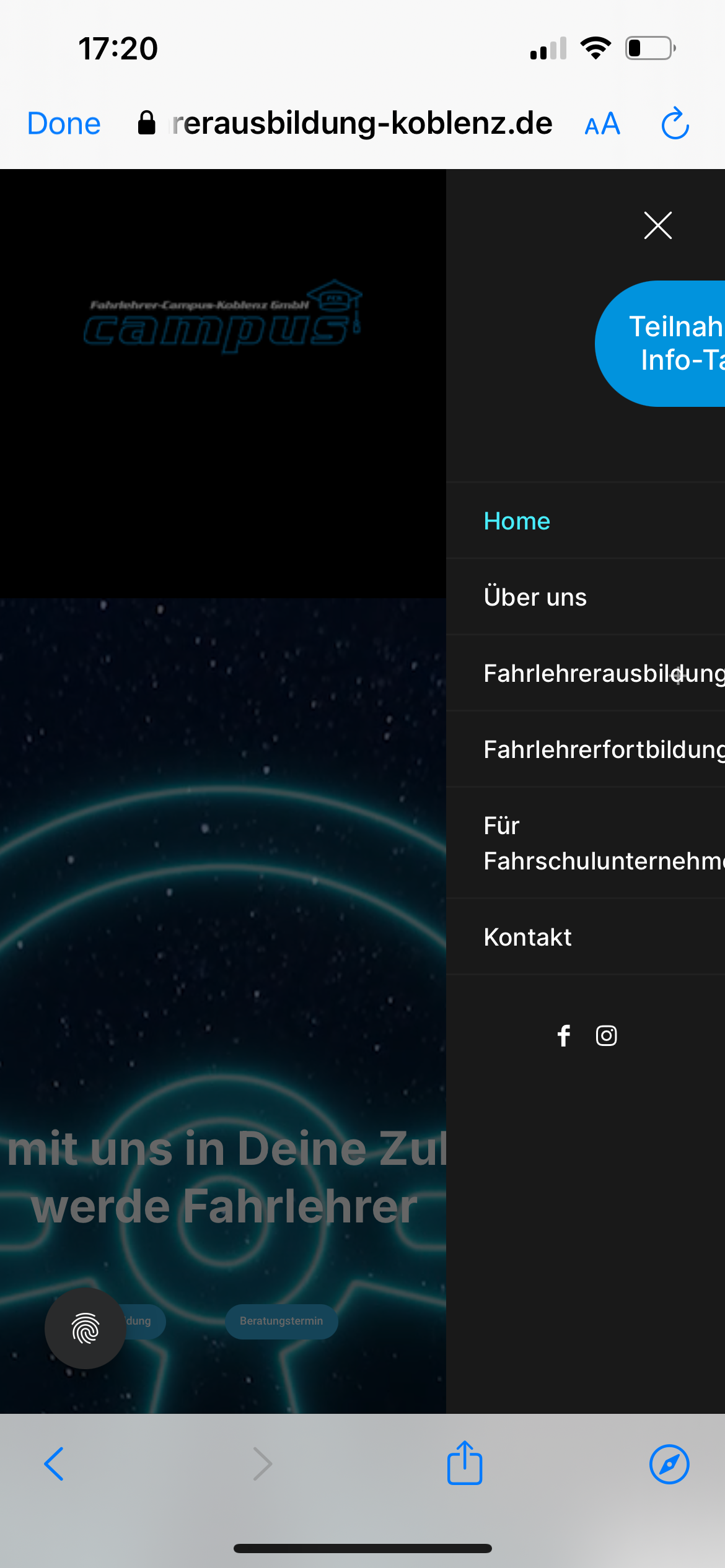
Stack Center Header is not working on the mobile version.
Hi,
We use Stack/Center Header and when it is mobile version the menu is width is somehow smaller. Can we fix this somehow?
Please see in the image:
Normally BeTheme menu width is bigger and responsive.
Thank you in advance.

Comments
Hi,
Please always attach a link to your website so we can check it out. If the page is offline(localhost), then our help will be limited. You will have to contact us when the page is online. Also, please make sure that the page is not under maintenance before you provide us with the link.
Thanks
https://fahrlehrerausbildung-koblenz.de/
sent login details to: https://themeforest.net/user/muffingroup
It is because of your custom CSS code:
When you remove it, the display will be correct.
Best regards
No, this does not work...
The menu is still cut...
Could it be this?
The button was overlapping so your support gave me this code to add :)
I removed Cash :)
That is because you set up Side slide width to 150px.
You can increase this value in Betheme -> Theme options -> Responsive -> Header.
Best regards
Thank you so much!!! It works!