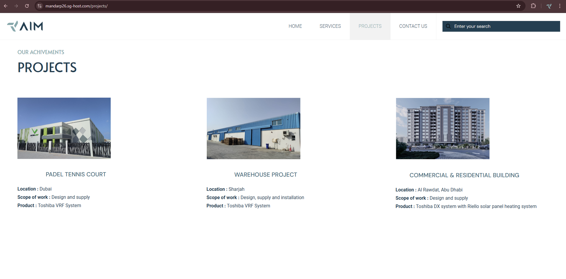
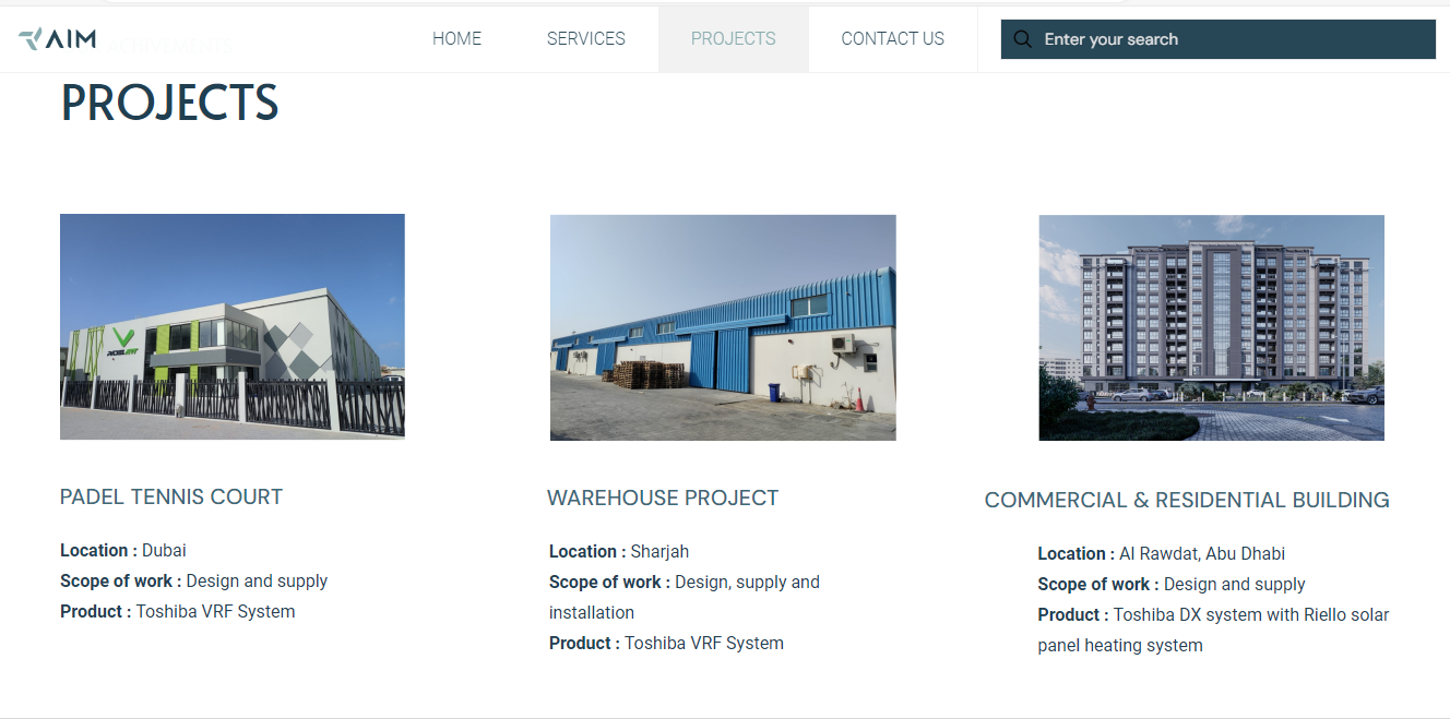
Website view is not proper
hi team,
my website is showing fine on my desktop, but when we open it on other desktop, its size is reduced.
Whatever content visible on my side with 100% view is showing like 80% view in some other desktops.
Is there any changes do i need to add, pls guide.
Attached snip for your reference.
- view from other desktop-
View from my desktop-
All images are with 100% view.
Pls guide and suggest any changes if required.
Also when we scroll any page then control will go to next page.
How can we implement that ?


Comments
Hi,
Please always attach a link to your website so we can check it out. If the page is offline(localhost), then our help will be limited. You will have to contact us when the page is online. Also, please make sure that the page is not under maintenance before you provide us with the link.
Thanks
for projects page- Projects – AIM
for home page- AIM
Above are the urls for respective pages, pls check
Please turn off all of the plugins, refresh your cache, and check if the problem persists.
Moreover, if you use a child theme, switch to parent, and recheck it.
Thanks
Also when we scroll any page then control will go to next page.
How can we implement that ?
Sorry, but I do not understand what you want to achieve.
Can you explain that in more detail or attach some examples?
Best regards
i want my website in one page, whenever we scroll down next page will open.
pls refer below website for your reference- AIM
Please see the following video tutorial:
https://support.muffingroup.com/video-tutorials/how-to-create-one-page/
Best regards
Hi
After making suggested changes, website is still not showing properly in some of devices.
How can i fix the same alignment for all devices as visible in my system.
Pls guide.
thanks
Please send us the WordPress dashboard and FTP access privately through the contact form, which is on the right side at https://themeforest.net/user/muffingroup#contact and we will check what might be the reason.
Notice!
Please attach a link to this forum discussion.
Sending incorrect or incomplete data will result in a longer response time.
Therefore, please ensure that the data you send are complete and correct.
Thanks
hi
Requested details sent on mail
pls check and update
pls refer below images for better understanding-
My Laptop view-
My Users Laptop view-
Monitor view-
I need same view for all devices, which is in my laptop. There is alignment issues for images and heading on all devices.
Pls guide me on same so that website will be visible to all devices with same alignment and view as in my laptop.
I deactivated all my plugins and activated again, also switched from child theme to parent theme but still issue is not solved.
Pls guide ASAP.
I have activated the stretch option for these images:
Please check it out.
Best regards
hi
only images are stretched, content is not getting aligned in big screen.
We need content and image on same alignment
pls guide
Please open the Fancy Heading style tab, and set the alignment to the left:
Best regards
what about other 2 images,
if we select test align left for other 2 images then content is view is breaking
Also home page is not fully visible on desktop, it should be same as visible in laptop.
where can i find setting for same.
Pls guide
That image should be visible on complete page, that HOW WE CAN HELP part should be visible after scrolling only.
It is working fine in laptop but not in desktop.
Pls guide.
Page url- AIM
1) You assigned a negative margin to the title:
2) This is how it looks for me on desktop view:
As you can see, the scroll bar is at the top.
Anyway, you can adjust the slider height in the slider edition.
Best regards