
BeTheme - Side Margins on Mobile and Tablet

Hello,
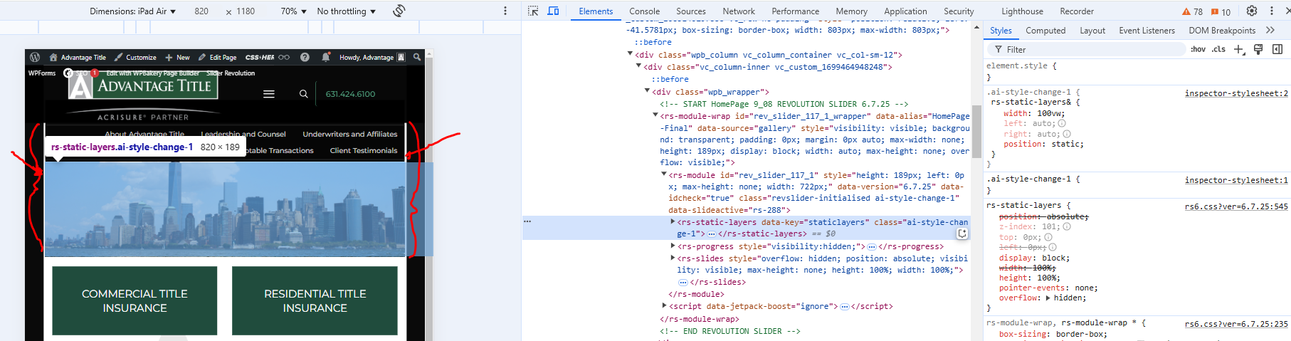
My site is working nicely in desktop, however when I resize the browser I am getting a small side margin that I can't figure out how to fix. The Home page was originally built using WPBakery. Is there a setting in the BeTheme options I am missing? The small side margin is visible on the top slider and the testomonials that run on the bottom of the page, I've tried to be careful with adding CSS tags @media only, however I still haven't been able to find a solution to this issue.
Stan from Revolution support points out that:
"BeTheme adds 1% side margin for contents and on your screenshot it pretty clearly seen that not only a slider has that offset. You need to check the theme builder settings if it’s possible to change the offset or ask the theme devs for assistance"
Comments
Hello,
This issue has been something I've been working on for a while and Phil helped me fix it on the desktop, this fix helped most of the media sizes, here is the CSS
/*Betheme support fix*/
body.layout-boxed .vc_row[data-vc-stretch-content="true"]{
margin-left: -2%!important;
margin-right: -2%!important;
}
Quite sometime ago we added this @media only CSS directly to the page to fix the top menu and logo on mobile devices, could I add something else to fix this tiny white margin issue?
@media only screen and (max-width: 600px) {
#slider-row {
margin-top: -65px !important;
}
}
So, to try and clarify, here's a screenshot of the bottom section - testimonials in iPad Mini resolution, if I could only get these sections to be full width...
For the custom css @Phil gave you above, you need to add the following custom css as well:
/* Tablet */ @media only screen and (min-width:768px) and (max-width:959px){ body.layout-boxed .vc_row[data-vc-stretch-content="true"] { margin-left: -2.4% !important; margin-right: -2.5% !important; } } /* Mobile */ @media only screen and (max-width:767px){ body.layout-boxed .vc_row[data-vc-stretch-content="true"] { margin-left: -1% !important; margin-right: -1% !important; } }Thanks, Albert
I will give it a try