
Sidebar menu opens automatically and overlaps header on tablet/mobile + hover effects not working

Hi,
I’m having an issue with my Betheme header on tablet and mobile view.
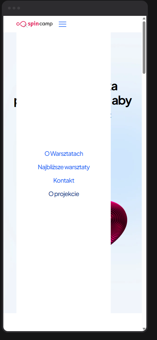
When I resize the screen, a sidebar/off-canvas menu appears automatically — it’s already expanded and overlaps my existing mobile header.
It looks like two menus are being displayed at the same time.
On desktop everything works fine, but on smaller screens the sidebar (mfn-header-tmpl-menu-sidebar) opens by default and covers part of the layout.
My website is: www.spincamp.pl
I’m using a Header Template created in BeBuilder, without any custom CSS or JS related to the menu.
Also, I’m not sure how to make hover effects (color change ) display correctly for the menu items — currently, the links don’t react when hovered.
Could you please advise how to:
- Prevent the sidebar menu from opening automatically on tablet and mobile, and
- Make the hover styles for menu items work properly?
Thank you very much for your help!
Comments
Hey,
Please send us the WordPress dashboard and FTP access privately through the contact form, which is on the right side at https://themeforest.net/user/muffingroup#contact and we will check what might be the reason.
Notice!
Please attach a link to this forum discussion.
Sending incorrect or incomplete data will result in a longer response time.
Therefore, please ensure that the data you send are complete and correct.
Thanks
The culprit is the bedoctor-gs1 global section. I do not know how, but you put Header Burger element into this section.
I have removed it from there.
Regarding the menu hover and active menu item you can set the color in the Style tab of the menu element:
Note that your homepage highlights three menu items, as they all point to anchor links on the same page. I suggest activating the One Page option for the homepage:
Best regards
ok, thx, what about colors in main menu?
I have explained the part about the colors in the menu in my previous message.
Best regards