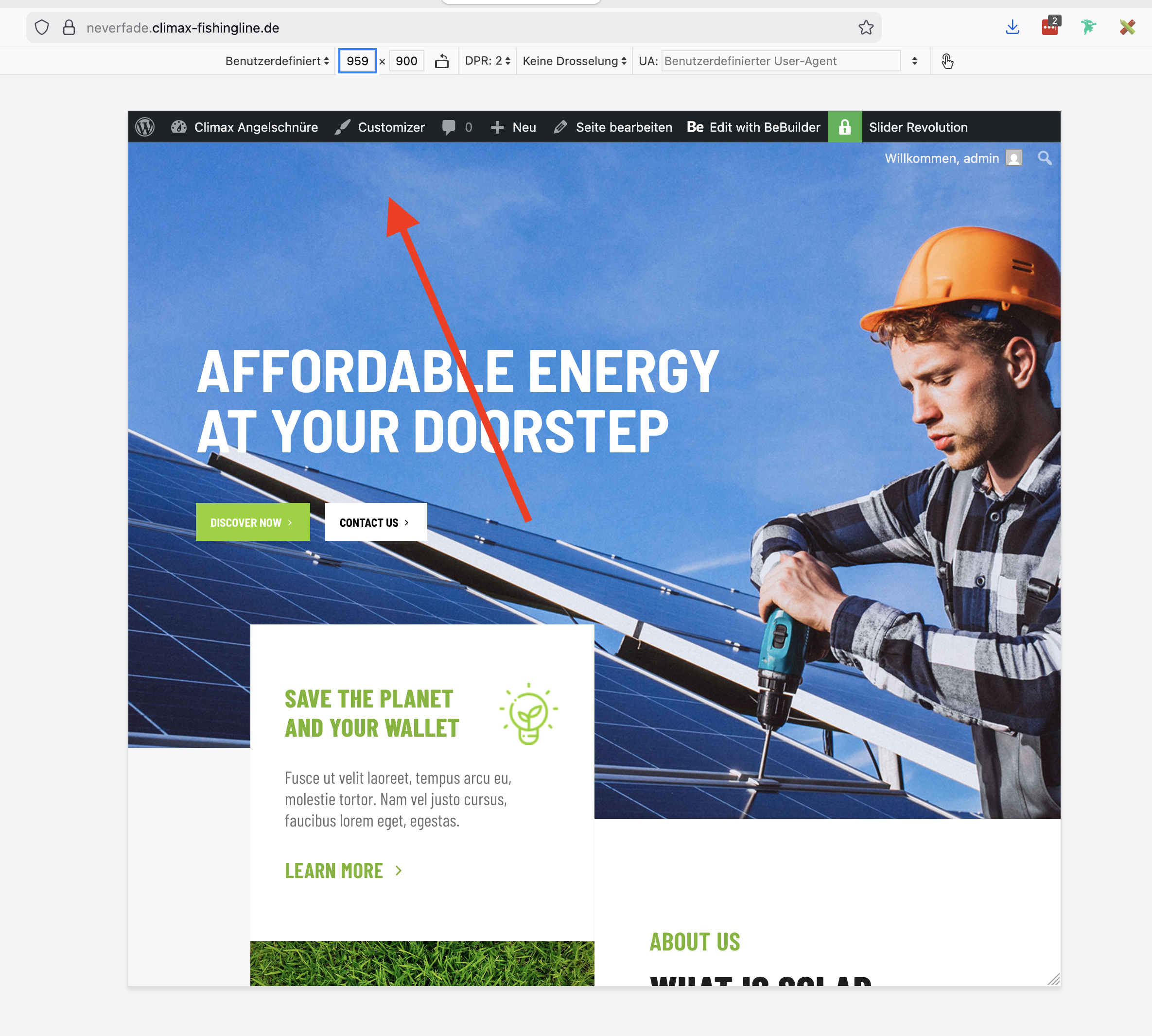
Menu gap from desktop to mobile
Hi there,
I am working on this website https://neverfade.climax-fishingline.de (PW: andigehtangeln) and I have a problem with the menu I created using templates.
I´ve setup a menu for desktop / laptop and one for tablet / mobile.
Displaying and hiding them accordingly.
But I have a gap:
between 959 and 768 pixels screenwidth none of the both menus are being displayed (see screenshots).
Could you please tell me, where I am wrong and help me display the menus correctly?
Many thanks
and best regards,
Daniel


Comments
Hi,
Please check if you did not hide the section (the one that is displayed on desktop) with the responsive visibility on the tablet.
https://support.muffingroup.com/video-tutorials/responsive-editing-in-bebuilder/
Best regards
Hi Phil,
You are so right - I made a third menu for mobile and was hiding the whole menu (section) on desktop / laptop viewports.
Now I´ve deactivated the "mobile" setting in the menu and added the burger menu to the default and sticky menus.
That worked.
Many thanks and
best regards,
Daniel
As always, I am glad I could help.
If you have any other questions or problems, feel free to ask.
Best regards