
Side Cart

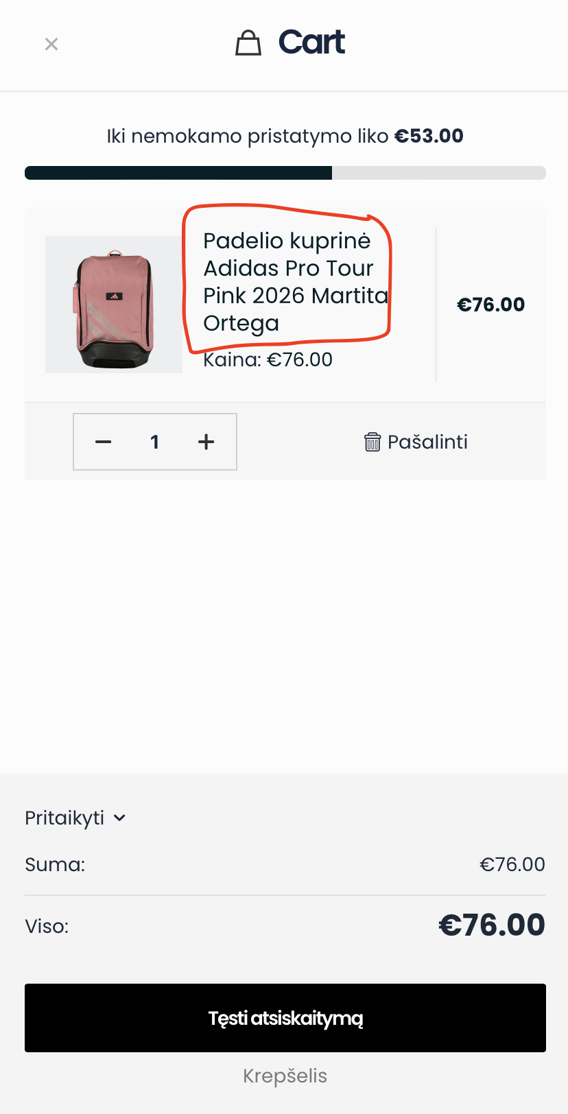
Hello where I can change font size of Side cart product item name?
Also where I can translate Side cart on the top "Cart"?
Hello where I can change font size of Side cart product item name?
Also where I can translate Side cart on the top "Cart"?
Comments
Hi,
1) It would require writing a custom CSS code. I can help you with that, but I will need a link to your website.
2) It is taken from the cart page title. When you change it, the title will change in the side cart as well:
Best regards
Thanks. I also have problem with theme update after trying to update I've got Error: "An error occurred while updating Betheme: Could not move the old version to the upgrade-temp-backup directory"
Please try to do the tips mentioned in the following link:
https://wordpress.org/support/topic/update-failed-could-not-create-the-upgrade-temp-backup-directory/
Best regards
Thanks Phil, can you please advise how to move in header mobile version logo in the middle?
Please attach a link to your website so we can check it out. Also, please make sure that the page is not under maintenance before you provide us with the link.
Thanks
https://raqedo.com
You must have three wraps on mobile. The left one should have a hamburger menu, the middle one the logo, and the right one can remain empty. Wraps on the sides should have the same width:
The middle should take the rest of the space, and positioning set to the center:
Best regards
Hello how it's possible to remove mobile version bottom navigation with Cart, Wishlist etc..?
Go to Betheme -> Theme options -> Shop -> General, and set to hide the Sticky shop menu:
Best regards
Thank you. And how I can make Mobile version menu that on the left side will be "Hamburger menu" in the middle "Logo" and on the right side "Cart"? And in desktop version will be like in this screeshot?
Do as I described here:
But put the cart icon in the wrap on the right.
Best regards
I tried this but if I'm making wraps in mobile version it also changing and desktop version... Is it possible somehow to log in in my website and do this?
Our support team is here to help guide you through the process and provide assistance whenever questions or technical issues arise. While we are unable to build or assemble the website on your behalf, we will be more than happy to explain each step, offer recommendations, and help you find the best way to move forward.
The following video tutorial should give some more light on building mobile headers:
https://support.muffingroup.com/video-tutorials/building-mobile-headers/
If you have any further questions, feel free to ask.
Best regards
Thanks a lot it helped me to build header as I wanted. One more question. If I have Mega Menu in Desktop version and I want when I click in mobile version on element that displays a mega menu?
Mega menus do not display on mobile.
You should prepare an appropriate menu for mobile display and assign it to the menu burger element.
If you want to build a custom sidebar menu, you should use a sidebar menu template.
https://support.muffingroup.com/video-tutorials/sidebar-menu-vertical-header-builder/
Best regards
Thank you, one more question is it possible to change icon in marked screenshot? And make it way smaller? I couldn't find any settings of this
Can you tell me how exactly you want to change it, please?
A custom CSS code might be required for that.
Best regards
I would like to make smaller icon and change icon for zooming a photo
Thanks, but I need you to be more precise.
How much smaller?
To which icon do you want to change the current want?
Thanks
1/3rd smaller than now, I want to change icon which zooming photo which is in the white background into "resize-zoom" icon.
And one more question how to add filter section in shop page in the left side of shop page?
1) Use the following CSS code:
.single-product .mfn-product-images-wrapper .woocommerce-product-gallery__trigger:after{
 display: none;
}
.single-product .mfn-product-images-wrapper .woocommerce-product-gallery__trigger:before{
 border: none;
 content: '\e90e';
 font-family: 'mfn-icons';
 font-size: 18px;
 color: #000;
 margin-top: 7px;
 margin-left: 2px;
}
.single-product .mfn-product-images-wrapper .woocommerce-product-gallery__trigger:hover:before{
 color: #04bfad
}
Put it in Betheme -> Theme options -> Custom CSS & JS -> CSS.
2) See the following video tutorial:
https://support.muffingroup.com/video-tutorials/ajax-advanced-filtering-live-product-filters-for-any-post-type/
Best regards
Thank you for css code. It change the icon and reduced it. And how to make smaller white background in which is the icon?
Use also this CSS code:
.woocommerce .mfn-product-gallery-grid .woocommerce-product-gallery__trigger{
 width: 30px!important;
 height: 30px!important;
}
You will also have to adjust margin values to position icon inside:
Best regards
Thanks I adjust for myself. One more question how it's possible to display "Product description" not in Tabs but in Accordions?
In a single product template, there is no option to have product description in accordions, and only tabs are available there.
Best regards