Hi, I've been looking into shipping options, but I've only found this one, which is not user-friendly at all. Could someone please advise how to make shipping and payment more user-friendly, or ideally make it another step in the ordering process? Thank you


Comments
Hi,
Please explain in more detail what you want to achieve.
Thanks
Thank you for your question.
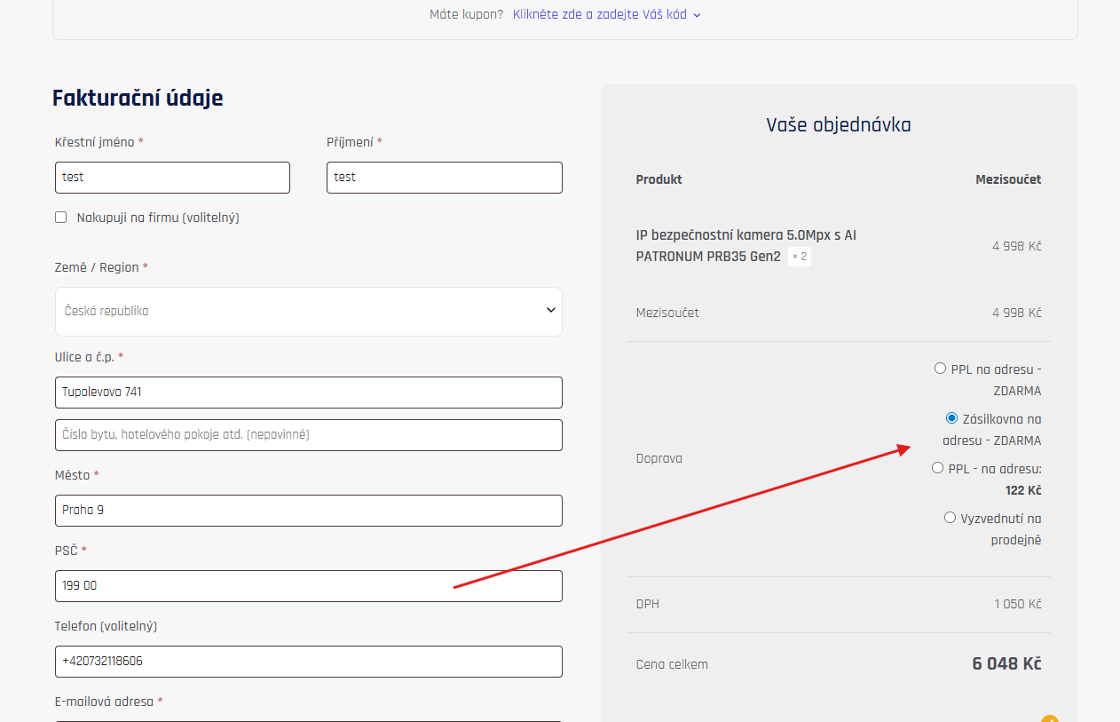
But most of all, I would like to achieve a better display of the transport selector. The options squeezed into one column are not overlooked at all. The ideal solution is shown in the image below.
You can make this entire block full-width by using cart template:
See the following video tutorial:
https://support.muffingroup.com/video-tutorials/cart-checkout-thank-you-page-builder/
Best regards
Yes, there is bottom option, but athats all what i cant change in checkout blok?
These blocks are predefined, and you cannot rearrange fields and parts inside them.
Best regards