
Change the location of the hamburger button

Hello,
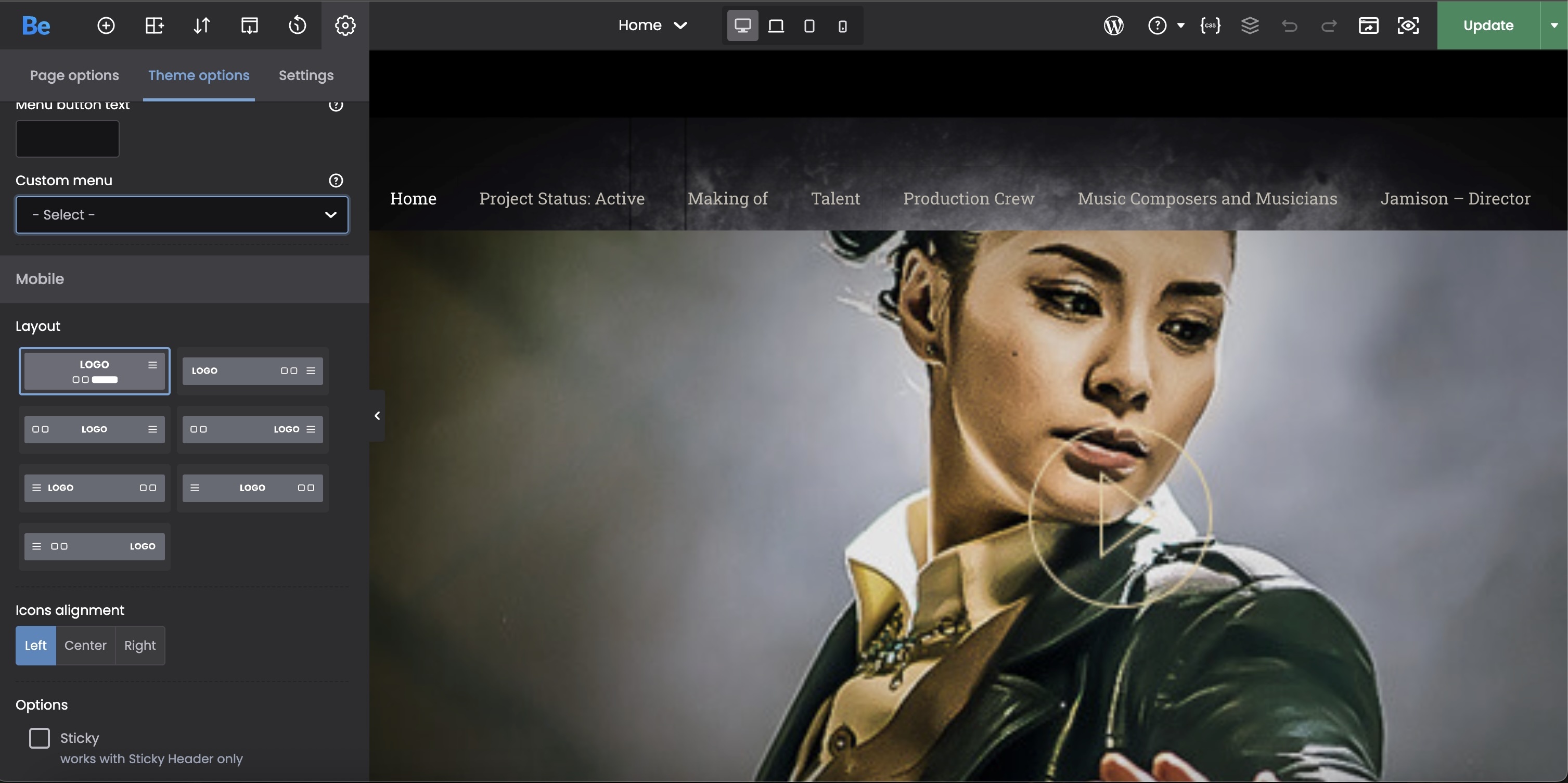
Where do I change the location of where the hamburger button is located for the iPad-size version of the website? For the mobile version, it's automatically on the right (where it needs to be), but on the iPad version, it switches to the left-hand side of the screen. As you can see in the attached image, the hamburger button is set to be on the right (in Theme Options), but it's on the left.
Thanks, JL
Comments
Hi,
Please always attach a link to your website so we can check it out. If the page is offline(localhost), then our help will be limited. You will have to contact us when the page is online. Also, please make sure that the page is not under maintenance before you provide us with the link.
Thanks
Oh, I'm sorry. Here's one of the pages where the hamburger button is on the left using the iPad, but it's consistent with all of the pages on the website.
Click here.
Thanks, JL
Thanks, I have passed it on to the dev team, and we will make adjustments to this.
For now, please use the following CSS code:
@media only screen and (max-width:960px) and (min-width:768px){
 #Top_bar .menu_wrapper .responsive-menu-toggle{
  float: right!important;
 }
}
Put it in Betheme -> Theme options -> Custom CSS & JS -> CSS.
Best regards
Hello,
I placed that code into the website. I checked it with my iPad and the hamburger button is still on the left-hand side of the screen. Further, it shows the button is on the right-side (where it's supposed to be) in the viewing mode. (Difficult to explain, so I'm sending a picture.)
I'm currently in two different discussion forums (I thought I was done with this hamburger button issue). If you need to log in to our website, I sent that information to you in a private message already. Here's the other discussion forum: click here.
It says the button is on the right:
My iPad's screenshot:
Thank you, JL
Please replace the previous code with the one below, and recheck it:
@media only screen and (max-width:1240px) and (min-width:768px){
 #Top_bar .menu_wrapper .responsive-menu-toggle{
  float: right!important;
 }
}
Best regards
I placed the new CSS into the website. On the iPad still, the hamburger button is now on the right, but the menu still appears on the left.
Thanks, JL
https://apparitionmovie.com/actor-darren-sliva/
Add also this CSS, please:
@media only screen and (max-width: 1239px) {
 .header-stack .menu_wrapper #menu {
  left: auto!important;
  right: 0!important;
 }
}
Best regards