
Space problem in Homepage

Hello,
I try a lot of time of understand how to resolve this problem regarding the space under the newsletter section in my homepage, web address is www.findgram.it and the broblem is gray space up footer, here the pictures of visualization in desktop and smartphone .... please can you help me?
Comments
Hi,
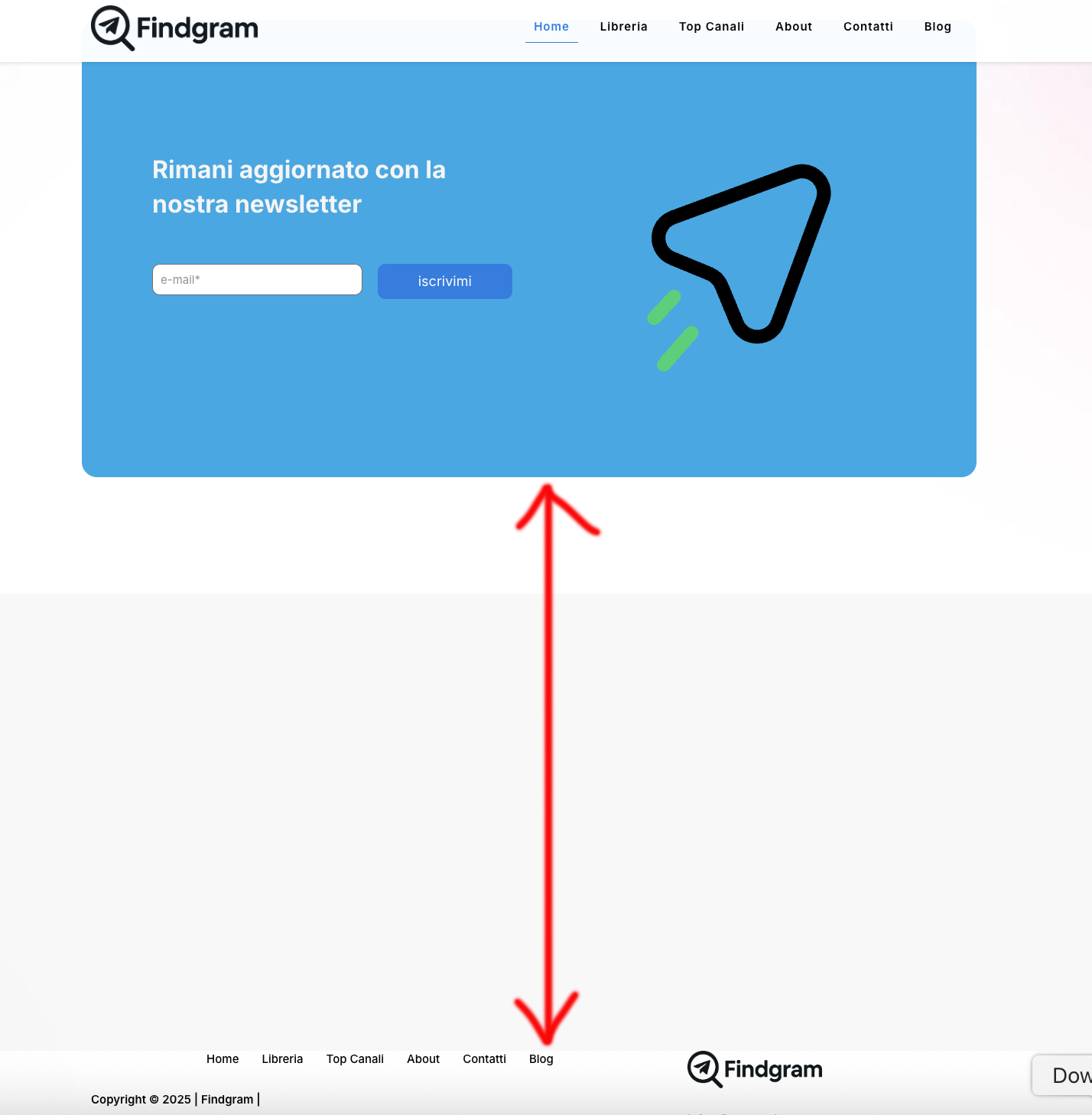
In this gray space, there should be this blue newsletter area, but you moved it up -750px:
When you remove this value, the newsletter will be placed like this:
Then the white space that will remain is caused by another -800px move up:
From what I see, almost all sections have these negative values for top property. That is not how you suppose to position sections or elements on your website. Clear this for all parts on this page, and check how it is displayed then.
Best regards
I know there are negative margins, but I added them myself because there was too much white space between sections on both desktop and mobile. I thought this was the only way to fix the layout. If I reset everything to zero, how can I properly adjust the homepage display?
So, ok as you can see I have removed all the negative values but foo example from this two sections there is a big space ... how I can reduce it?
I have now reset all the margins to their default values. Everything looks correct on the desktop view, but when I edit the page in mobile mode, I can't seem to get all the fields aligned properly. It's proving to be quite difficult—could you help me if I give you administrative access?
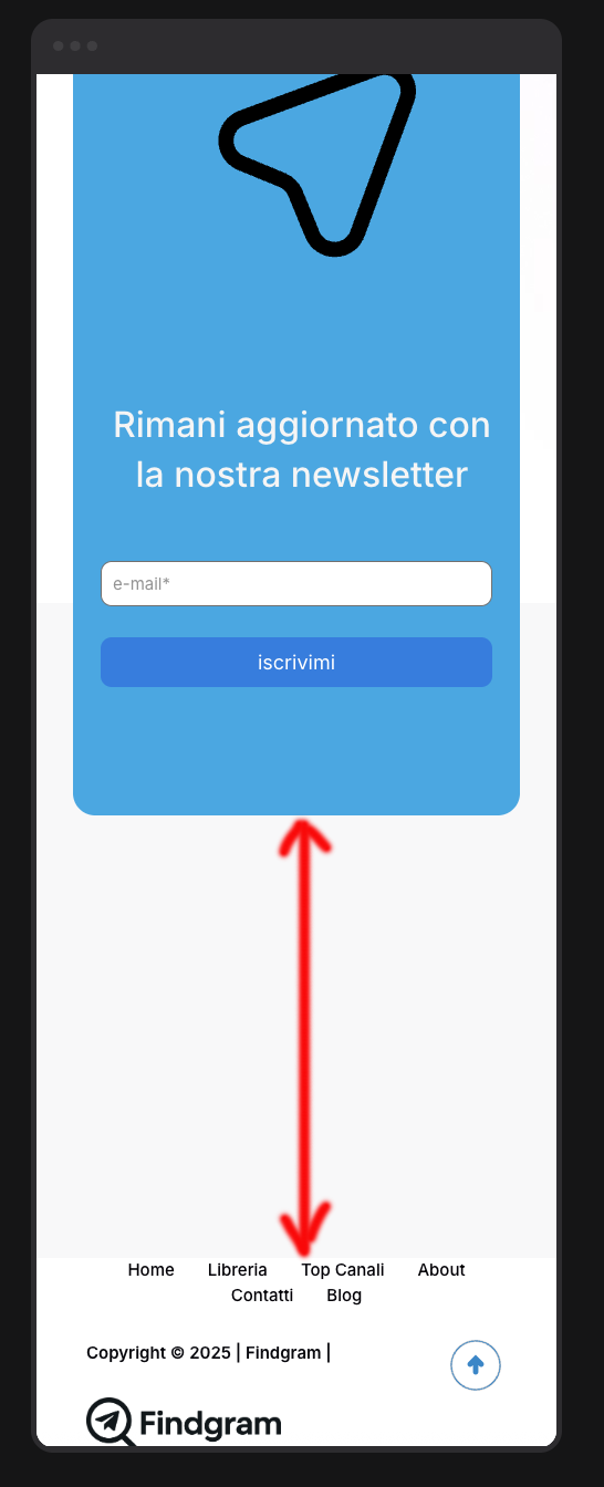
This is the actual situation in smartphone visualization!
That is because you still have negative values assigned to the mobile view:
You must reset it there as well.
https://support.muffingroup.com/video-tutorials/responsive-editing-in-bebuilder/
Best regards
I believe I’ve fixed the spacing issues. However, I’m running into a problem I can't seem to solve. The channel ranking section (week/month/all-time) is managed by the
functions.phpfile.Specifically, on the desktop view, I see 9 channels initially, and clicking the 'Show More' button reveals 3 more for a total of 12. On mobile, I would like to see only 6 channels initially, with 'Show More' revealing another 6. The issue is that while the 'Show More' button works perfectly on desktop, it isn't clickable on smartphone view and nothing happens when I press it.
Can you help me? If needed, I can send you my
functions.phpfile. Thanks!"Desktop
Smartphone
What you are asking for requires file customization, which is not covered by the standard support policy. As per the Item Support Policy [Links visible only for registered users], we do not offer free modifications or extensions of the theme's original functionality. Item policy says:
Item support does not include services to modify or extend the item beyond the original features, style and functionality described on the item page. For customization services that will help you tailor the item to your specific requirements, we recommend contacting the author to see if they privately offer paid customisation services.
If you would like our team to handle this for you as a paid service, please contact us via this link: https://muffingroup.com/betheme/customization/.
Thanks
Hello,
The problem is regarding theme setting and not regarding php file, because in desktop visualization the problem is not present, please check if in smartphone visualization there are some strange spage on theme layout.
Thank you.
I think there are overlay problem made by the theme in smartphone visualization becuase in desktop visualization all is perfect.
Please check it.
Thnx.
This part does not seem to come from our theme. Are you sure that you used the Betheme features for this area?
What element/post type did you use there?
Best regards
Let me explain why I believe this is a theme-related issue. In my
functions.php, I manage a 'Top 10' Telegram channel ranking. I've created a section calledclassifica_likewhich I use as a shortcode to display this leaderboard.Inside this section, there is a 'SHOW MORE' button that reveals additional channels from the Top 10. This button works perfectly on desktop; however, it is not clickable on mobile. I suspect this is caused by some sort of overlay from the BeTheme theme that sits on top of the button, preventing the click.
I have insert the shortcode like in this pic
I don't understand why the same shortcode works on PC but not on a smartphone, considering the code is exactly the same.
I can see that you changed the construction of this section. Anyway, I noticed that there is still some part that overlaps the section above:
Anyway, after all, it is not a Betheme-related issue, but the way you configured the layout.
Best regards
Thank you very much for your precious support, but please can you explain how to solve it?
Thank you.
If some sections overlap another, making some parts unclickable, you must get rid of this displacement, just as you did before.
As you can see on the screenshot I sent in my previous message, there is -650px assigned to the top value of the highlighted wrap.
Thanks again,
but unfortunately I can't find where to go to correct it, I've looked at all the settings but I can't find where to delete that one, if I let you access the backend as admin could you tell me where to go to change it?
Yes, please send us the WordPress dashboard access privately through the contact form, which is on the right side at [Links visible only for registered users].
Notice!
Please attach a link to this forum discussion.
Sending incorrect or incomplete data will result in a longer response time.
Therefore, please ensure that the data you send are complete and correct.
Thanks