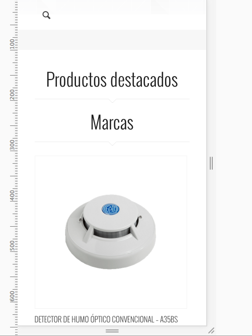
Hi, on my homepage i have the content build with muffin builder, and i have two columns 2/3 and 1/3 , both with fancy header and content, on pc, laptop they look ok, but on mobile the organization is bad, both fancy headers are one on top of the other and then the content of each column, and thats not good. each title on top of each content should be the right thing...
On mobile:

As you can see in the image, the titles are on top of each other even though they are separated in each column. help please. thanks
 As you can see in the image, the titles are on top of each other even though they are separated in each column. help please. thanks
 As you can see in the image, the titles are on top of each other even though they are separated in each column. help please. thanks
Comments
this is how responsive works exactly. In responsive mode, content is being read from the left to right side by rows. If you want to change this behave, use WRAPS items then.
Thanks!