
Make image overflow container

Hi,
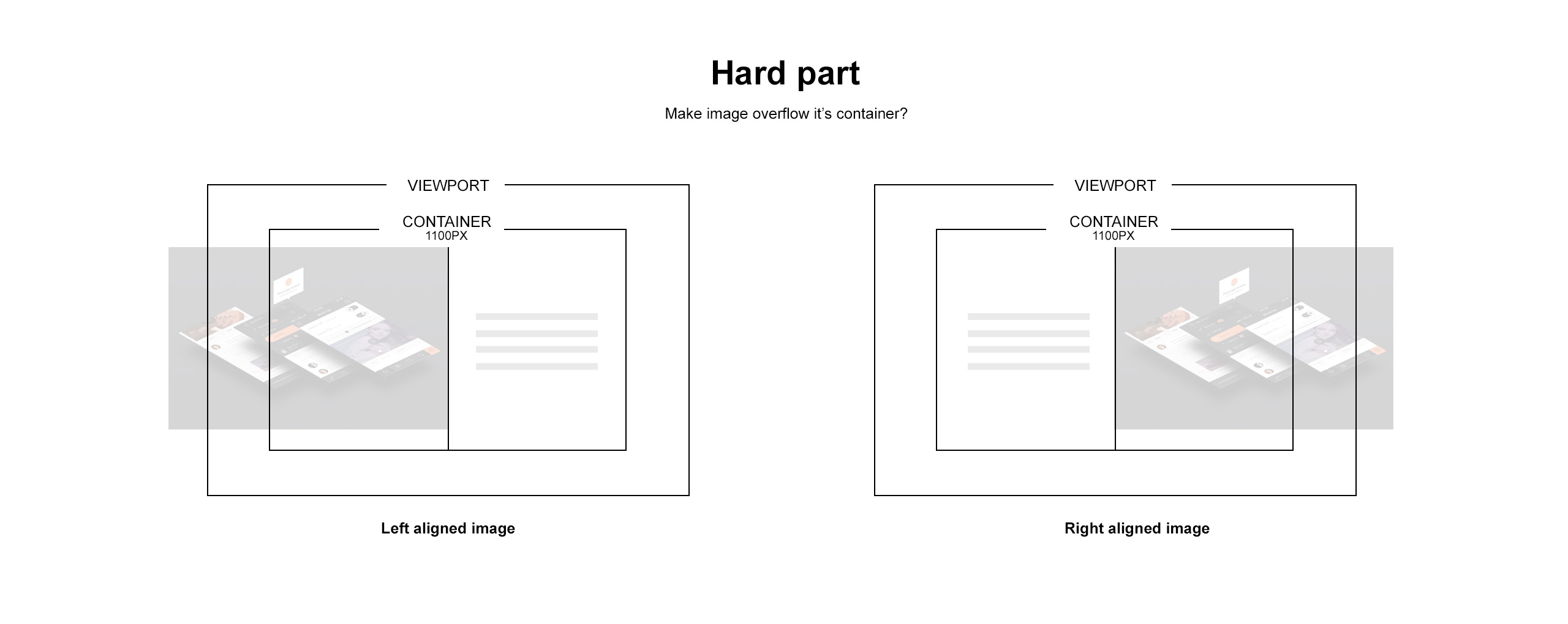
I'm trying to make a section with a 2/3 column of text on the left and a 1/3 image on the right, but have the image on the right cover the entire container area, mainly on big screens.
I'm trying to make a section with a 2/3 column of text on the left and a 1/3 image on the right, but have the image on the right cover the entire container area, mainly on big screens.
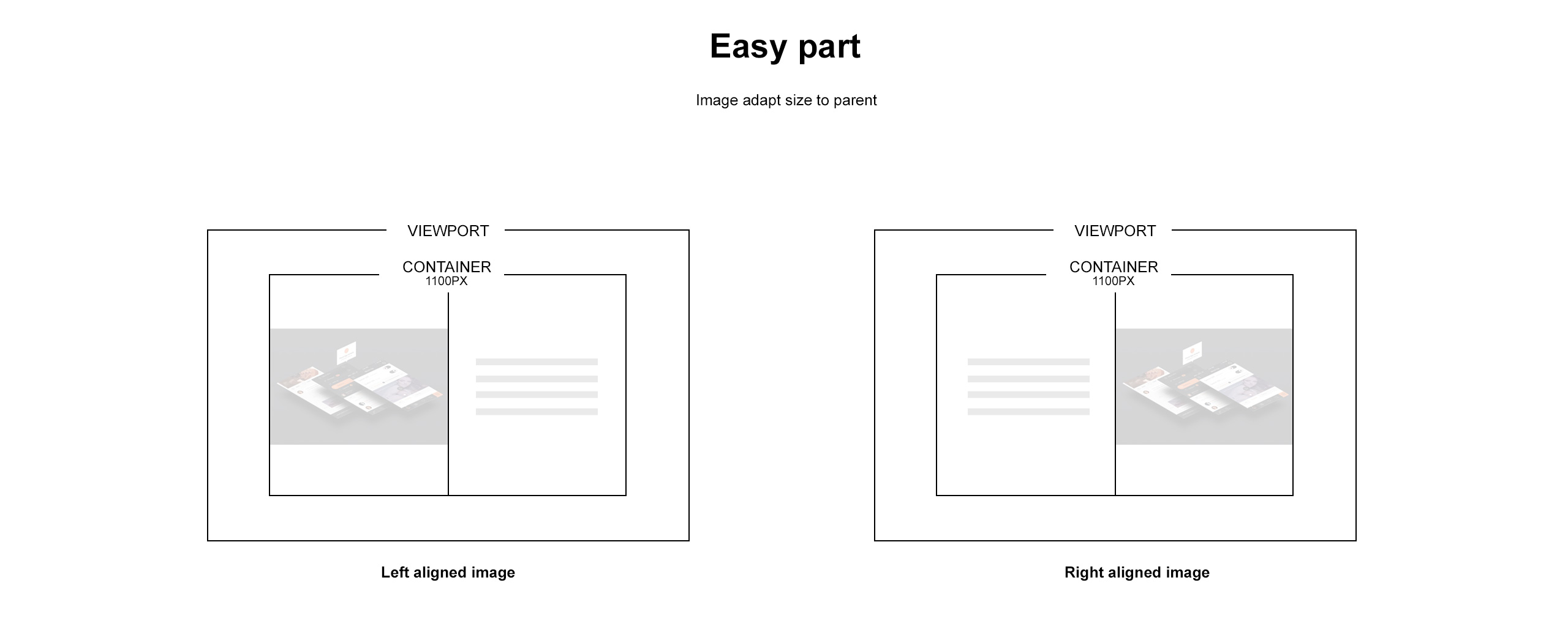
I can do this:
But want to create this:
The key is to keep the Main Content area width intact, for all screen sizes, for text on the left. If I mess with padding it throws out mobile or super larger screens etc.
The site in question is here, its the 1, 2, 3 text section with teh image on the right - [Links visible only for registered users]
The site in question is here, its the 1, 2, 3 text section with teh image on the right - [Links visible only for registered users]
Anyone help?
Comments
we would do this:
1. Make a section
2. Set the background image and align it to which side you want.
3. Edit the section and select the 'highlight left/right" style to have 1/2 of the section covered with color.
You can choose the color in theme options>colors>content
4. Use two 1/2 wraps and place the content on the covered side.
thanks