
Header Builder - submenu styles not working on some mobile devices

Hi,
My clients are reporting that on their iphones, the
sub-menus are white with white text which of course is not correct. On my iphone & ipad, it is
correct and represents what I have in the Styles in the Header Builder.
sub-menus are white with white text which of course is not correct. On my iphone & ipad, it is
correct and represents what I have in the Styles in the Header Builder.
Header Builder Settings>Styles:
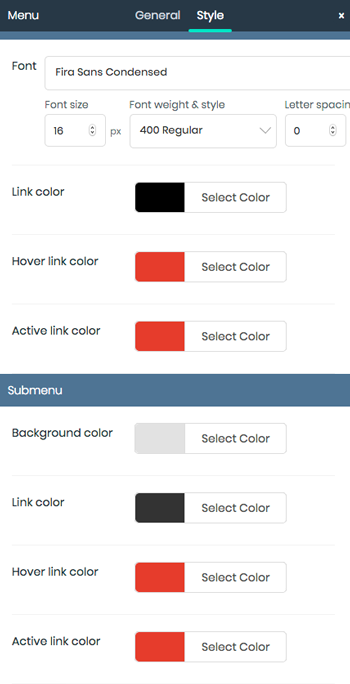
CORRECT Hamburger SubMenu:

INCORRECT HAMBURGER MENU SUBMENU

I also notice that the Hamburger Menu should be in red, and on the Incorrect One, it is white while the dropdown is activated (it should be red all the time.)
Thanks for any help you can give me. I just can't figure out how it can be displaying differently on different iphones! It is also correct (except for the font!) in the Google Chrome Emulator.
Cheers & Be Well!
Susan
Comments