
windows scale and layout

Hi,
I noticed that in some laptops, due to monitor size and resolution, windows by default recommend zooming everything!
See the following image.
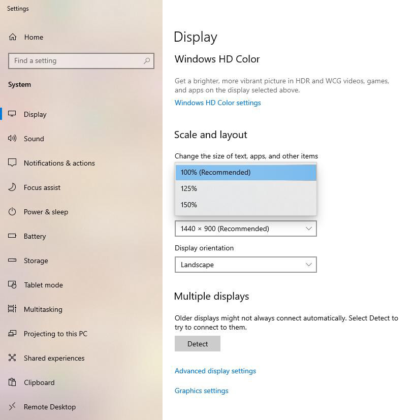
This is a "normal" monitor(23") . BUT many customers, have
devices that recommend 125% and 150% zoom (laptop monitor sizes: 14" or
smaller)!
This causes the site to be shown bigger and, sometimes, some of the elements cannot be seen.
devices that recommend 125% and 150% zoom (laptop monitor sizes: 14" or
smaller)!
This causes the site to be shown bigger and, sometimes, some of the elements cannot be seen.
Is there any way to ignore this zooming?
To help you, i found that there are some ways but i think that i cannot change the "master" css file and i'm afraid to edit anything in the "core".
Here are some links:
Is there a simple solution (i.e. a plugin) to force the site to be shown in its default size?
Regards.
Comments
thank you