Header Builder Responsive Settings
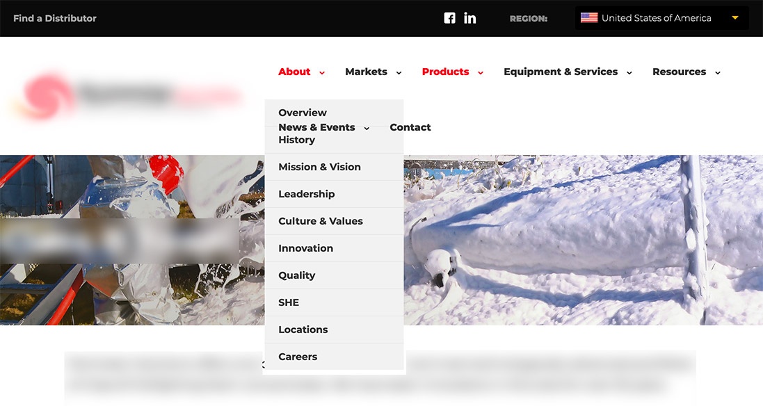
I'm using Header Builder and have a long menu. It displays fine in desktop layout but when I shrink the browser window it resorts to 2 lines before it reaches tablet size and forces the hamburger menu.
is it possible to change the responsive settings to force the hamburger menu when the desktop menu doesn't fit?
The menu on 2 lines makes some menu items inaccessible because the top row overlaps the 2nd row.

Comments
Hello,
Unfortunately, there is no setting to change the mobile breakpoint in the Header Builder plugin.
I can recommend you only to make your menu shorter by removing some items or adding them to the submenu.
Best regards