Display error p4c_ch
Hi all,
On my home page I have several problems, that need to be fixed. May I ask you your help, please?
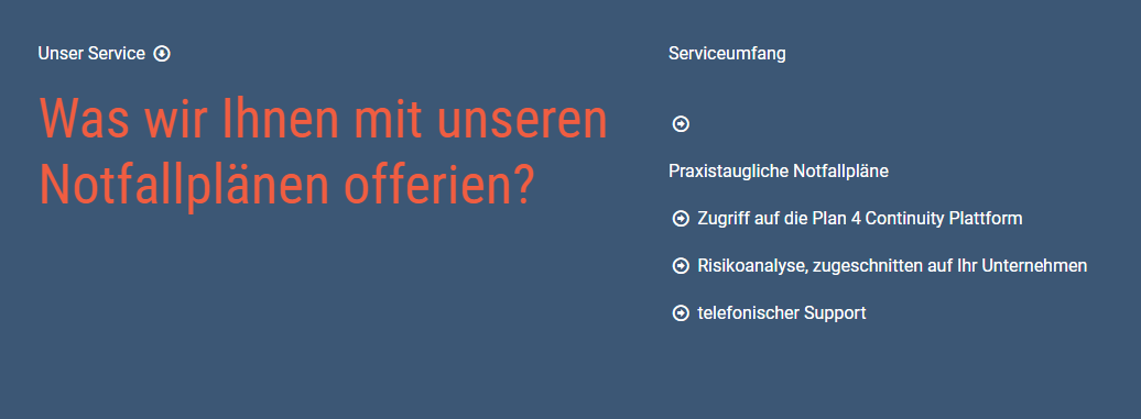
- Image 1.1 and 1.2. : How can I manage to have the sign « arrow » on the same line as the two words praxistaugliche Notfallpläne ? Obvisouly, on the other lines under it worked.
- Image 2 : How can I manage that the two phone numbers and the two e-mail adresses of the two different colums are on the same line?
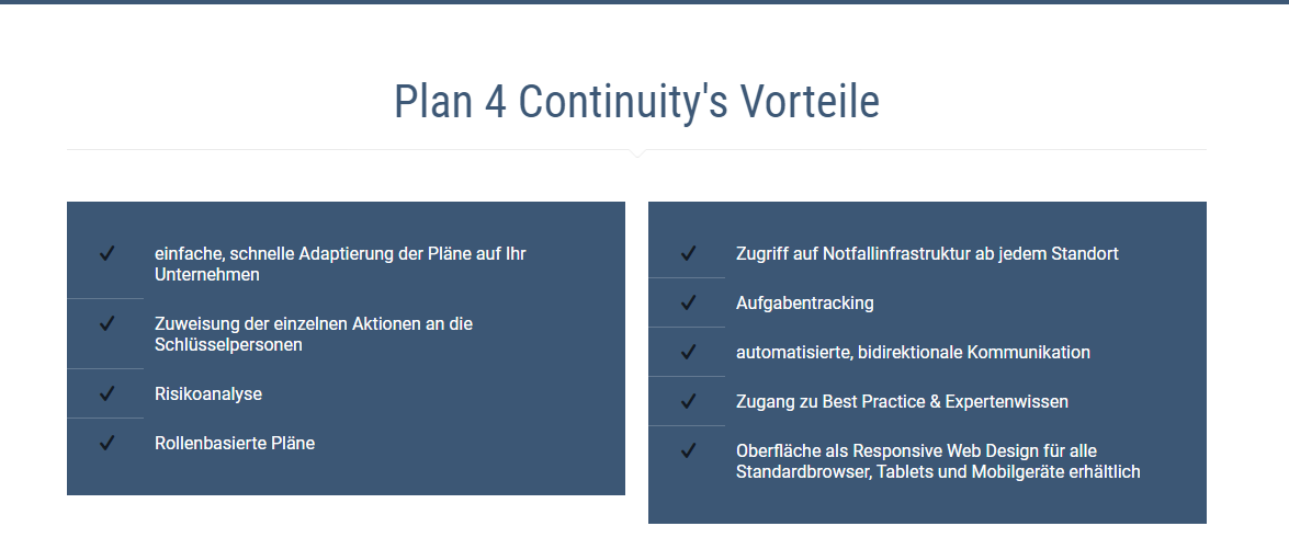
- Image 3: How can I adjust the length box on the left hand side to the length of the box of the right hand side?
Image 1.1 and 1.2.
Image 2
Image 3
Thank you very much for your help, as soon as possible. I am very happy to have you in building the website.
Best regards,
Nicole Güntensperger


Comments
Hi,
Please always attach a link so we can check it out. If the page is offline(localhost), then our help will be limited, you will have to contact us when the page is online. Also please make sure that the page is not under maintenance before you provide us with the link.
1) Did you close the <h6> tag? If not, please do that because it may cause this issue.
Moreover, please try to remove the <br> and check if it works then.
2) You can achieve that by adding some top and bottom padding for these lines.
3) Can you tell me how did you create these boxes, please? Did you use column item or some other item?
Thanks
Hi Phil
Just coming back from the ski holidays and I am very happy to have your answer. Thank's for letting me know, that you like to have the link of the website.
1) I took away the <h6> tag. As it did not work, I tried to take away the <br> too. I am lucky the arrow and the words are on the same line, but unfortunately not in white and not bold. Do you have any suggestions? The Link is as follow: https://dev.p4c.ch/
2) Would you be able to do that for me?
3) I used the info boxes
Thank's for your help. I am looking forward to hear from you. Nicole
1) Please, try to recreate it like this:
2) Please, go to Betheme -> Theme options, edit the Footer | #2, and add inline CSS to the <h5> tag that contains the phone number.
3) Please, go to Section settings that contains these boxes, and check the option Equal Height | items in wrap.
Thanks