Adapt the content to the mobile
Hello,
It is supposed that Betheme is responsive, also for mobile, but there are some elements that do not display very well when they are open in a mobile. Is there any way to make some changes only for the mobile view?
The problems we see are the following:
-Some images are too big for mobile, and it could be fixed if we could display them in 2 columns, not only 1, could be? how? I've uploaded those images directly by Muffin Builder
-The same problem with other images that we've uploaded first to Media and then by code to a column block by Muffin. Maybe in this case there's a code to add here??-
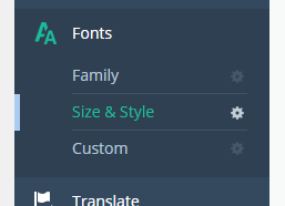
-Some fonts displays too small by mobile but ok by PC. In Betheme -- Theme options -- Fonts I see where to change the size of the fonts, but not where to change it for mobile.
Many thanks.


Comments
Hello,
If you would like to have a different display on the mobile, you can create two similar sections, use the Responsive Visibility option, and justify the display for the mobile section.
But there is no option to display two columns next to each other on mobile at the moment, but we are working on it.
Best regards