Help needed! Responsive svg images
Hello,
I am new to Be theme. I have used the BeTaxi as a starting point and created a very simple one page site.
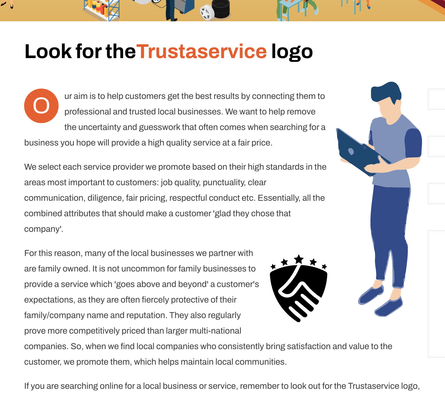
I have inserted 2 x SVG images into the body of text within the 'column item' that holds the text using the shortcode below: (see image above)
[image src="my WP image upload link is here" width="150px" height="" align="right" border="0" margin_top="" margin_bottom="" link="" link_image="" target="" alt="" caption="" greyscale="0" animate=""]
My issue is this: If I assign a set width of pixels for my images, (code example above of man image).....it looks good but it doesn't scale responsively!? It ALWAYS stays at a width of 150px......even on mobile. (making the man huge and the text wrap look silly.)
This is probably such a silly error on my part. But can anyone tell me what needs to be typed into the width and height areas to ensure the pics remain responsive?
Thank you

Comments
Hello,
When you set the width there, then it will be strict on all resolutions.
Please, create a copy of this section, set responsive visibility so one will be visible only on desktop and second on mobile, and change this value so the display will suit the mobile display.
Thanks
Brilliant! Thank you Phil.