Photo Box Layout Issue
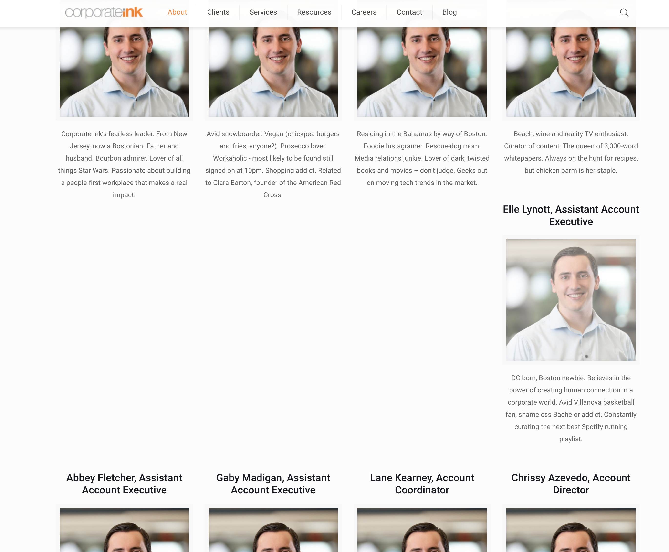
When I place multiple rows of photo boxes in a section of a clients website (using them to show a list of company employees with name, title and a short bio) it doesn't format the rows correctly. It will force one or two of the boxes onto its own row. I tested this by making each photo box with the same amount of copy and it seems to format it correctly (4 items per row). The issue is when there is different word counts in each box, it then forces the rows to be uneven. Is there a solution or trick to make this work.
As you can see on the image below, the body copy is really the only variable that is causing this issue, from what I can tell.

Comments
Hello,
Please, open the option of the section that contains these photo boxes, select the option Equal Height | items in wrap, and check if the display corrects after that.
Thanks
That solved the display issues with the photo boxes, but it caused another issue. When I make them all Equal Height as you suggested, it adds excess padding above that section causing a large gap between the headline and the images (see below). There is no extra padding added to the section, It only appears when I Equal the Height of the photo boxes
Is there a solution to this issue?
Please try to put the photo boxes and this text in separate wraps. If they are already separated, or this will not help, please create a new section where you will put this text.
Thanks