
[single post] How to make feature image (on "related posts") not expandable + button align

in Blog
Hello!
I have looked everywhere and still not being able to find a solution to organize this section into single post:
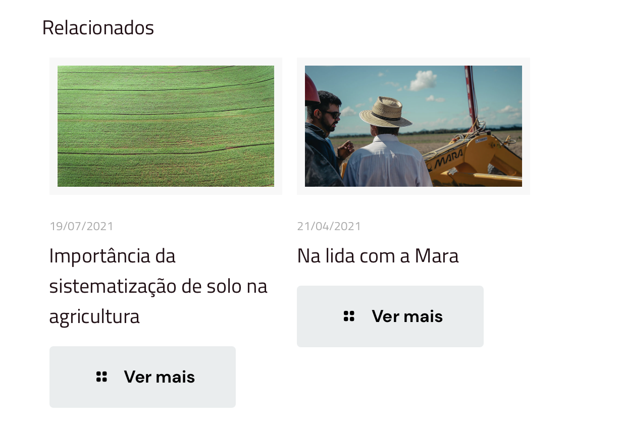
- Can I make the related post feature image without this gray border and make the images not expandable? Like, clicking on it will only open the post (instead of giving the user two options of zooming the image/opening the link)?
- I know it seems small but it is quite annoying that the "see more" buttons are not arranged in the same line, according to different title lengths. Can I make them aligned?
Thanks in advance
Comments
[edit:] Other layout problems I'm having on mobile:
This gray color is the subheader background, which have to be displayed on desktop since I'm using transparent menu with white letters.
Although, when in mobile, as the main menu turns into "hamburger" type, it just shows an empty gray space between header and content. Can I hide in mobile only?
Last thing: I have changed single post H1 size with custom CSS for better layout harmony. Although, it still is really big in mobile, making the whole page weird. How can I fix this without compromising the desktop view, which is currently good?
Hello,
1a) To remove the border, go to Betheme -> Theme options -> Global -> General, and from Border, dropdown menu select hide.
1b) In the same location as above, from the Style dropdown menu, select Zoom | without icons.
2) I have visited your website and I cannot see the "see more" button under posts. Do you still need help with that?
3) Please go to Betheme -> Theme options -> Responsive -> Header, and there you will be able to set your Subheader padding for mobiles to zero.
4) You can decrease the font size for mobiles only with custom CSS and media queries. Do you need help with writing it?
Best regards