
responsiveness on mobile

Hi, it all looks quite good on laptop but when it comes to mobile i have the next issues:
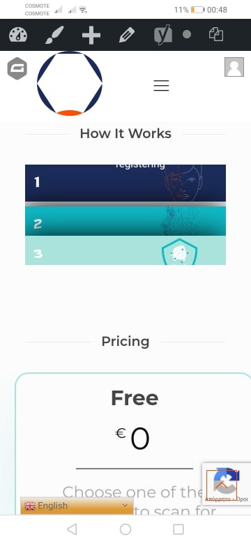
- the accordion on mobile is shrinked. I remember somthing about css important! 768px but can you please provide 1-2 lines of code in order to apply properly?
- the price tables are set to the right (on mobile) as you can see from the same attachment. At the same time set to the left (on laptop). What should i apply please?
- the go to top arrow is on the recaptcha even if on laptop i moved it to the left. The contact form popup icon has dissapeared.
[Links visible only for registered users] (this is the laptop view)
Please help, any help is much appreciated!
thank you
Comments
Hi,
Please always attach a link to your website so we can check it out. If the page is offline(localhost), then our help will be limited. You will have to contact us when the page is online. Also, please make sure that the page is not under maintenance before you provide us the link.
Thanks
i have sent you a private message with admin credentials so that you can see it in action.
Thank you in advance
1) This accordion comes from unsupported plugins. Sorry, but we did not test this plugin with the theme. Our policy states that we do not support third-party plugins or custom code, so, unfortunately, we cannot help you.
Also, we cannot recommend any plugins other than the ones we support. You can find the list on this page, in the sidebar:
[Links visible only for registered users]
2) There is a left margin set to this row.
It causes a different view for laptops and mobile. If you need to adjust the display for mobiles, you can use the Responsive options.
3) You can move the Back to top button to the left with custom CSS. Do you need help with writing it?
But unfortunately, the Popup contact form is not available for mobile devices.
Thanks
Hi, regarding question 2, i have set the margin in order to apply it to thr middle of the line. I can remove it though. What please must i exactly apply in order to show correctly on laptop and mobile devices?
Regarding question 3,please provide css,.
Thank yoi
2) I think that the best option will be to adjust it with the responsive option, as I mentioned before, so it will look as you want for each resolution.
3) Please use the following code:
#back_to_top{
   right: unset!important;
   left: 50px!important;
}
Thanks
regarding question 2 ,ok i deleted the left margin and set as you sudjested but, still it is not totally on middle. on mobile it is a bit to the right and on laptop it is to the left [Links visible only for registered users]
please advise for both situations, css ?
also in addition to the above and regarding question 3, i appliued to above code but the button is now to the left and not next to the email button. How please can the padding be applied only for mobile view?
thanks
1) I did not notice anywhere that you used the responsive option. Therefore, I have created an example on your page.
Please, check it out.
When you use the responsive visibility option, you will be able to adjust the display for desktop, tablet, and mobile, however, you want.
2) Please replace the previous code with the following one:
@media only screen and (max-width: 767px){
#back_to_top{
   right: unset!important;
   left: 50px!important;
}
}
Thanks
ok, almost perfect ,thank you.
on mobile the row is still not centered,it is to the right. i set padding to 0, i then set margin 20 from right. but still no result.
Extra, please tell me for future use how you structured,applied this use for mobile? e.g i see that the row which is for mobile use is on gray. where is this setup please?
thank you
You can set the responsive options in the column settings.
To center it on mobile, you will have to work a little with margins. You can try to use percentages instead of pixels.
Thanks
can you please exlain how you applied two lines, one for laptop view and one for mobile view?obviously it is applied depending on visitor's view. [Links visible only for registered users]
is there some particular setting you setup in order to fit on both occasions laptop and mobile? what is this setting please apart from the above you provided?
thank you
I copied the whole row that already existed and assigned the Responsive option for each column.
If you want to learn more about the responsiveness in WPBakery, please, check the following link:
[Links visible only for registered users]
Thanks