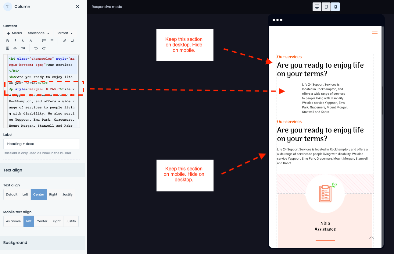
Hide text sections on mobile and desktop.
What we need to do is hide a text section on mobile and desktop.
In the screenshot, we are viewing the code on the desktop.
You can see the <p style="margin: 0 26%;"> for padding in the left editor.
(we do not want this on mobile)
It seems that your editor has no setting for mobile, so we duplicated the section and removed the style tags, so we now have left-justified text on mobile.
However, how do we hide a section on mobile and desktop?
Where are your editor features to do this?
(you can hide rows on multiple devices, however, this is no use in this case)
The only mobile adjustment we can see on the left column editor is 'Mobile text align'.
Help appreciated.

Comments
Hello,
You can use the Responsive Visibility option.
To learn more about it, please, check the following video tutorial:
Thanks
I will take a look. Thanks
Just looked at your video and in essence - there is no way to do this :(
The Responsive Visibility option only works in sections.
In other words, I have to create new sections for EVERY option I want to be changed in mobile.
OMG. This needs to be fixed.
Thanks for your quick response though.
Yes, you need to create sections for both desktop and mobile displays.
If you would like it to work for particular items, please, leave your suggestion on the following topic:
https://forum.muffingroup.com/betheme/discussion/113/your-suggestions-for-future-updates#latest
Thanks
Sure thing. I may do that. In the meantime, I have been re-organising the pages to suit your suggestion.
Thanks