Padding on Mobile
Hi there,
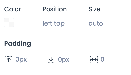
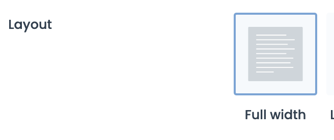
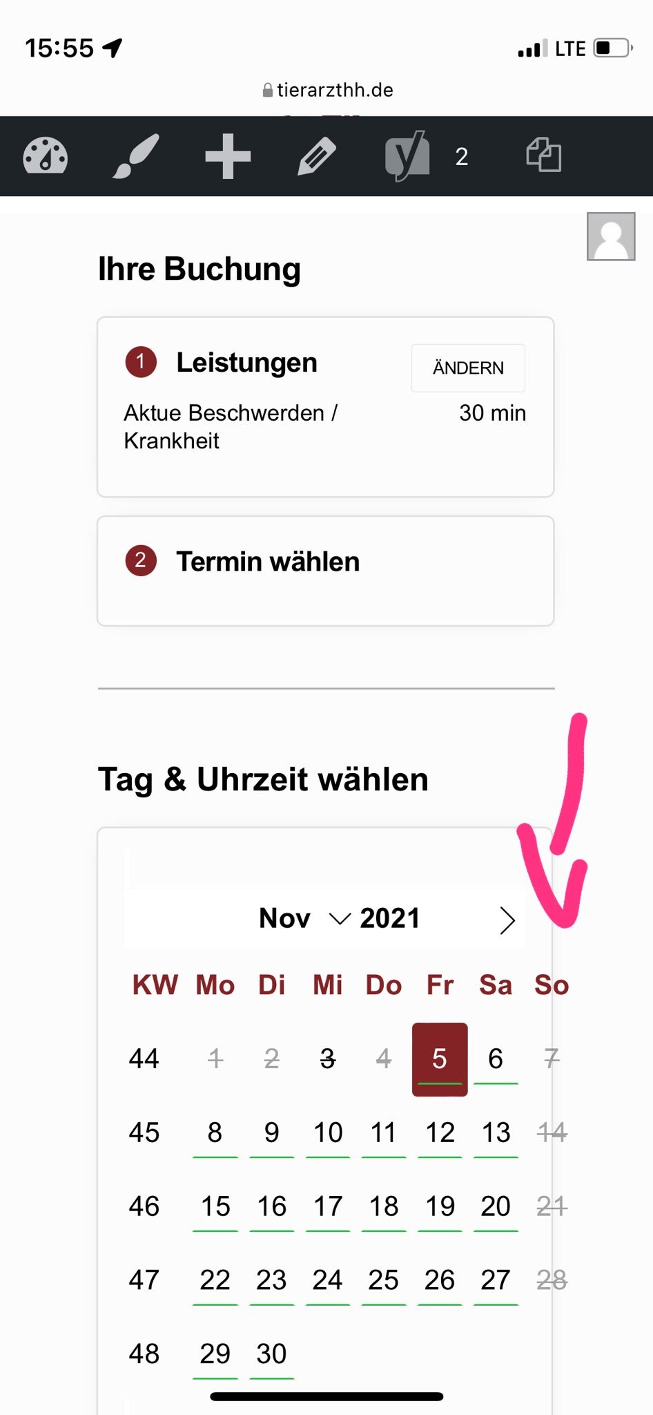
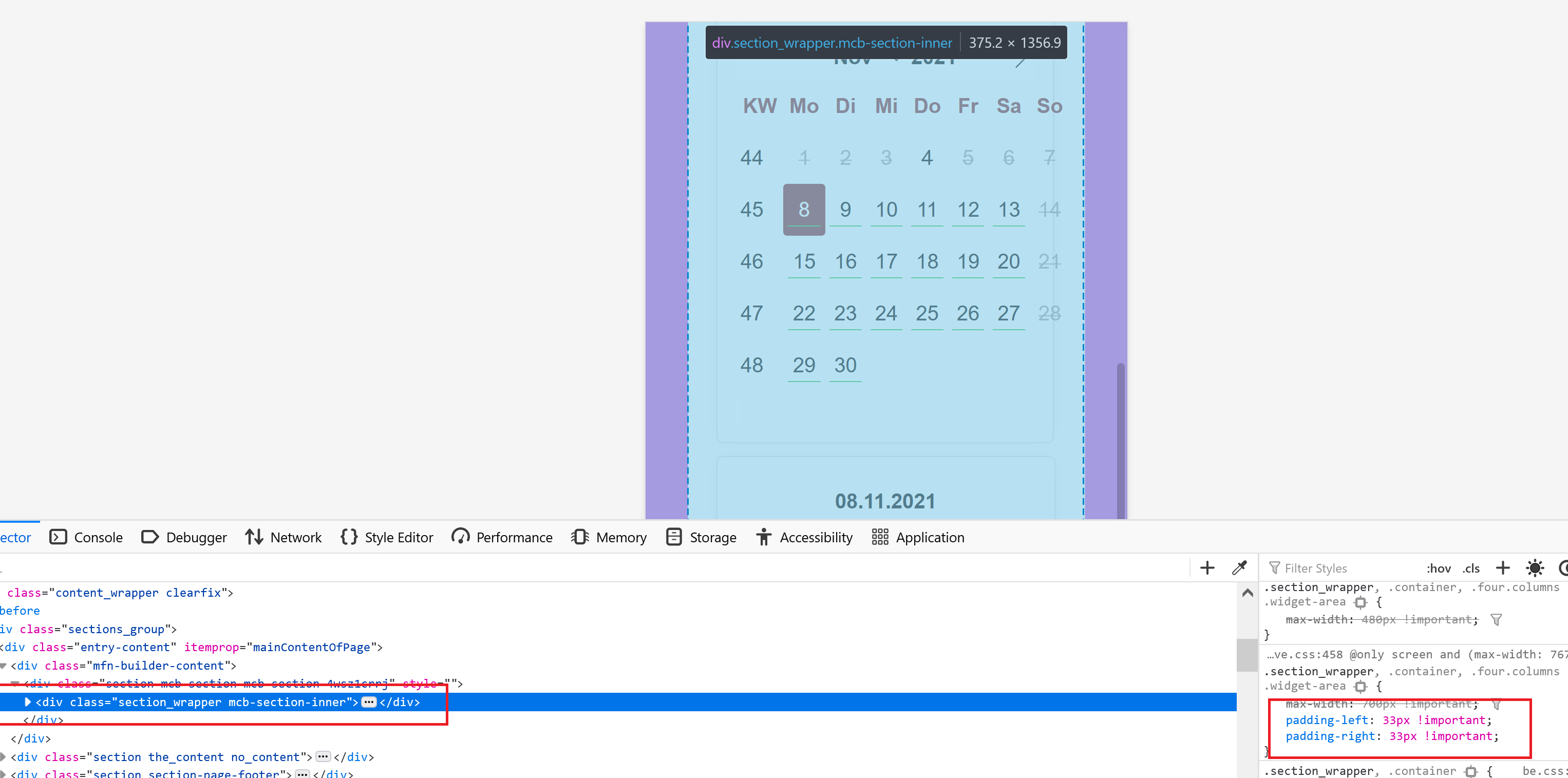
I created a full with page and only put an iFrame code on it. It's a booking tool. It works, but on mobile the calender floats over the line (see attachment). I contacted the provider of that tool who said, there is a padding set on the website which makes that visual problem (see picutre with blue and purpble border). But I set no padding (see pictures). Do you know what she means?
Here's the URL: https://tierarzthh.de/termin-buchen-2/
Thank you!
Kathrin


Comments
Here's iFrame code: <iframe id="etifr" src="https://www.eTermin.net/DrGervers" width="100%" height="1600px" frameborder="0" scrolling="no"></iframe><script src='https://www.eTermin.net/js/resizecustomersitescroll.min.js' type='text/javascript'></script>
Hello,
Please, open the section options that contain this iFrame, check the Full Width option, and check if the problem persists.
You can also check the Columns | remove horizontal margin.
Thanks
Thanks, works.
Sorry, did not see it but now it's not correct in the length (see attachment). Some boxes are not displayed anymore and the button "Termin buchen" is too much below and also the info links are not looking good. Here again the url: https://tierarzthh.de/termin-buchen/
It has to look like here on mobile: https://www.etermin.net/DrGervers But it does not.
Please, try to increase the height value for your iFrame.
Thanks
Which height to you recommend for the theme?
The height worked before I changed to "full width" and checked in the section "Columns | remove horizontal margin"...
You will have to test with which heigh the display will be best.
Unfortunately, I cannot recommend one universal value.
Best regards
The original height worked all the time since I changed/activated the checkbox in section by "full width" and "Columns | remove horizontal margin".
So I changed the height first to 600px then I saw more less of the boxes, then I changed it to 2200px and all that happend is, that the boxes where visible, but the button "Termin buchen" was extremly below.
This cannot be the solution. The theme must put the iFrame into responsive like it does without activating the checkbox as I wrote above.
Why does suddenly a problem with height occur only by activating "remove horizontal margin" for columns?
Sorry, but we did not test this script with the theme. Our policy states that we do not support third-party plugins or custom code, so, unfortunately, we cannot help you.
Thanks