
Menu and action button not full width on Tablet or mobile landscape mode

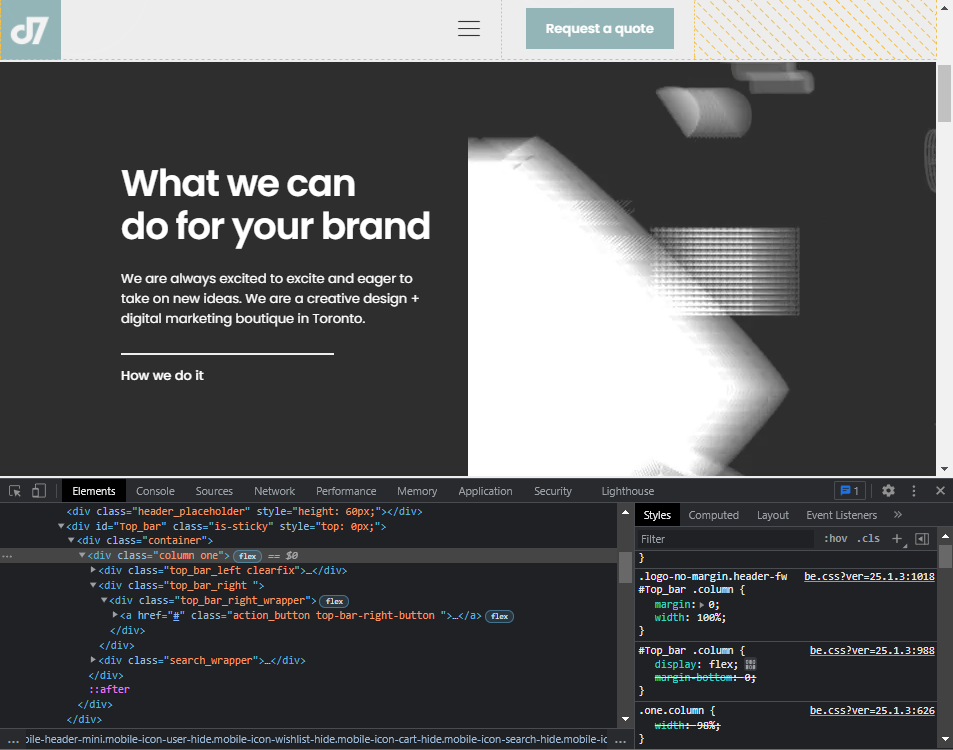
Hello, the menu and action button on tablet or mobile landscape mode is in the middle instead of the far right of the menu. I've attached a screenshot while inspect elements and i see a yellow box on the far right of the pushing the menu and action button to the middle. I think this happened after updating betheme not 100% though.
I've tried turning off all plugins and clearing cache.
Your help would be greatly appreciated!
Comments
Hi,
Please always attach a link to your website so we can check it out. If the page is offline(localhost), then our help will be limited. You will have to contact us when the page is online. Also, please make sure that the page is not under maintenance before you provide us with the link.
Thanks
I will make a temp link and share with you shortly
Here is a temporary link -> temp.brickpaintingtoronto.ca
It seems to be an issue with Betheme.
We will fix it in the upcoming update, but for now, please, use the following code:
@media only screen and (min-width: 768px) and (max-width: 959px){
   #Top_bar .top_bar_left{
      width:100%!important;
   }
}
Thanks