
Change table in Mobile view

I have a table on my page which is 6 rows by 4 columns. This is fine on a desktop/tablet view, but on a portrait mobile it doesn't work, with some of the columns not being accessible (off screen to the right).
So in mobile mode I need to use a different page layout which has 3 tables each 6 rows by 2 column
e.g - if the screen is >520 pixels, then the table resizes to a readable size - all good
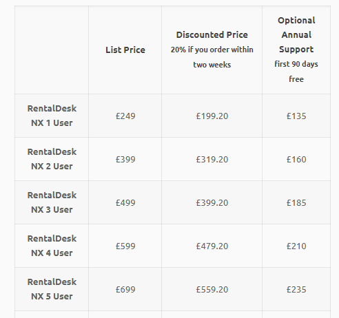
If on a mobile, then I need to display three tables thus
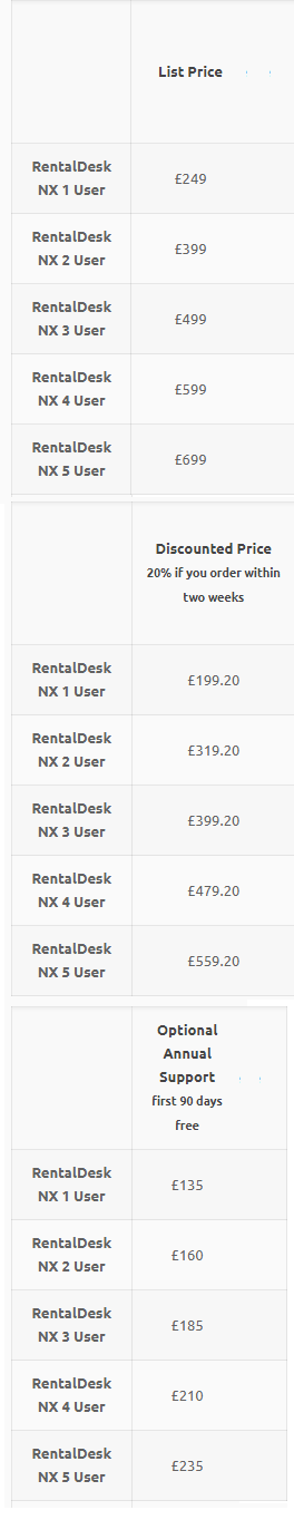
How would I achieve something like this please ?
Comments
Hello,
You can use the Responsive Visibility option for a different mobile display.
Please, check the following video tutorial about it.
https://support.muffingroup.com/video-tutorials/section-responsive-visibility/
Thanks