
Tablet/ipad - Archive page, product display

Hi,
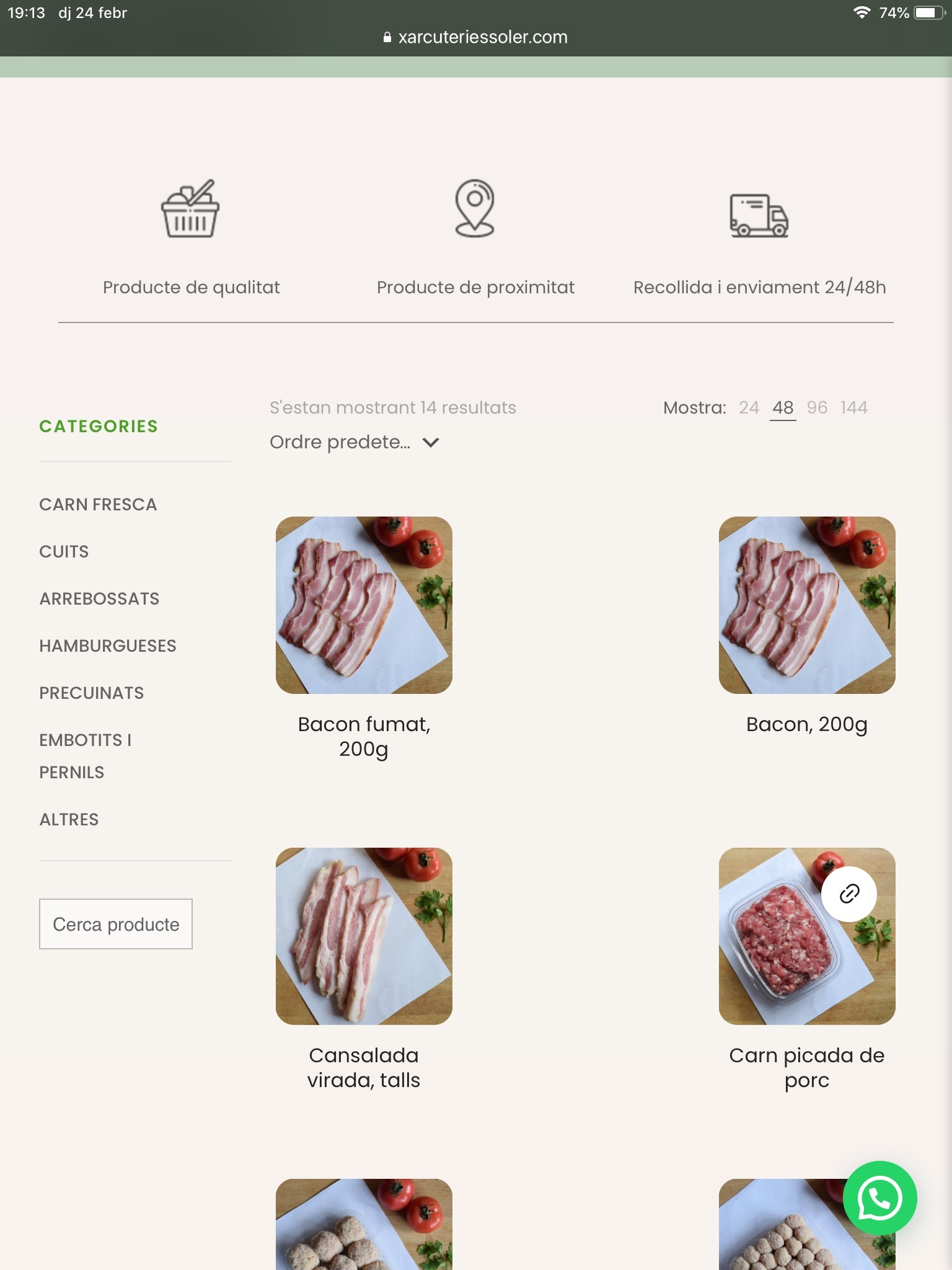
I have a problem with how products are displayed in tablet/ipad. When ipad is vertical, the products are shown like this (photo attached), two columns instead of 3, and with a lot of space between them. When placing the ipad horitzontally, the problem is solved.
Do you know how I can fix this? I guess it has something to do with the fac that on mobile only two columns are shown, but I don't know how to fix it in a tablet view.
Thank you in advance.
G.
Comments
Hi,
Please always attach a link to your website so we can check it out. If the page is offline(localhost), then our help will be limited. You will have to contact us when the page is online. Also, please make sure that the page is not under maintenance before you provide us with the link.
Thanks
Hi,
Link was on the picture. It's www.xarcuteriessoler.com.
The same happens in mobile view related products section in single product page, there are some black spaces.
Thanks!
G.
Sorry, I missed it somehow. However, it is easier to copy the link than write it by hand. ?
I can see that you do not have the newest version of Betheme.
Please, update it, and check if the problem persists.
Thanks
Hi Phil,
Sure, I understand. So I updated the theme, and the problem persists in Safari.
Also, after updating the plugin, something happened with the content width, because the 4rt column in the footer is not displaying right (now it's under column 2) and also the first part of the shop page, the third column is not displaying right either. I'd appreciate if you could check it: [Links visible only for registered users]
Thank you in advance.
G.
The theme update changed a lot of things...
I have set everywhere to hide the product description in shop page and now it it showing! Please, fix it.
The problems with layouts you mentioned occurred because of your custom CSS.
I have removed them from the website source, and the layout is correct.
These CSS codes could also affect the product list layout. Please, go to Betheme -> Theme options -> Custom CSS & JS -> CSS, and remove them one by one to see which one causes it.
Thanks
Hi,
Found it and fix it, thanks. However, it is not the only thing that is not working. The sidebar in shop page is not showing since the update, and the product description is showing even when I set it to "hide" in page options. I kind of fixed this by setting it to "list layout only".
Could you tell me how to fix the sidebar?
Thank you in advance.
G.
Please, check the following link, and check if you set up your sidebar correctly:
https://support.muffingroup.com/documentation/woocommerce/how-to-set-sidebar/
However, I did not see a description in your product list. Can you show a screenshot of what you are referring to, please?
Thanks
Hi,
The sidebar was working just fine before the theme update. I checked the link you attached but it's not my case, because I'm using a template and a sidebar widget area (it was already like this, I'm using one of your prebuilt themes). So, I've looked everywhere and tried everything to fix this but nothing works.
SOLUTION: For anyone having the same issue, I just found the solution: there was inconsistency with the sidebar width set at theme options (30px) and the width of the sidebar column in the page template (25%). Now I use 30% and it is showing again. Again, this problem didn't exist with the previous version of Betheme.
Regarding to the reason why I started this discussion (products no showing fine in tablet/ipad), the problem still persists. Any idea how to fix it?
Thank you in advance.
G.
Good to hear you solved the issue with the sidebar.
About the tablet, please send us WordPress dashboard access privately thru the contact form, which is on the right side at [Links visible only for registered users] and we will check what might be the reason.
Notice!
Please attach a link to this forum discussion.
Thanks
The issue is your custom CSS. After I removed them temporarily, they went to full width.
If you want to have three columns on a tablet, you should change to Masonry, 3 columns.
Thanks