Align textcolumn with site content in a full-width section
Hi there,
first things first: I love the new dimensions, spacing, positioning, etc. features in the Theme. But I believe I still need to learn how to handle them ?
Maybe you could help me out...?
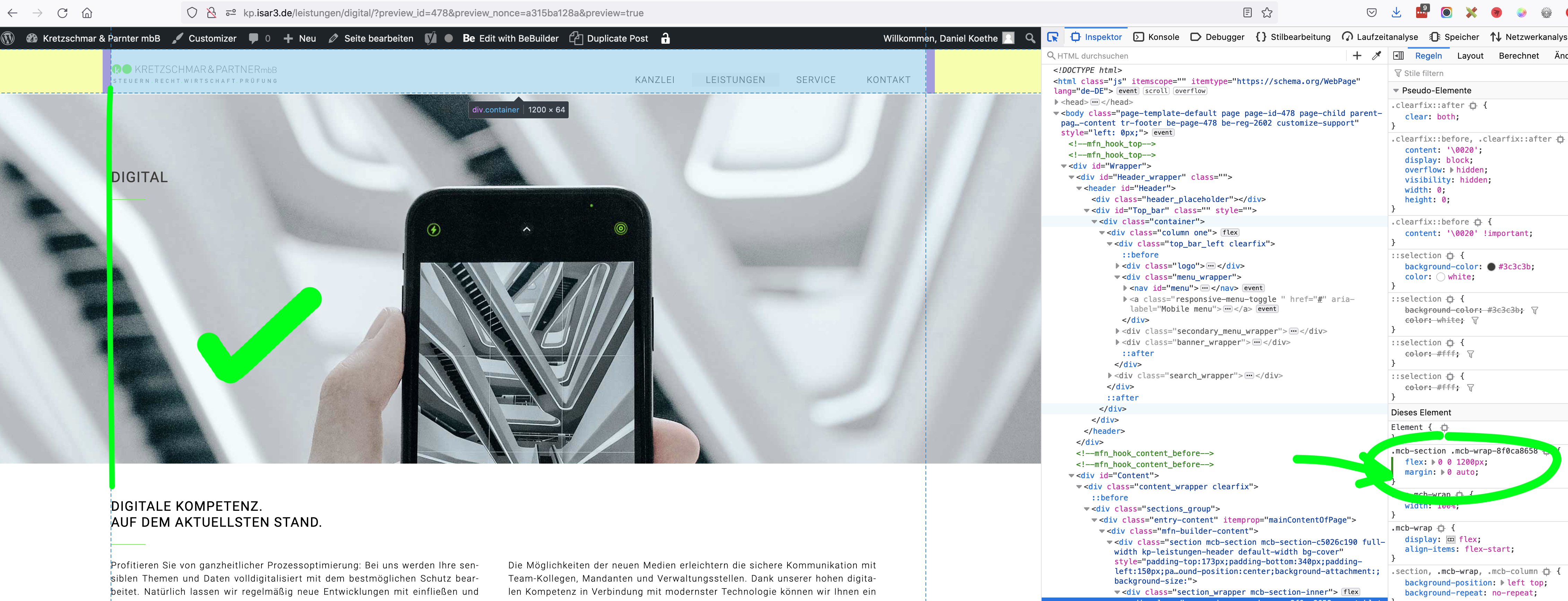
I´m working on this page http://kp.isar3.de/leistungen/digital (Password: Clemens1) and want to align the "title" in the header (here the word "DIGITAL") with the left border of the content.
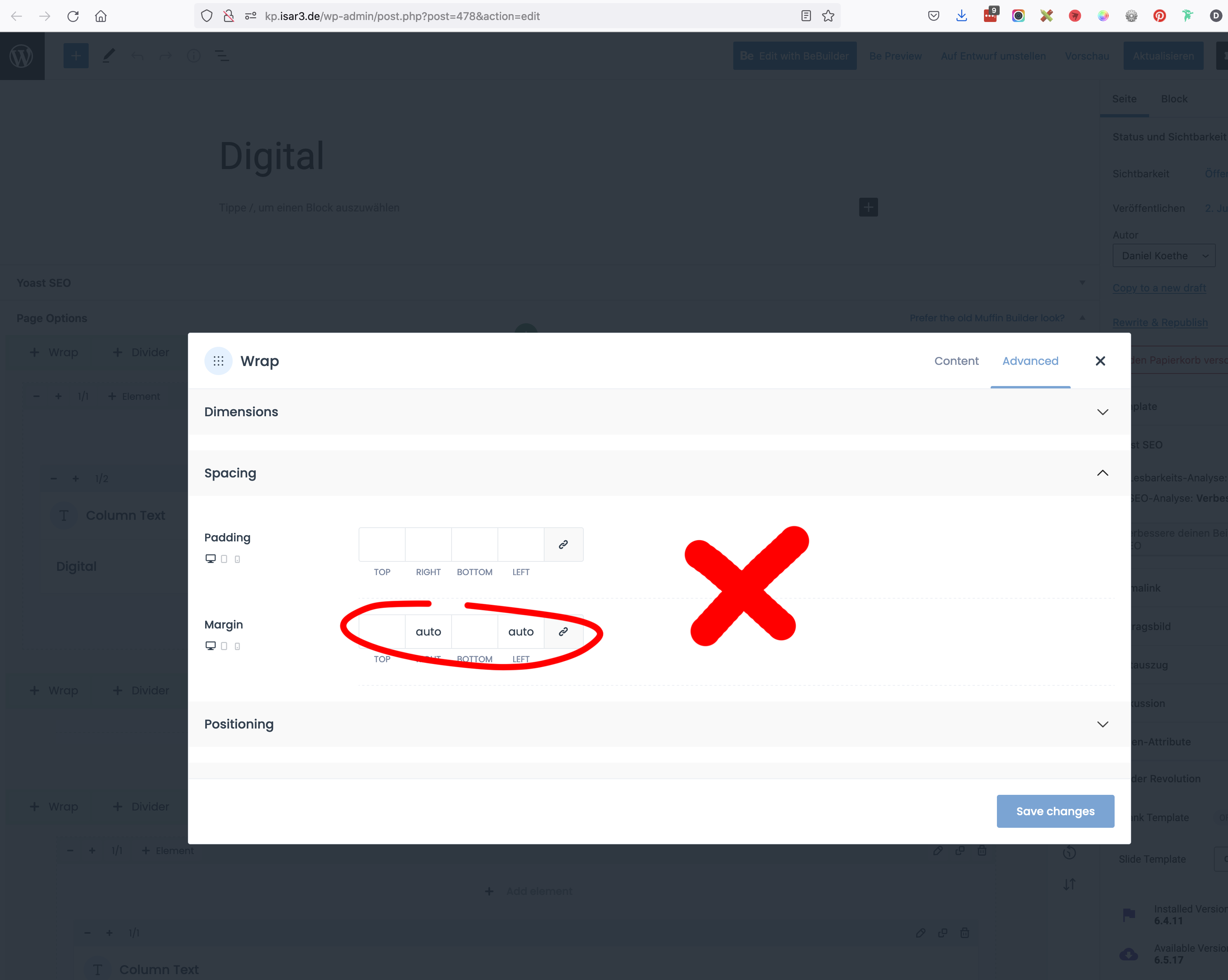
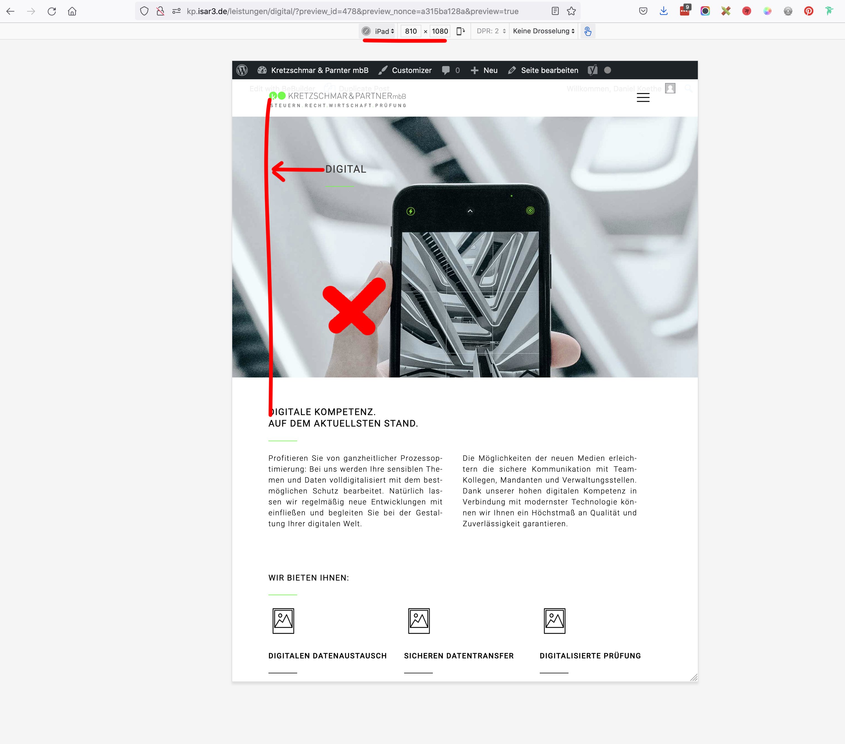
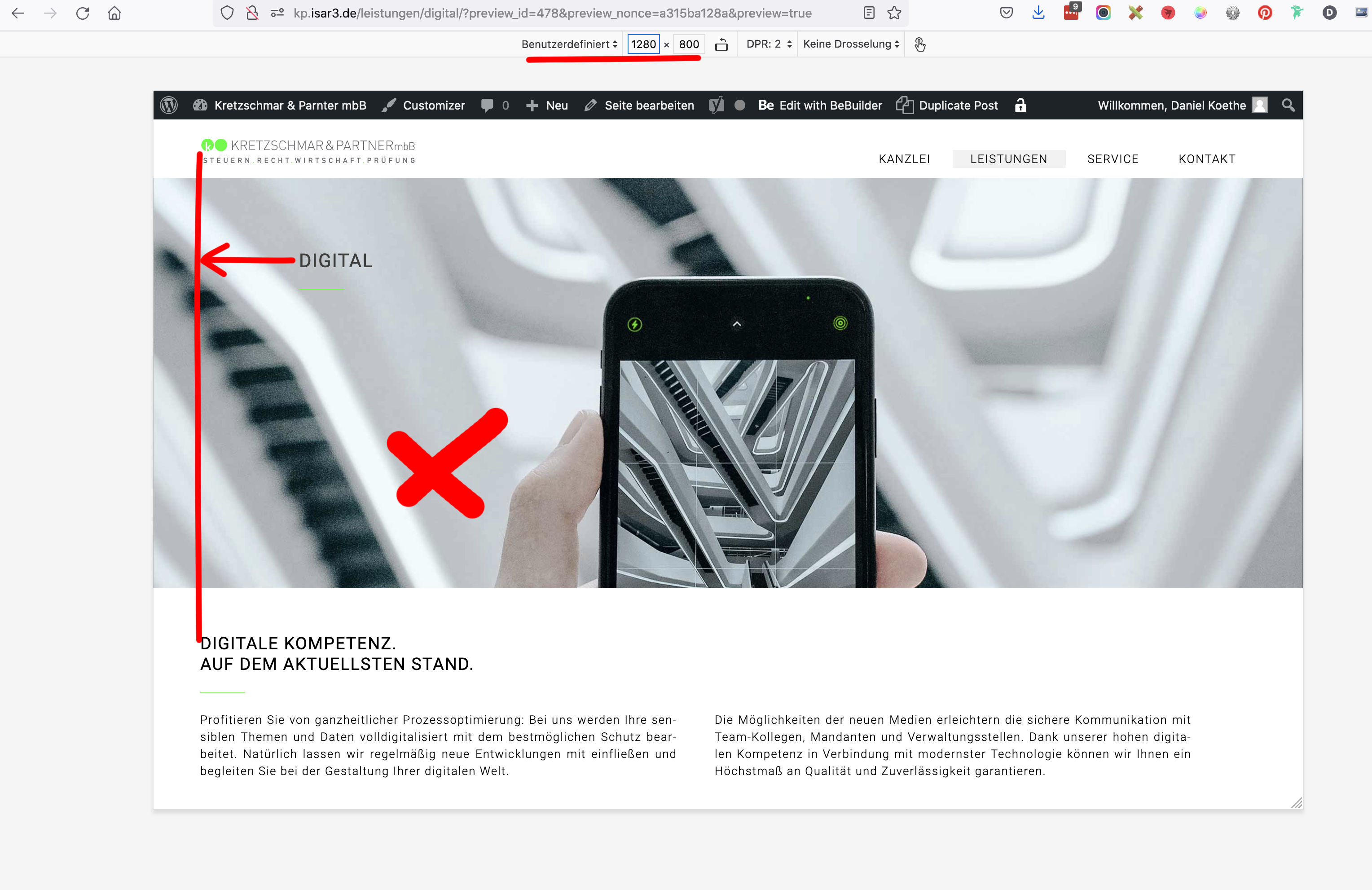
So far I made it to give the wrapper around the column-element the same width as the content (1200px), but I can´t make it to always have the right margin. I´ve tried going "auto" on both sides of it. But this only works if I do it "hard-coded" in with developer-tools (see my screenshots). And this does not help for all screen widths. (see more screenshots).
In the screenshots you will see marked green what helps... and red what doesn´t work.
Looking forward to learn how to handle the new tools properly and to your feedback.
Happy weekend and
best regards,
Daniel


Comments
Hi,
If you add this element to your website and do not touch it anyhow, it should behave as you expected.
As you can see, the wrap is always set to the site width from theme options, so it is the same as the whole Top Bar.
In that case, I only added left padding to the Heading element, because my menu items have 20px left padding.
Best regards