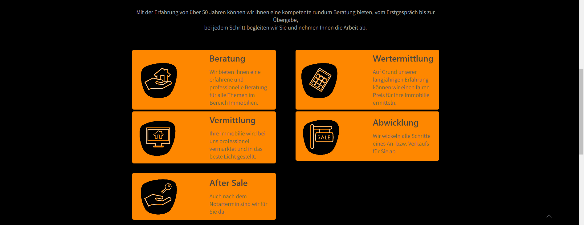
feature_box objects break on smaller screens
Currently, our website has five feature_box objects next to each other (see screenshot). As soon as the width of the browser changes (on mobile or when you just drag the browser smaller on desktop), they start overlapping. I managed to find the approximate resolutions when it breaks and works again.
They start breaking once you get smaller than 1222px, break even more when smaller than 942px, fix themselves at 750px. I can't drag the browser window smaller than that, the phones I managed to test with started at 412px down to 320px, broken on all of them. I don't know when it starts breaking again between 750px and 412px.
I've tried to add the following code:
@media only screen and (min-width: 750px) and (max-width: 1225px) {
.feature_box_wrapper {
margin-bottom: 100px;
}
I put the margin to such a high number as 100px just to see if I would notice any change, nothing happened.
The website URL is https://www.immobilienbeck.de

Comments
Hello,
Please, turn off all of the plugins, refresh your cache, and check if the problem persists.
Moreover, if you use a child theme, switch to parent, and recheck it.
If this will not help, please, keep minifying plugins off because I need to check your website with them disabled.
Thanks