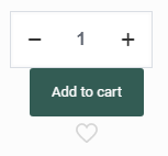
Quintity Button styling issue
Good day,
It seems the styling of the quantity section of the product page is not left to the button as it always was,
as well ass the wishlist button was always on the righthand side of the button asswell
I tried to play around with the preset styles of the single product pages in the betheme settings but nothing there suggests any setting in regards to the positioning of said boxes
is there a way to fix/change this as it does not look very pleasing, and it seems the issue only occurs for single products and not variable products.
Site with issue: https://polokwanespa.co.za/
one of the pages in question: https://polokwanespa.co.za/product/teens-manicure-60min/
We are currently using Betheme V26.2.1

Comments
Hi,
Please, put the following CSS code in Betheme -> Theme options -> Custom CSS & JS - CSS.
.woocommerce .product div.entry-summary .cart{
   flex-direction: unset!important;
}
Thanks
Seems to working after applying the snippet of code thank you