
Slider Rev Optimised for Desktop and Laptop Screen but not resizing in Browser

Hi There, thanks for your help so far.
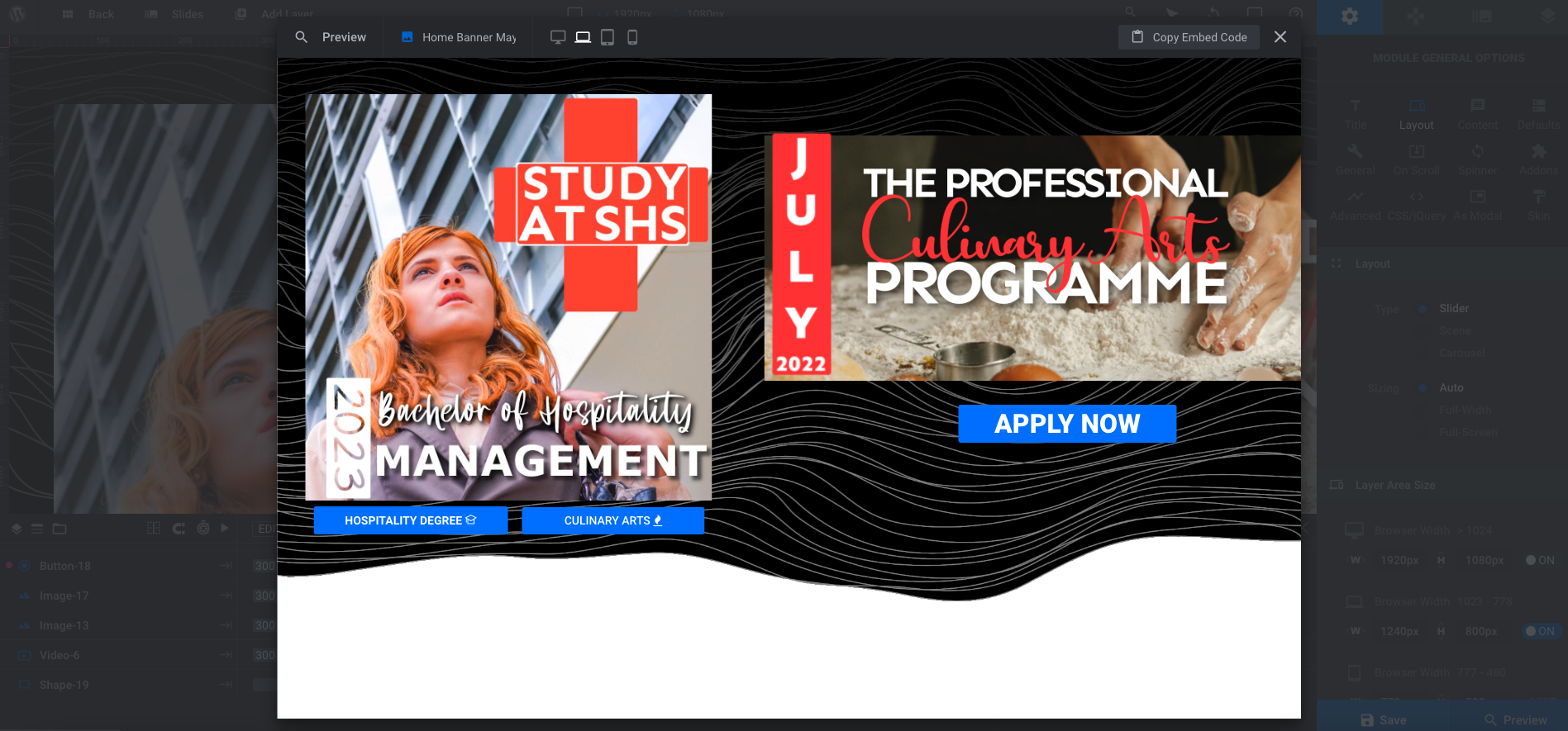
I have an issue (see screenshots attached of preview in REV SLIDER) I have created a banner slider in Rev Slider, both are optimised for Desktop and Laptop Screens, but when I view it in the website browser and resize, it does not resize accordingly ... please help I am launching this website in 2 days (Wednesday 18 may 2022).
I have attached below a screenshot of the laptop browser so you may see how the design does not fit in real life... (it doesn't present the same in rev slider as it does in the laptop browser screen).

Thank you.
Image below: screenshot in Rev slider of desktop and then in laptop screen browser.

Comments
Hi,
Please always attach a link to your website so we can check it out. If the page is offline(localhost), then our help will be limited. You will have to contact us when the page is online. Also, please make sure that the page is not under maintenance before you provide us with the link.
In the meantime, you can also check if the same thing happens on a standard theme like Twenty Twenty, by switching themes in Appearance -> Themes and adding the Revolution Slider in the Gutenberg.
Thanks