Fix Padding on Portrait Oriented Images on Blog
Hi,
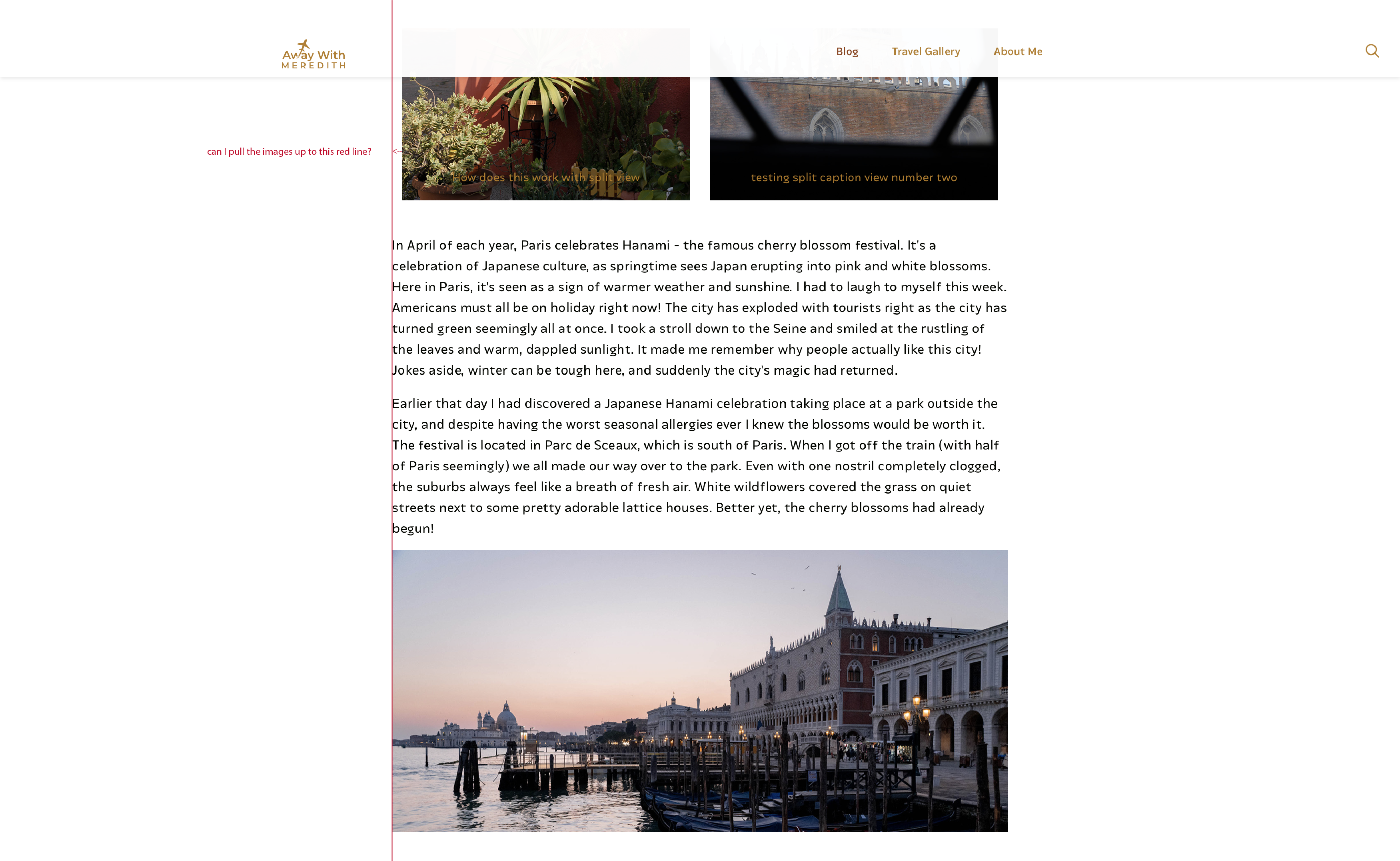
I'm looking to fix the image padding on blog posts when I have two portrait-oriented images next to each other. Right now, on desktop and tablet views, there is always excess padding on the left and right with this configuration. The two portrait images, therefore, don't line up with the rest of the content on the page.
Right now, I have all the content in one section, but in individual wraps. I have tried putting everything in its own section or putting all content in one singular wrap(in one section) but with no success. At one point I put these portrait images in their own section and adjusted the padding to be slightly less than the rest of the content on the page. But when resizing the screen (for responsive views) it's always a tiny bit off.
I uploaded an image so hopefully you can see what I'm trying to correct. Thanks for your help!

Comments
Hi,
Please, open the options of these images, and set the margin value to zero in Advanced -> Spacing.
Thanks
Can't believe I didn't think of that, thank you!