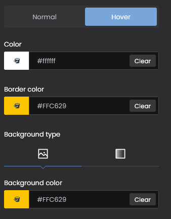
Color button
Hi guys,
it's been a while since I had this feeling, because the color I set in the key was always a bit "dirty" than the one I set, but I thought it was just my impression ... but haha now I found out! ?
There must be some weird shadow effect on the text that makes the desired color darker.
I found out by setting the border to the same color .. here is the result ?️
How can we remove this unpleasant shadow effect on the all buttons text?
Thx guys!
here the link https://albaequipment.senapestudio.com/prodotti/croissant-2/


Comments
Hi,
The link you have sent shows a 404 page. However, I have checked a button from there.
You have a Round button style chosen in the Theme Options, which adds such effect.
I suggest choosing a custom button style and recreating the desired display (the unwanted effect will be gone).
Thanks
Ok Thx!
But now the "slide on top button" is round,
how can we make it the way it was before? (like this)
Maybe with some CCS, in case you can provide it to us?
Please, use the following CSS code:
#back_to_top{
   width: 70px!important;
}
Thanks
Thx! and for remove the white border?
This one:
#back_to_top{
   border: none!important;
}
Best regards