Button Placement
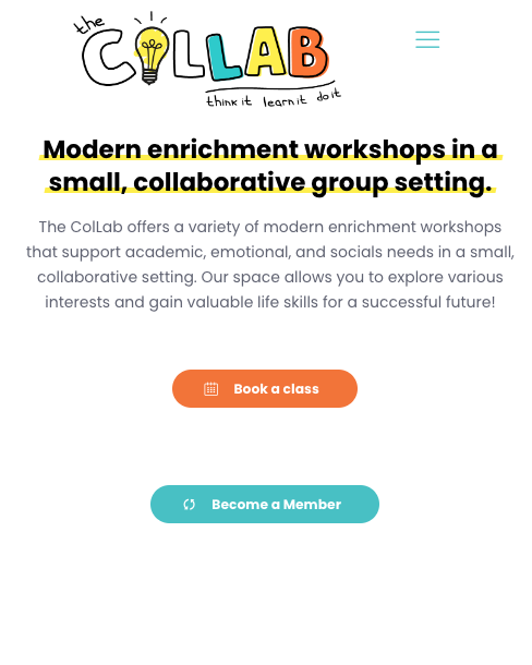
atthecollab.com - I cannot get the "book a class" and "become a member" buttons closer on the homepage here on the desktop, tablet or mobile version. I've tried multiple different approaches in the positioning, padding, etc. Any advice?


Comments
Hi,
1) I can see that you put these buttons in the Column Text element with the shortcodes, and right now, your left button is aligned to the center. Please change it to the Button element aligned to the right so that it will be closer to the second button.
Also, you can decrease the first button container size.
2) The mobile display should also look better when you change these buttons to elements.
Best regards