
Mobile Sticky Header & Increase Font Size

Hello!
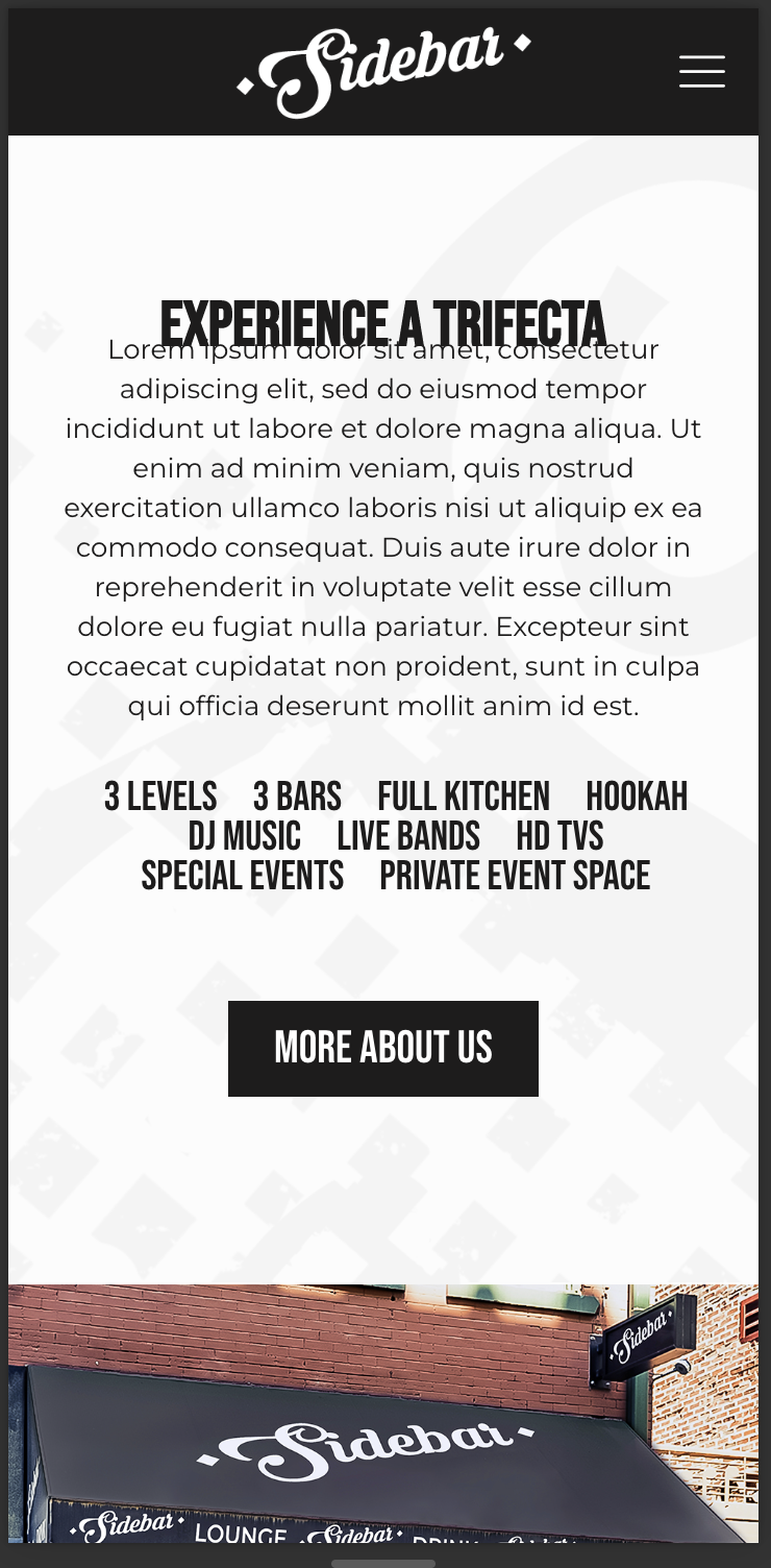
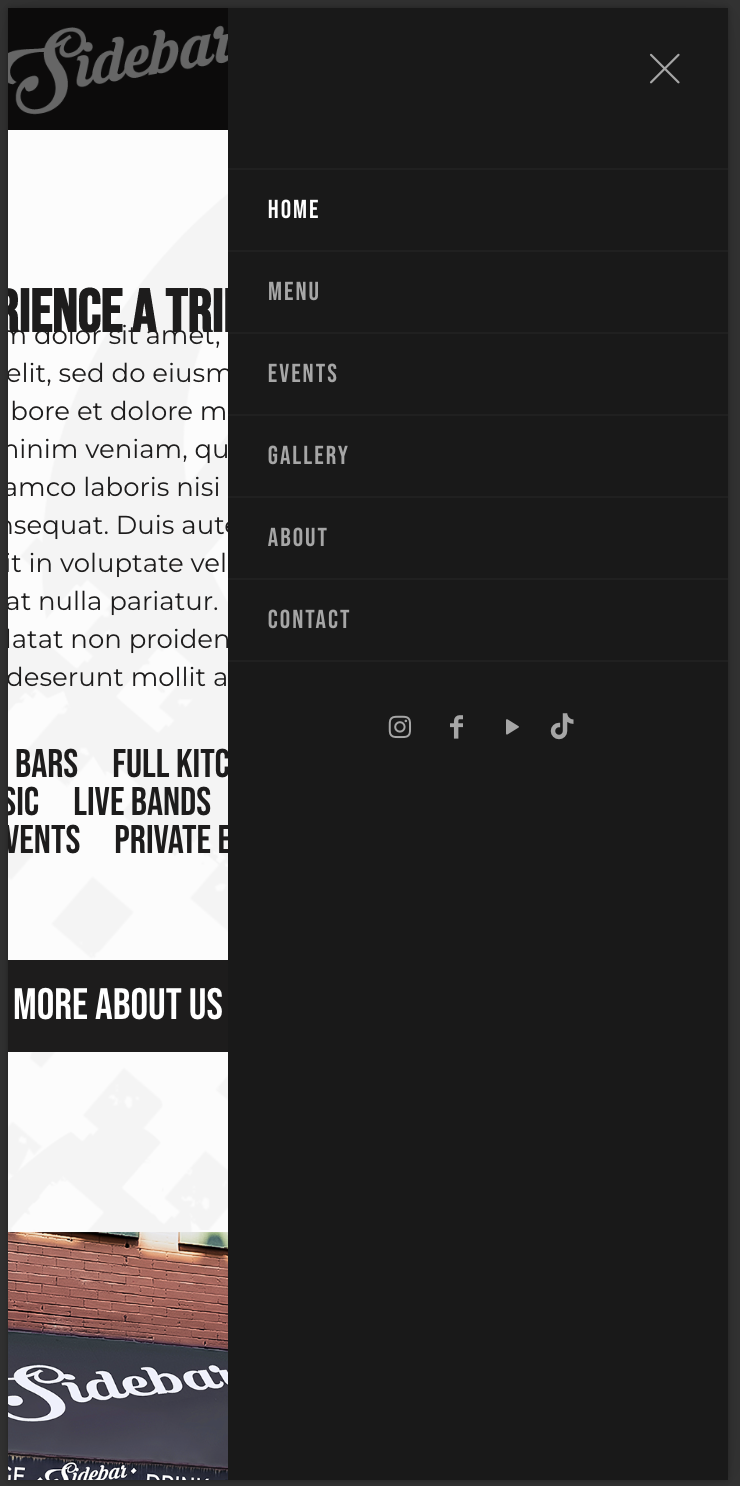
On mobile, the header is NOT sticky. How can I apply this plus increase the padding in Theme Options? Also, how to I increase the font size? See below screenshots of the mobile view.
Hello!
On mobile, the header is NOT sticky. How can I apply this plus increase the padding in Theme Options? Also, how to I increase the font size? See below screenshots of the mobile view.
Comments
Hi,
1) Do you have sticky header option enabled in Betheme -> Theme options -> Responsive -> Header?
This option need to be also enabled in Betheme -> Theme options -> Header & Subheader -> Header.
2) You want to increase the padding for what part?
3) To increase font size you need to write a custom CSS code, and place it in Betheme -> Theme options -> Custom CSS & JS -> CSS. I can help you with it, but I will need a link to your website.
Thanks
Hello!
1) I followed the steps you provided. I already had these options turned on and mobile header is still NOT sticky. See attached Theme Options:
2) I'm referencing the padding on the mobile header. The logo is just a bit too close to the top and bottom of the background.
3) Here's the link to our website - [Links visible only for registered users] - I'll need help with writing the custom css code.
Thanks!
1) The sticky header works on mobile, but it has a z-index lower than the content and it hides behind it. You have a custom CSS code that set the #Content z-index to 9999.
Get rid of this CSS, and the Top bar will appear again.
2, 3) Please, use the following CSS:
@media only screen and (max-width: 767px){
   #Side_slide .menu-item span{
   font-size: 20px;
 }
   #Top_bar .logo #logo{
      margin: 10px 0!important;
   }
}
Best regards
Thank you the issue has been resolved.