
How could I see the responsive menu on the bebuilder?

I need to see the responsive menu in order to set colors, fonts, etc.
I can't display the responsive menu, is there a way to see it on the bebuilder (I'm using Chrome) instead of using the mobile device?
And how could I replicate the default menu responsive design that you have on the original menu (margins, pads...)?
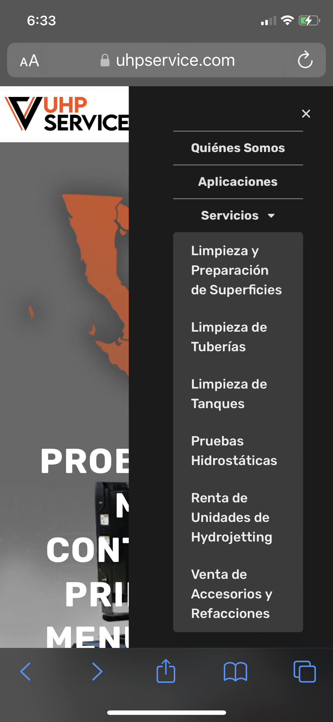
Is it possible to use a mega menu option or something like that from my responsive menu?
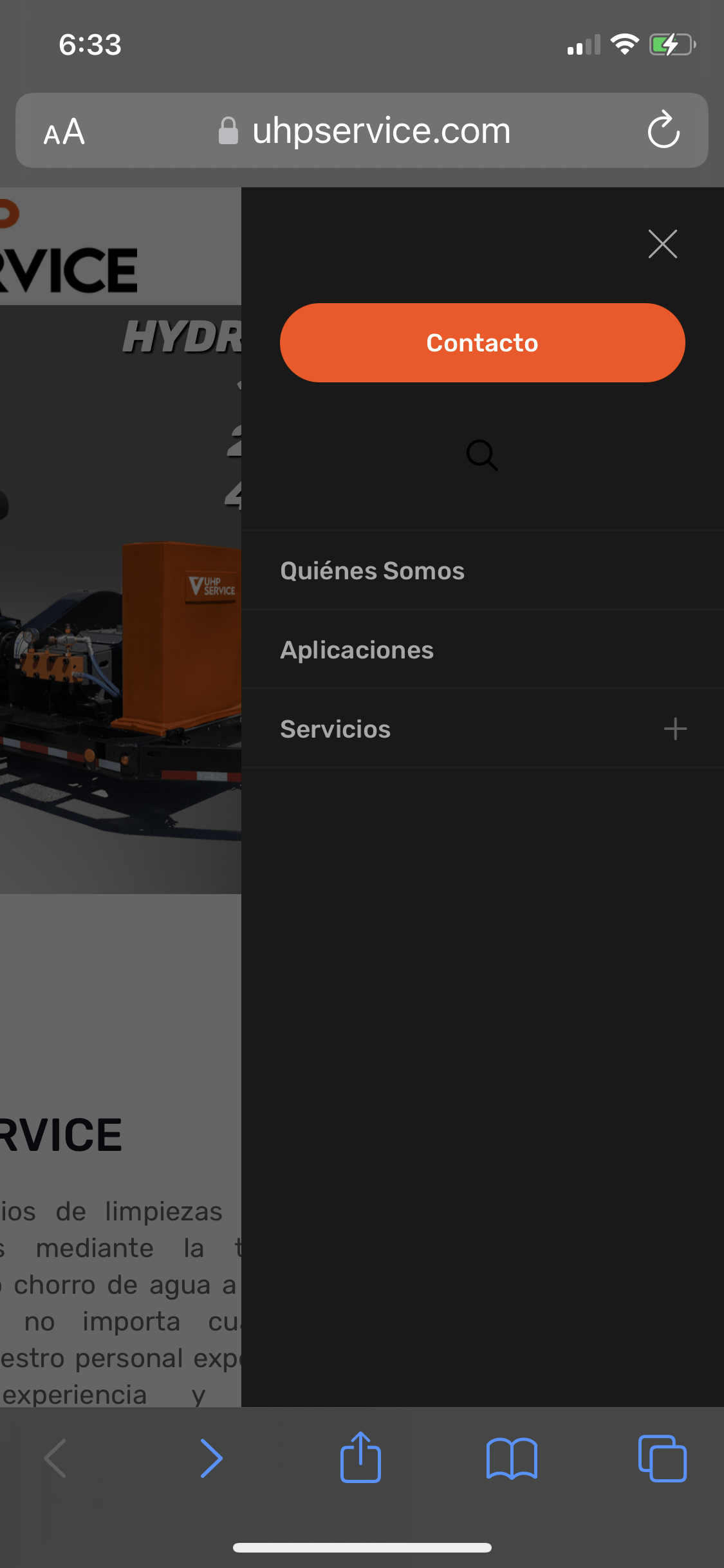
I don't know where to remove a lot of space (left space I think) in the responsive text menu, and I like the contact button there in the responsive menu too ?
Please I need help with that, Thank You! ?
Comments
Hi,
1) There is no option to show the Side Slide menu in the builder; the only way to see it is to check the published Header. However, you can use the browser developer tools and enable the responsive view.
2) You can set the padding and margins in the Style tab of the Menu Burger.
3) The Mega Menu for mobile devices cannot be displayed. However, if you want a menu with more menu items/submenus, you can create a menu, especially for mobile display, and choose it in the Menu Burger options.
4) To have a contact button in the Side Slide menu, you would have to add a new menu item to your mobile menu, add a custom class, and with CSS style, this class to imitate the button.
Best regards
Thank you very much for the reply
I'll give it a try and hope I can do something similar to the default menu ?
I was trying to replicate the button as you suggest, but I can't find the solution, could you help me a little with that?
Thank you so much!
.uhpservice_button {
	background:linear-gradient(to bottom, #d0451b 5%, #bc3315 100%);
	background-color:#d0451b;
	border-radius:16px;
	display:inline-block;
	cursor:pointer;
	color:#ffffff;
	font-family:Arial;
	font-size:13px;
	font-weight:bold;
	padding:9px 27px;
	text-decoration:none;
}
.uhpservice_button:hover {
	background:linear-gradient(to bottom, #bc3315 5%, #d0451b 100%);
	background-color:#bc3315;
}
.uhpservice_button:active {
	position:relative;
	top:1px;
}
In the Class CSS in a new menu item, I put the following class: uhpservice_button
Where could I sent you my credentials?
You will need to see I think
Please send this information privately thru the contact form, which is on the right side at [Links visible only for registered users].
Notice!
Please attach a link to this forum discussion.
Thanks
Thank you!
My private information has been sent ?
Your mobile menu did not have this class assigned.
I have added it, and the styles started to work.
Also, I have added one class to your CSS so your styles reach deeper, and I think that they look better now.
Please, check that.
Thanks
Oh Thank You So Much! ?