Problems with BeBuilder - Miscellaneous errors
Hi!
I have some issues with my theme.
At first I thought it was an installation bug and I uninstalled it, reset everything and started again, but the errors persist. Impossible to continue.
I ask for help.
I've tested it with several browsers and computers, and the problem with colors has nothing to do with screen size. I mention the size of the screens for a better understanding of the error and visualization.
1- Computer with 14 inch screen
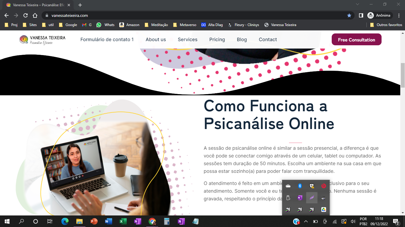
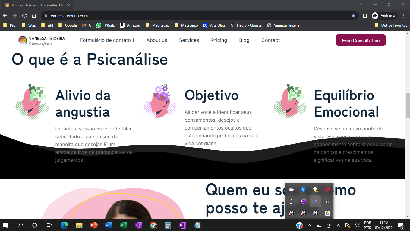
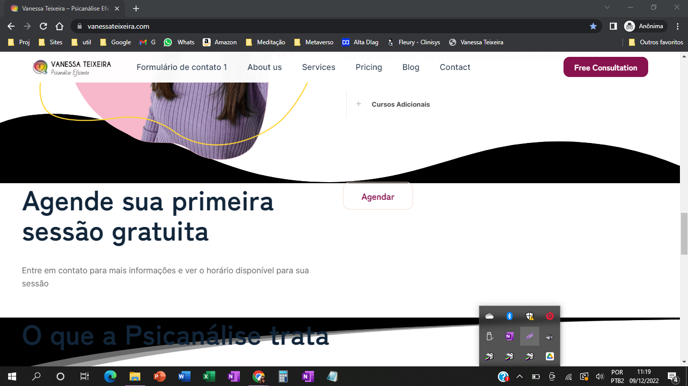
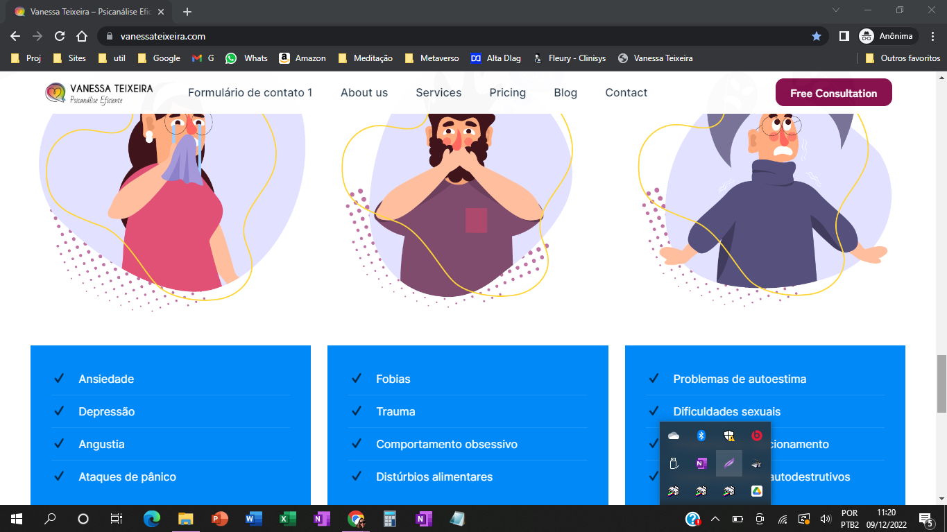
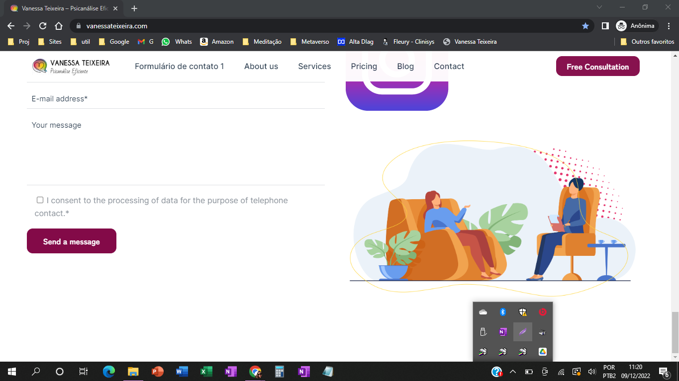
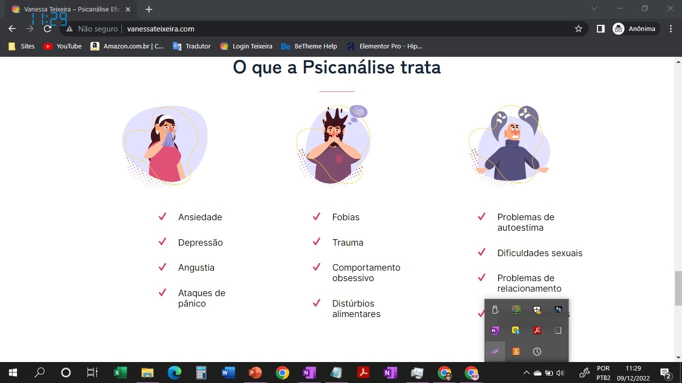
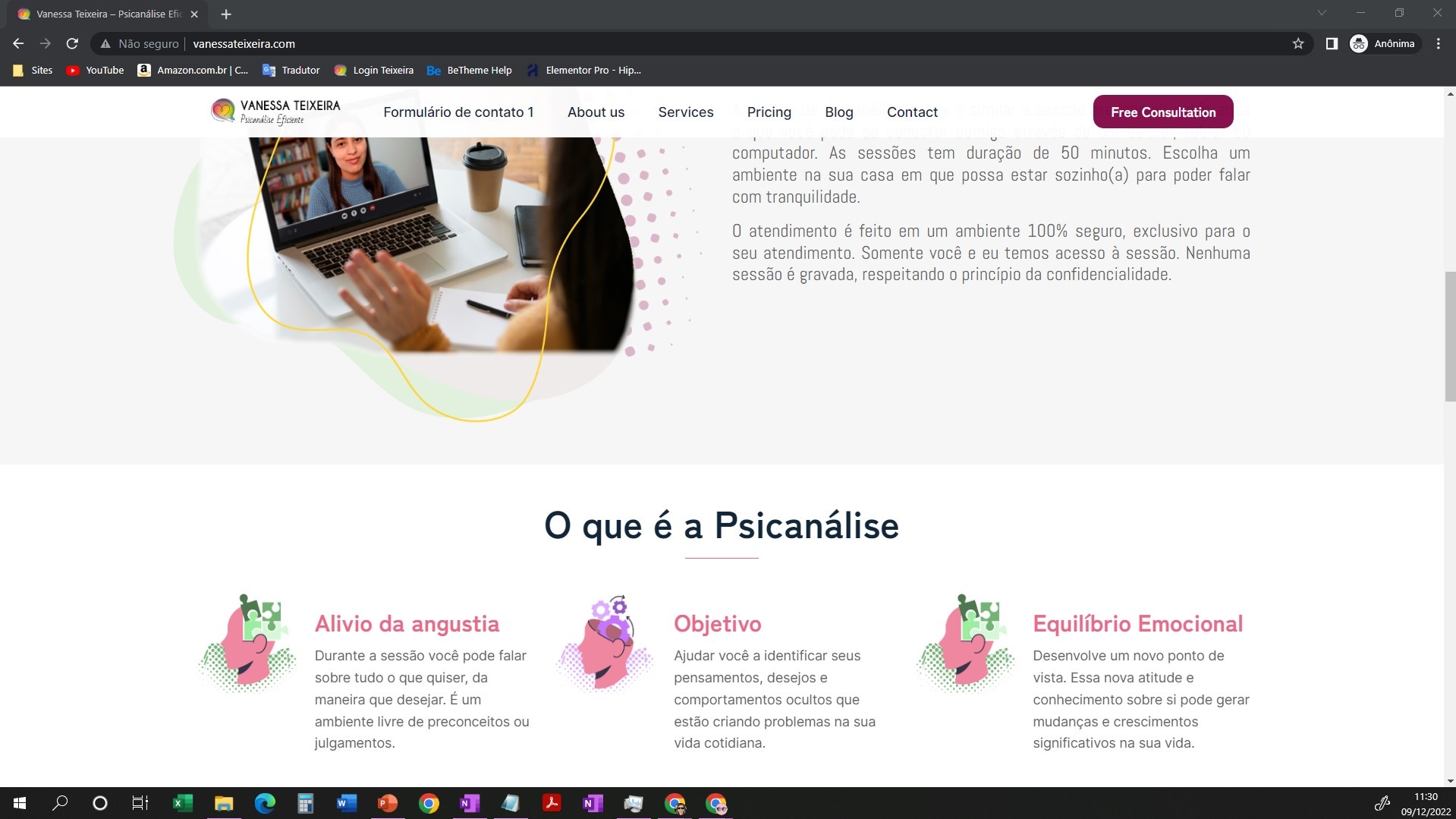
Depending on the computer I'm using or the colors of the sessions, the information box and the shape divider behave with an error. The footer doesn't work.
The shape divider is not black in my creation.
Check out the images: computer 14. These are pictures of my computer with a 14-inch screen.
2- Computer with 15 inch screen
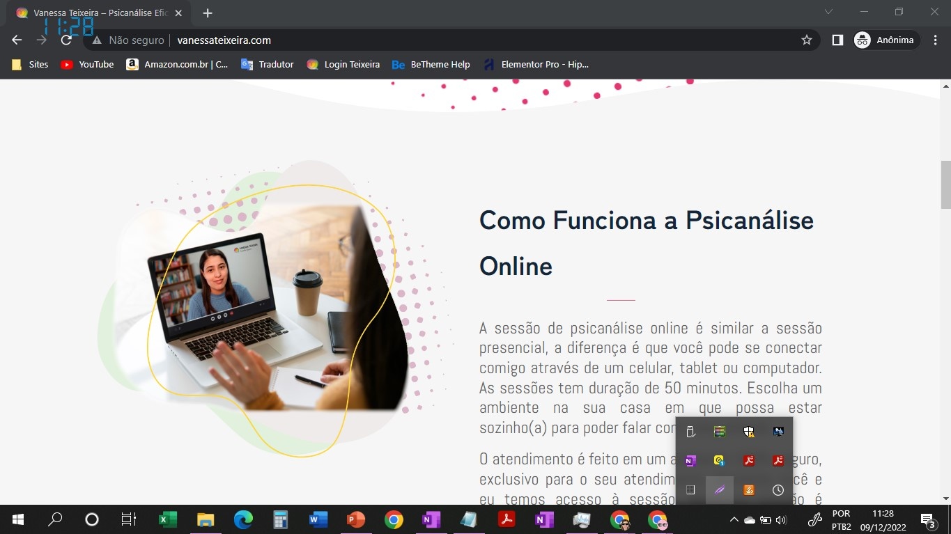
The content, in addition to having problems with the colors, it does not fit in a good responsive way, everything is squeezed and out of size.
Check out the images: computer 15
On my 22-inch screen, it works fine.
Check out the image: computer 22
I send several images for better comparison and understanding of the error.
Thanks
Comments
Hi,
There is a possibility that your website changes the URL from http to https, which is incorrect, generates a mixed content error, and styles are not loaded correctly.
Your htaccess can redirect your website to https, so you should edit it and change it to http.
https://www.freecodecamp.org/news/how-to-redirect-http-to-https-using-htaccess/
If this does not help, it would be best if you contact your hosting provider, and they should be able to help you with it.
Best regards
Hi, Phil.
Thank you very much for your support. I managed to change the SSL, now it seems to be right.
1 - The problem with the colors has apparently been resolved.
2- 14 inch screen - Problem.
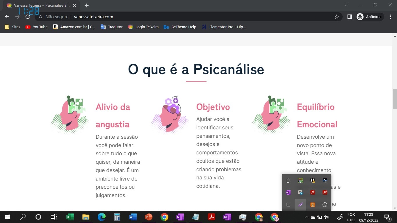
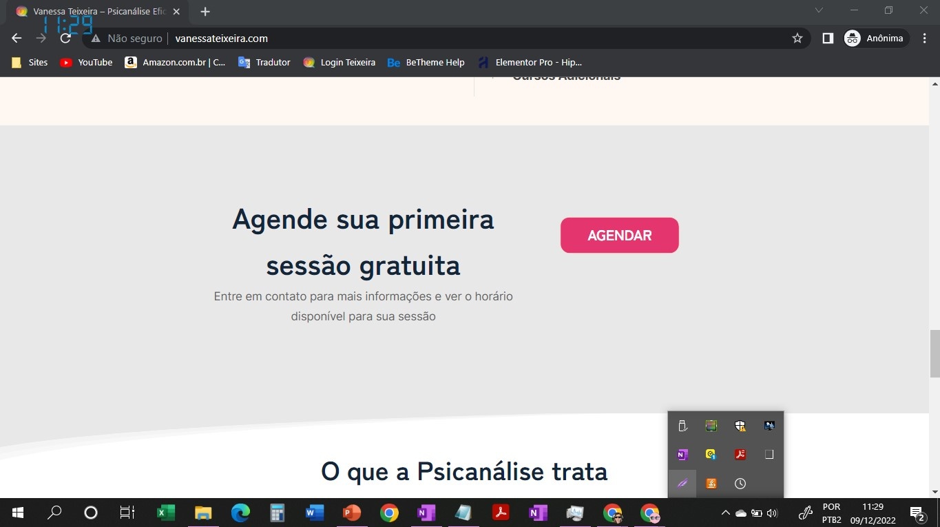
The issue of content not looking good on a 14-inch screen remains. Check it out in the images.
This image is just an example, it happens on the entire page, all misaligned.
That image with a red X is the wrong one. 14 inch monitor.
This other one is the correct image for you to compare.
Can you help me? It doesn't seem to be a responsive mode issue.
On an 11-inch monitor, the content is the same as on a 22-inch monitor.
Between 1240px and 960px, the elements are automatically narrowed so they do not overlap each other and do not move to the next row.
There is no setting to adjust the display in that gap, but I can see that you have a large line height in the title for the icon boxes. You should decrease this value.
Best regards
Phil, thank you so much for your support, I'll make the change.