
webshop lay out on mobile devices

Hi,
I can't get my page [Links visible only for registered users] on mobile devices not good. I would like to have them the same as [Links visible only for registered users]
On bigger screens it is oke but on small screens I can't get it nice see screen shot.
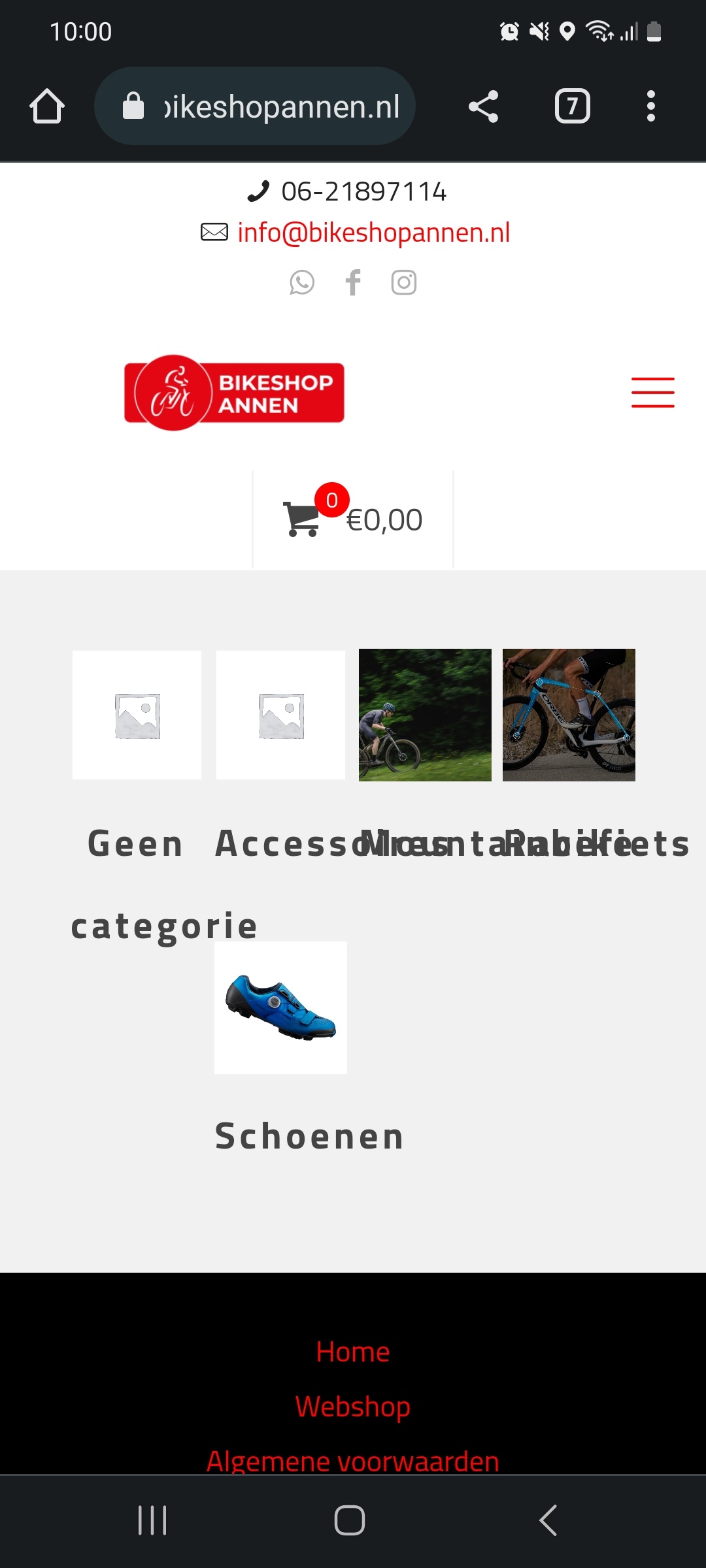
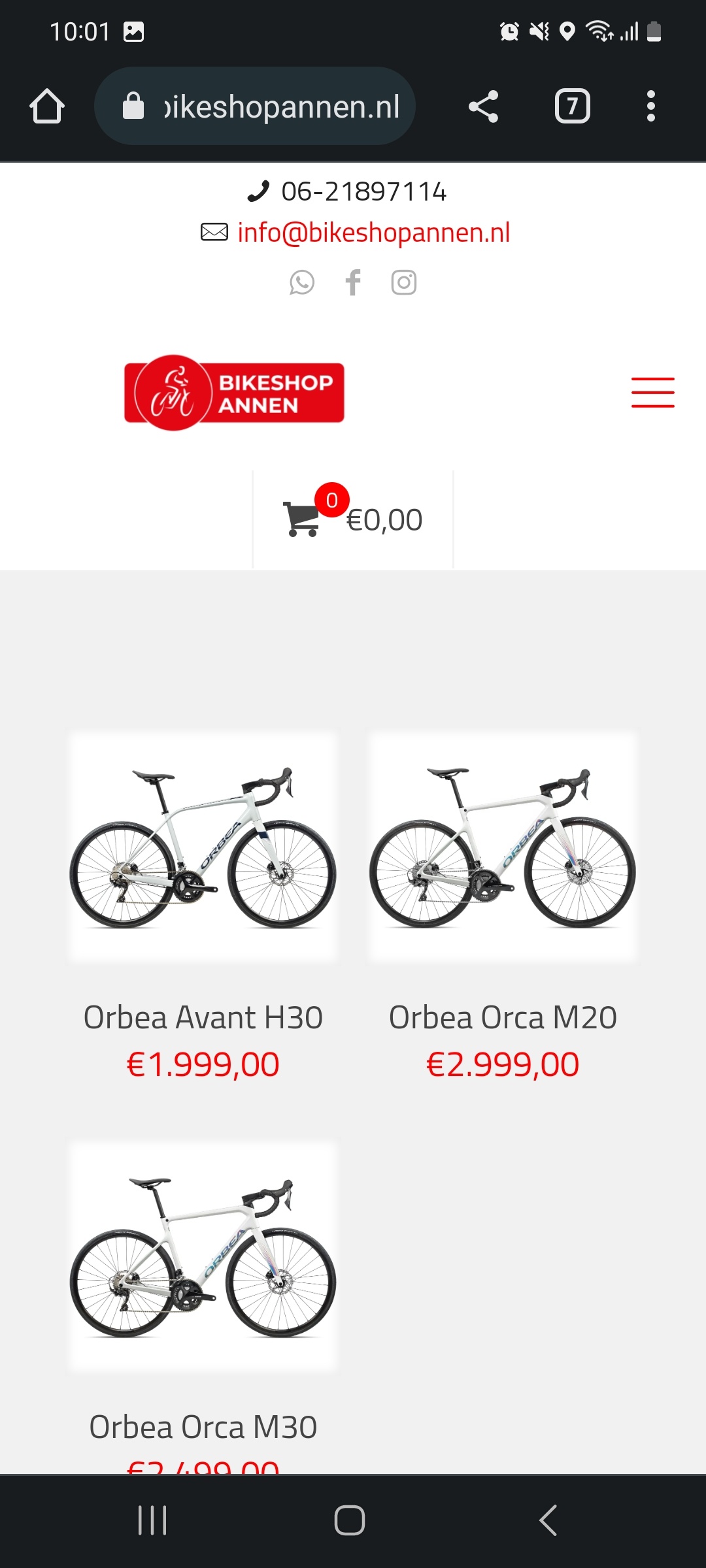
The way I would like to have it
Thanks
Comments
Hi,
I passed this info on to the dev team.
For now, please use the following CSS code:
@media only screen and (max-width:767px){
.woocommerce.columns-4 ul.products li.product{
   width: 48%!important;
}
.woocommerce.columns-4 ul.products li.product:nth-child(4n+1){
   clear: unset!important;
}
.woocommerce.columns-4 ul.products li.product:nth-child(2n+1){
   clear: both!important;
}
}
Put it in Betheme -> Theme options -> Custom CSS & JS -> CSS.
Best regards