
How to insert the breadcrumbs also in the mobile version: porfolio and other pages

Hello, I noticed that I can not see the breadcrumbs in the mobile pages: here is the desktop:
Here is the mobile version:

Can you please help me implement them in the mobile version too? Or show me a way to insert a sort of a list of previous pages?
This breadcrumbs problem happen to all pages, how can I adjust it?
Thank you
Comments
www.maelleapp.com
Hi,
Please, put the CSS code from below to Betheme -> Theme options -> Custom CSS & JS -> CSS.
@media only screen and (max-width: 767px){
   #Subheader ul.breadcrumbs {
   display: block!important;
 }
}
Best regards
THANK YOU! it worked!
there is a way in the code to put every different page in a different row:
like here I can see that HOME - CASE STUDIES are on the same row.
thank you
Change the previous CSS code to the following one:
@media only screen and (max-width: 767px){
   #Subheader ul.breadcrumbs {
   display: block!important;
 }
   #Subheader ul.breadcrumbs li{

      display: block!important;

   }
}
Thanks
Great thank you!
another thing:
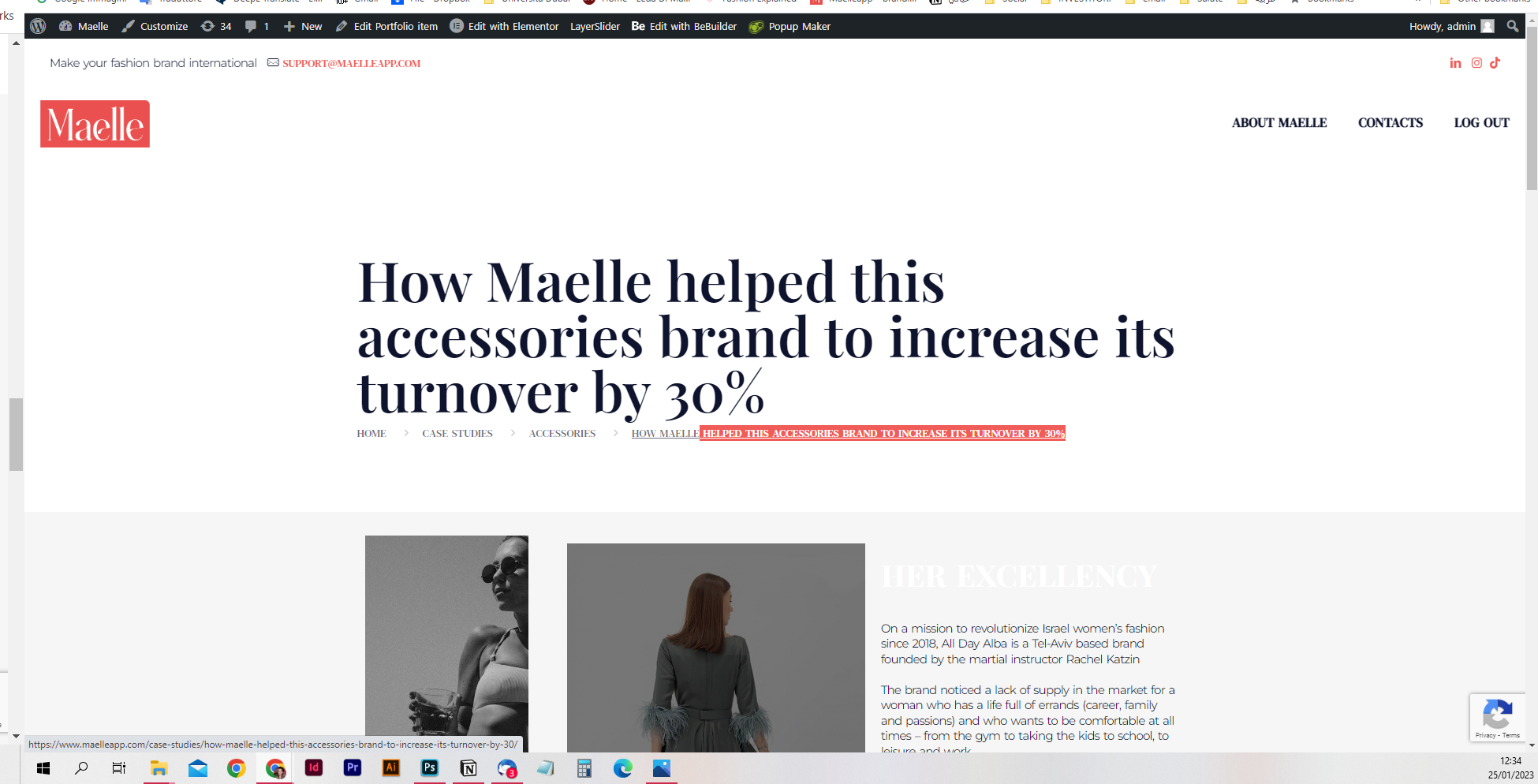
I see the catefories pages here: womenswear, accessories etc:
but the page ACCESSORIES or WOMENSWEAR or any other categories, ar enot pages that I want to create. they should not be clickable. it is just to make clear that this is the category for the user.
in fact, these pages do not exist:
Can I please know how to change it?
If it is not possible, can I delete this word CATEGORY from the breadcrumbs?
Thank you so much!!!!! You all are a great team support!
I think it would be possible to make these links not clickable but to check that, I will need a link to this page.
Please, send this link, and I will take a look.
Best regards
this is the link to the case studies page:
the singular pages are inside this page, as link, - porfolios.
You can
Please, try the following CSS code:
#Subheader .breadcrumbs li:not(:first-child):not(:nth-child(2)):not(:last-child){
   display: none;
}
Put it in Betheme -> Theme options -> Custom CSS & JS -> CSS.
Thanks
thank you for the code, but from the phone, I still can click on the categories and opens the error page 404. Could you please give me the code for mobile and tablet version too?
actually, sorry, this this code, I don't even see the category in the destop version:
womenswear disappeared totally.
Could you help me insert the categories in both phone and destop version but without the chance to be clickable.
Thank you
Try the following one instead:
#Subheader .breadcrumbs li{
 pointer-events: none!important;
}
Thanks
thank you so much, it works perfectly from pc,
but from PHONE, nothing is clickable now:
check the pic and check here FROM PHONE:
please check: [Links visible only for registered users]
thank you
Unfortunately, I cannot recommend anything else.
It would require more customization, and for it you should contact your web developer.
Best regards
but on the pc it works, so I am sure it could work on the phone also. Could you spend some more time evaluating the problem, or giving me a code back to adjust both in a different way,
because then, I would prefere to not show the category womenswear if you are not able to give me a code for making it not cliakcble form both phone and pc.
So please help me with it.
Thank you
I could misunderstand you.
Can you explain again how it should work? For example, breadcrumbs on both mobile and desktop should be not clickable?
Best regards
sorry, english is not my main language.
I mean that I want the breadcrumbs to be clickable in both PHONE AND PC view, all the voices BUT the CATEGORY (the category should not be clickable in both since the pages do not exist of any category).
Now in the pc are clickable all
and in the phone no one is clickable - no home, no category, no case studies, etc. NOTHING AT ALL
You can verify yourself same link.
If you can not help me to make the full breadcrumbs cliackable but the category in both pc and mobile view, then I would like to avoid to show the category at all, because it can't be that the clickable category does not bring to an unexisting page.
it is clear now?
thank you
Use this CSS code:
#Subheader .breadcrumbs li:not(:first-child):not(:nth-child(2)):not(:last-child){
 pointer-events: none!important;
}
Your CSS in theme options should look like this:
Best regards
sorry, could you copy and paste me the entire picture text code?
It is a screenshot from custom CSS placed in your theme options, so you already have most of these codes, and you only need to paste what I sent you.
Best regards
Hello, I inserted that code but nothing happened.
I still can not click on any of the words in the breadcrumbs, as you can see those are not clickable.
you can also check here:
I want to be able to click to HOME, CASE STUDIES , I don't want to be able to click on WOMENSWEAR because that page do not exist, but express the category.
Same for all pages as case studies in the page:
Thank you for the help.
Please, remove this part from your custom CSS:
Thanks
works perfectly thank you so much