
Width of a revslider Text/Button Layer on mobile

For some reason the width is not respected only for mobile.
This is the back end:

This is the front end:

The relevant settings:
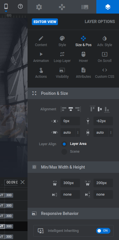
So, I am editing the mobile template editor, but for some reason the width doesn't take its setting. Please advise what to do... thank you kindly ?
edit sorry for not posting in the right subforum, please feel free to move it to revslider.
Comments
Okay, I already found it. Apparently I had to set the width under position and size too, not just under min/max width.
Hi,
Glad to see that you handled it.
Is there anything else I can help you with?
Best regards
Hi Phil, yes, you can. I hope it is okay if I keep using this thread.
My next problem has to do with the menu on the following page: https://stmartinusgroningen.nl/
The issue I am facing is as follows. I have selected the Transparent menu in Header & Subheader. Now as you can see (on desktop), the logo, and the text, are not clearly visible. So what I would like is to have a semi-transparent (40% black) background, in this header. How can I achieve this? Note: I would not like to add a custom header via Templates, because, this I think that this cannot become a semi-transparent option on top of the current background, can it?
(2) Secondly, on mobile, I would like to change the "empty" header with the hamburger menu. It has to be clear, to old people, that they can click the hamburger menu to view the pages. So I need to add a text to the empty bar. Or, I would like to have page names in the menu, too.
(3) I would like to add social media buttons (Facebook, Telegram, YouTube) to the menu.
(4) how do I make the page less big? I want to show part of 4 the boxes below, on the page, without having to scroll.
I hope you can help me. I'm having great difficulty with 1) this background (which I would like to keep even though it is bright) and 2) the header menus.
Thank you. ?
So, maybe I would like it to look something like the following, but not black but 40% transparent (or so)
1) Of course, it is possible to achieve that with the Header Builder.
You need to add transparency to the section/wrap background.
2, 3) Please, check the following video tutorial:
https://support.muffingroup.com/video-tutorials/building-mobile-headers/
If something is unclear after you watch it, or if you will have any additional questions, please, let me know.
4) Sorry, but I quite do not understand this point. Can you explain it in more detail, please? Do you have any examples of that?
Best regards