Help needed with portfolio template design
Hello,
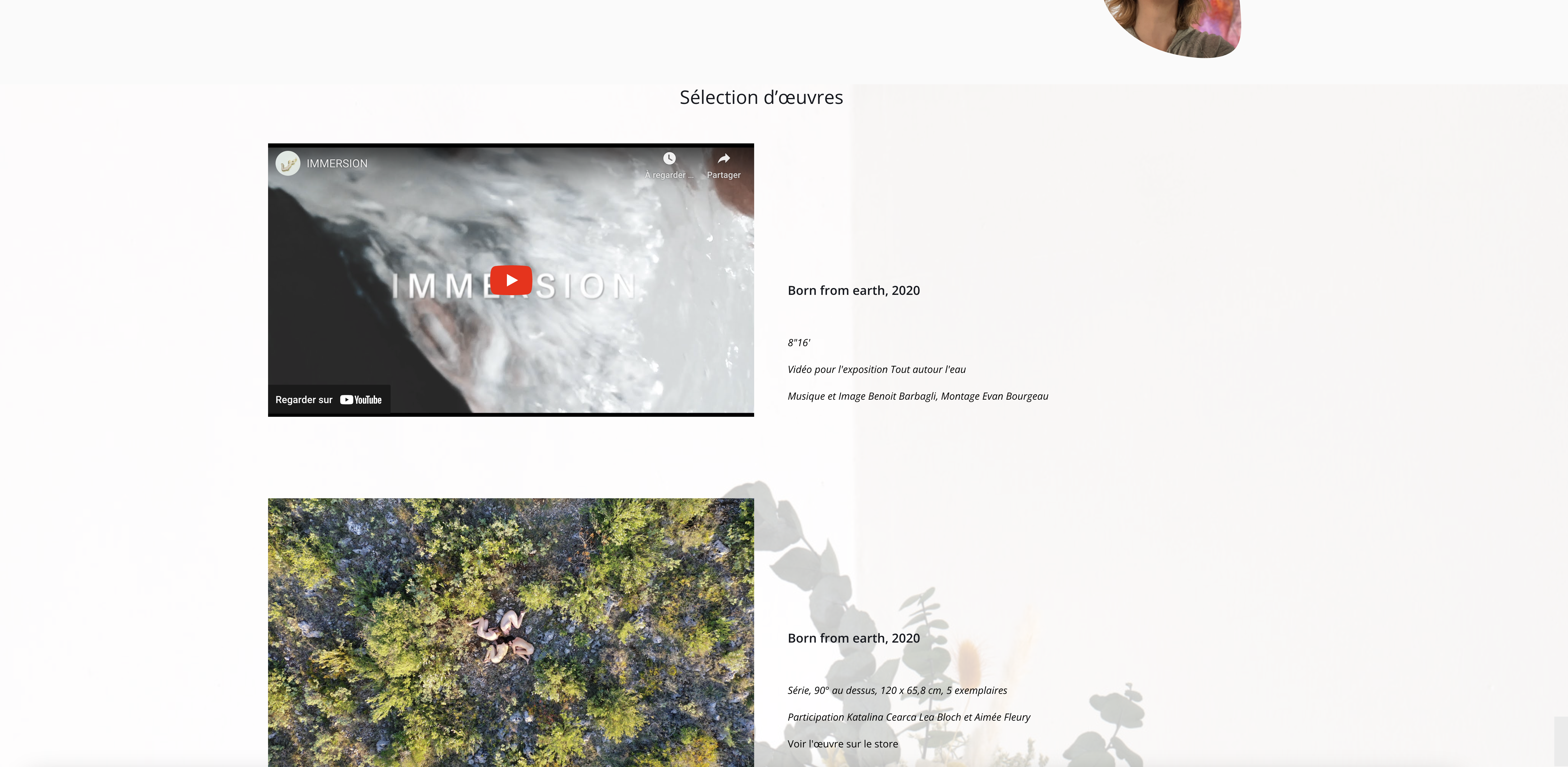
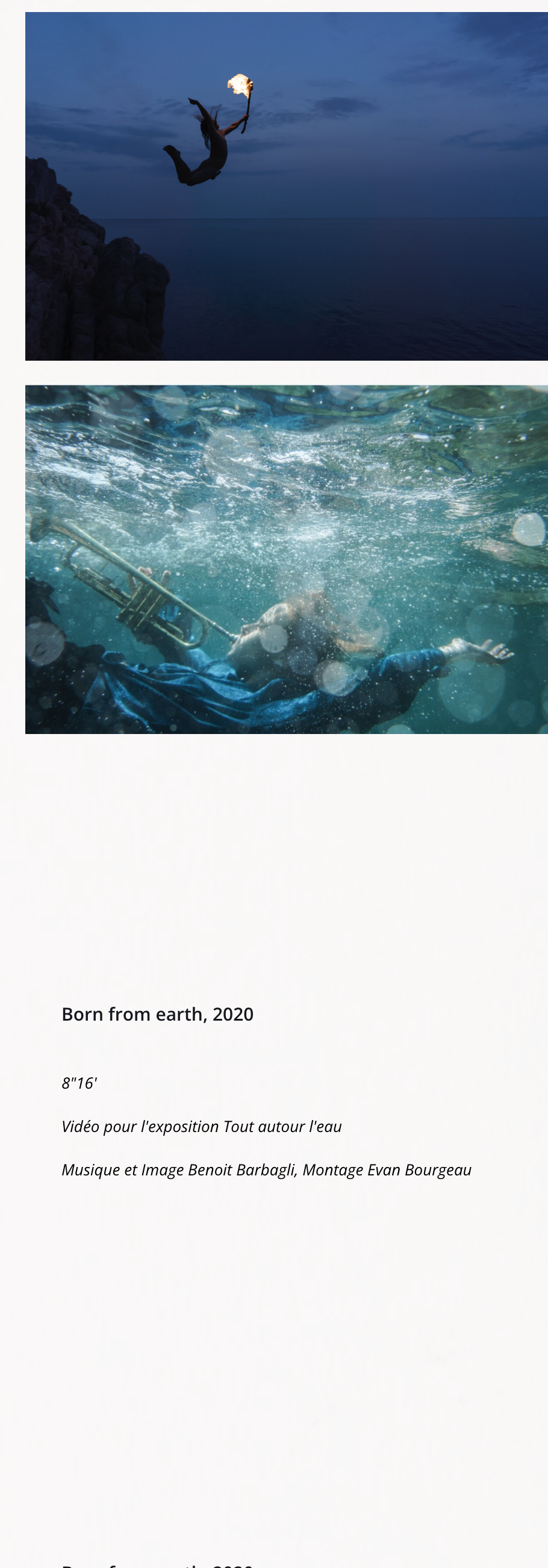
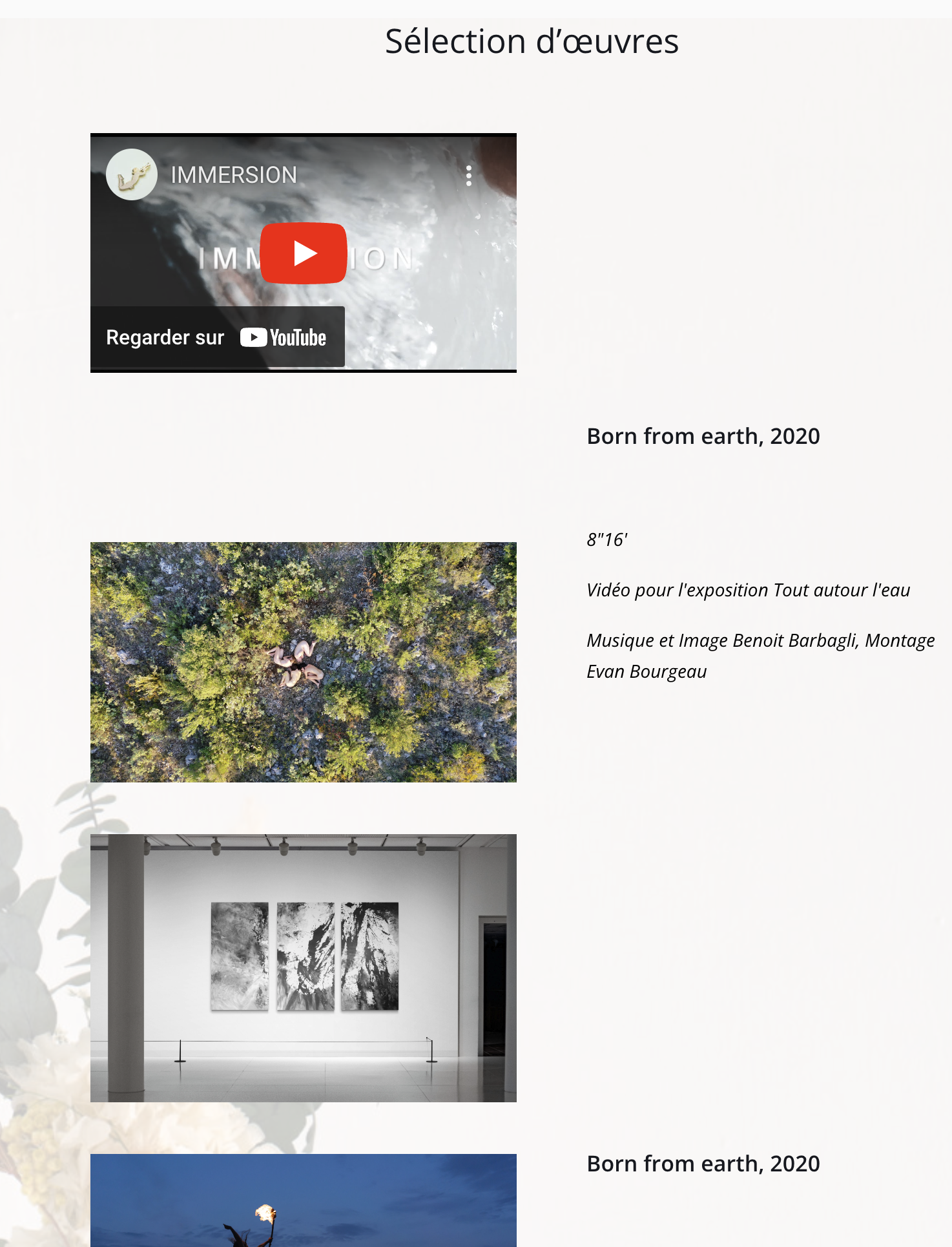
I have just built a portfolio template, and I am having difficulties with the warp and divider. I would like there to be the same background behind all the presented works, as seen in screenshot 1. I have managed to achieve this, but the problem with the method I have used is that it works poorly in responsive design. I used a 1/2 - 1/2 layout, with all the text in the same warp and all the images in the same warp, which means that when resizing the window (see screenshot 2-3), the text shifts, and on mobile, the order of appearance of the elements is not correct. In the pre-built section, I found an element that works (see screenshot 4), but the problem is that I cannot have more than three images. Can you help me, please?
Thank you.
1- Desktop view : ok result
2 - mobile view content inversed
3- small dektop/tablet (text non align to picture
4 - prebuil section with good result but only 3 picture
https://2023.eva-vautier.com/portfolio-item/benoit-barbagli/


Comments
Hi,
Please check the following video tutorial:
https://support.muffingroup.com/video-tutorials/responsive-editing-in-bebuilder/
There you will find out how to adjust the mobile view.
Thanks