
Mobile Design

Hey,
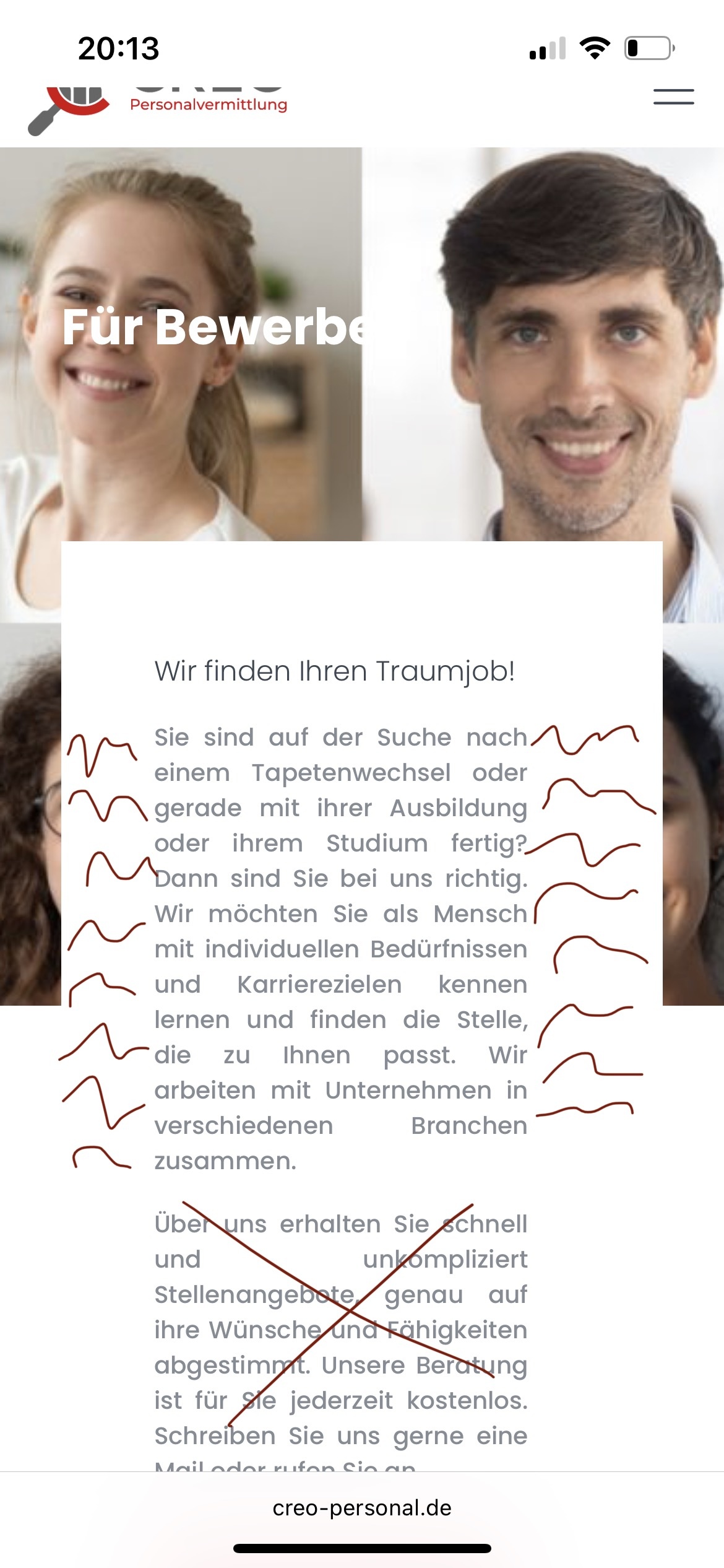
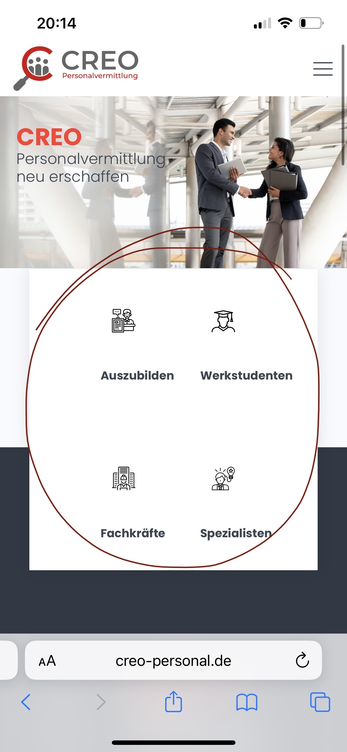
Can someone help me to get the mobile design right? I made the website creo-personal.de and everything looks fine. Except on the mobile side, at "Home" and "Für Bewerber" and "Für Unternehmen". With Home I would like the icons to look good or sit in the middle. With "Für Bewerber" and "Für Unternehmen" the text should be the entire width and not just left and right with huge spaces. I will put screenshots so you can see what I mean.
Thank for help :)
Comments
Hi,
Please see the following video tutorial:
https://support.muffingroup.com/video-tutorials/responsive-editing-in-bebuilder/
Moreover, I can see that you use deprecated options. To have higher control over your elements, I suggest changing them to options from Style and Advanced tabs. Check this link about deprecated options:
https://support.muffingroup.com/faq/what-deprecated-in-the-bebuilder-means/
If something is unclear, or you will have additional questions, please let me know.
Best regards
Hey,
I watched the video and read the article, but that's what I did. I can't get the text on the two sides "Für Bewerber" and "Für Unternehmen" to be wider, or that it fills it up and is still not so narrow. In addition, I can't get the icons on the Home page to be centered in the mobile view. Can you help me?
Please send us WordPress dashboard access through the contact form on the right side at [Links visible only for registered users].
Notice!
Please attach a link to this forum discussion.
Sending incorrect or incomplete data will result in a longer response time.
Therefore, please ensure that the data you are sending is complete and correct.
Thanks
I have created a copy of your sections and adjusted the settings to change the display.
Please see them, and analyze the changes I made to them. In short, I removed deprecated settings and adjusted the responsive view, as shown in the links I sent you in my first message.
Best regards